The Goal
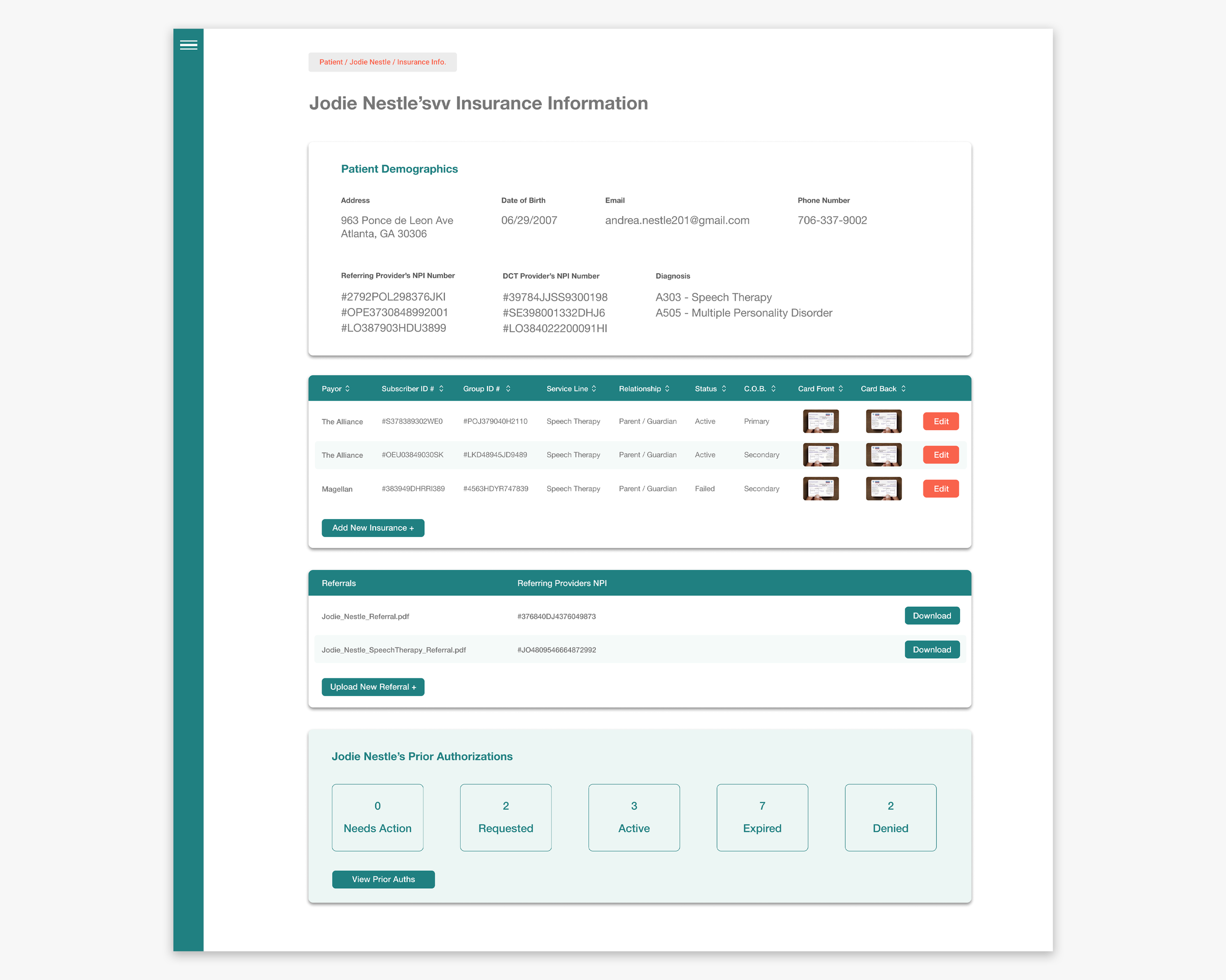
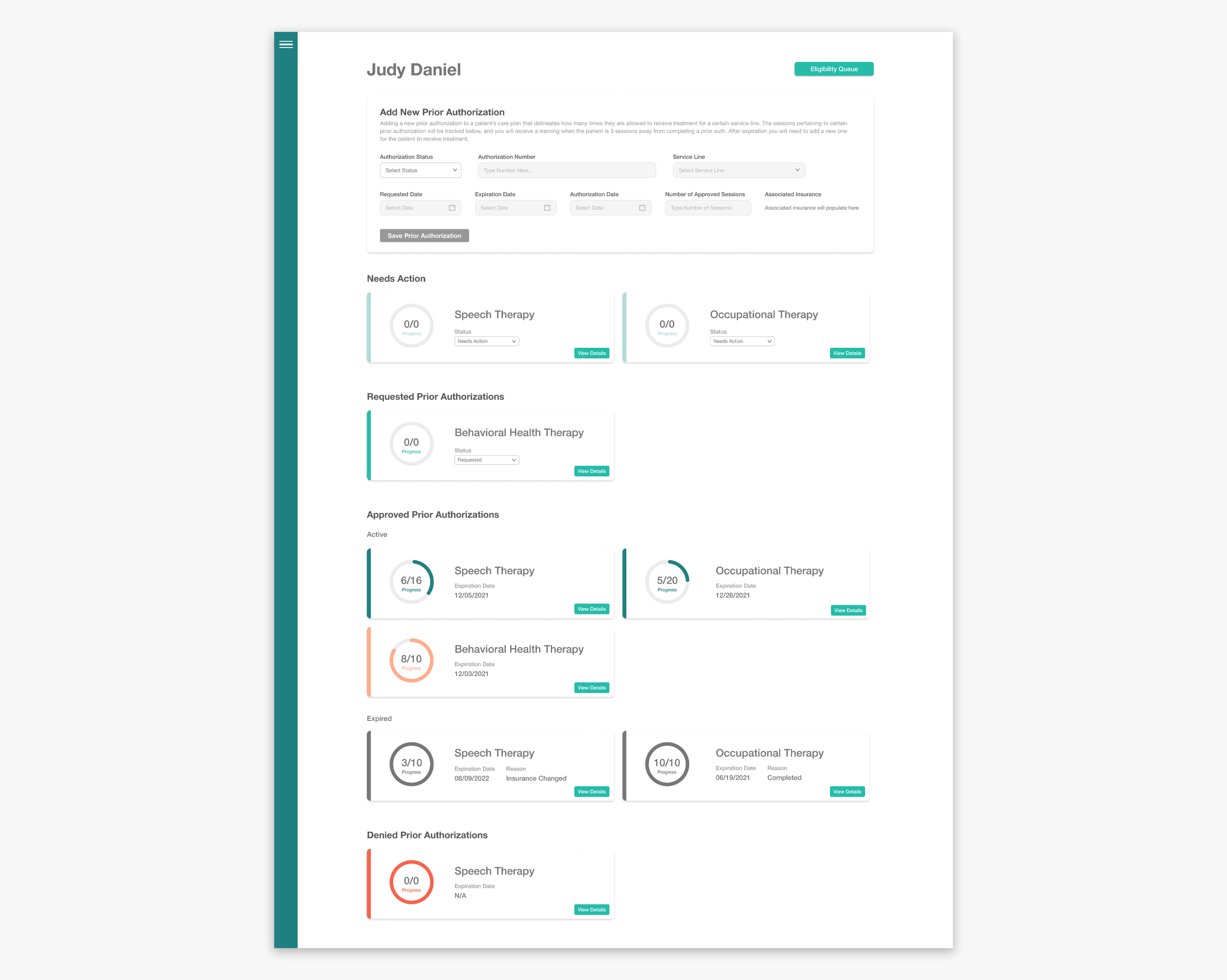
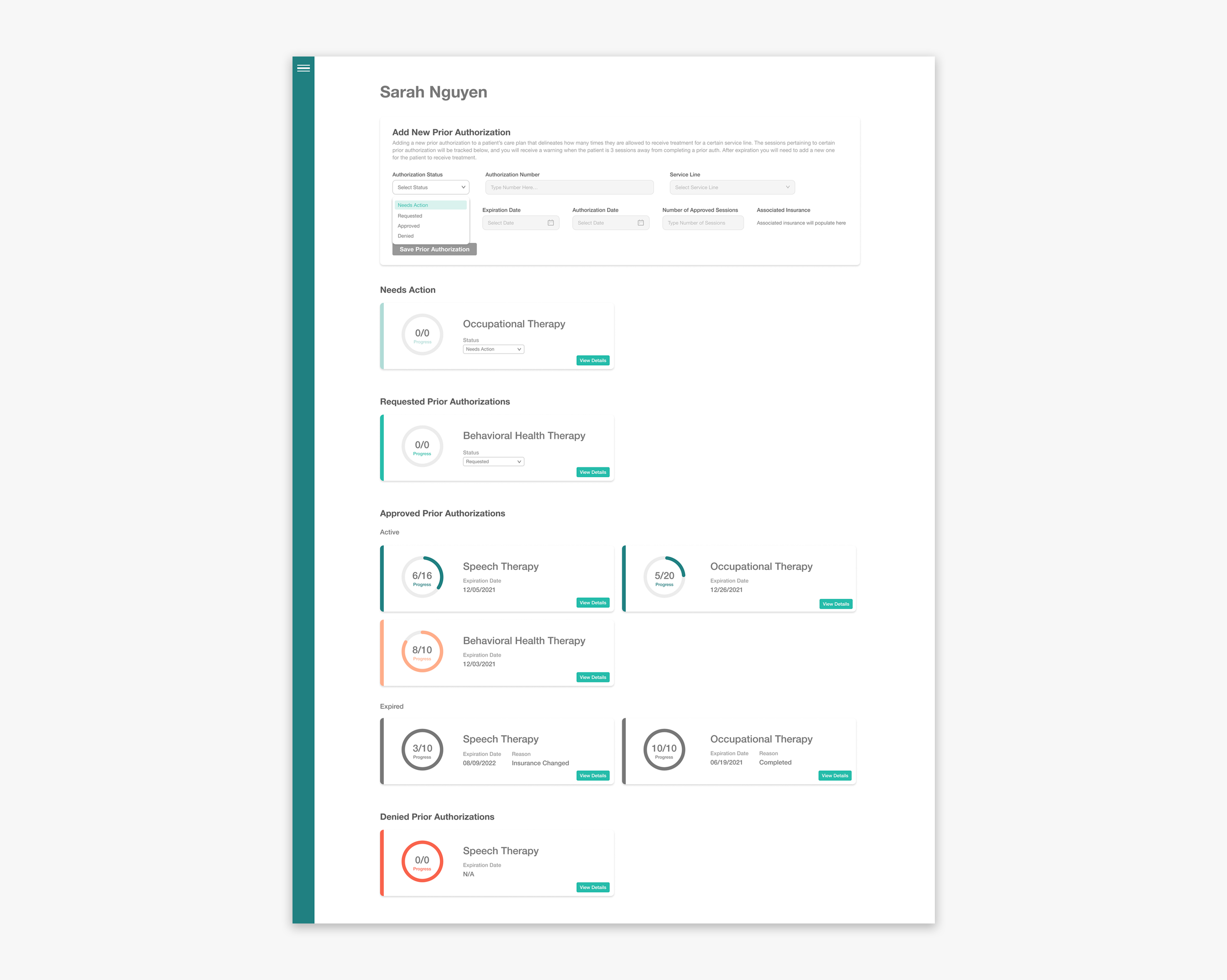
When insured patrons come in as new patients DotCom Therapy they often have prior authorizations that delineate how many sessions they’re covered for. This number tells DCT, and it’s therapist how many sessions their patient is allotted, which allows therapists to keep track of the patient’s progress, and tailor therapy according to that number.
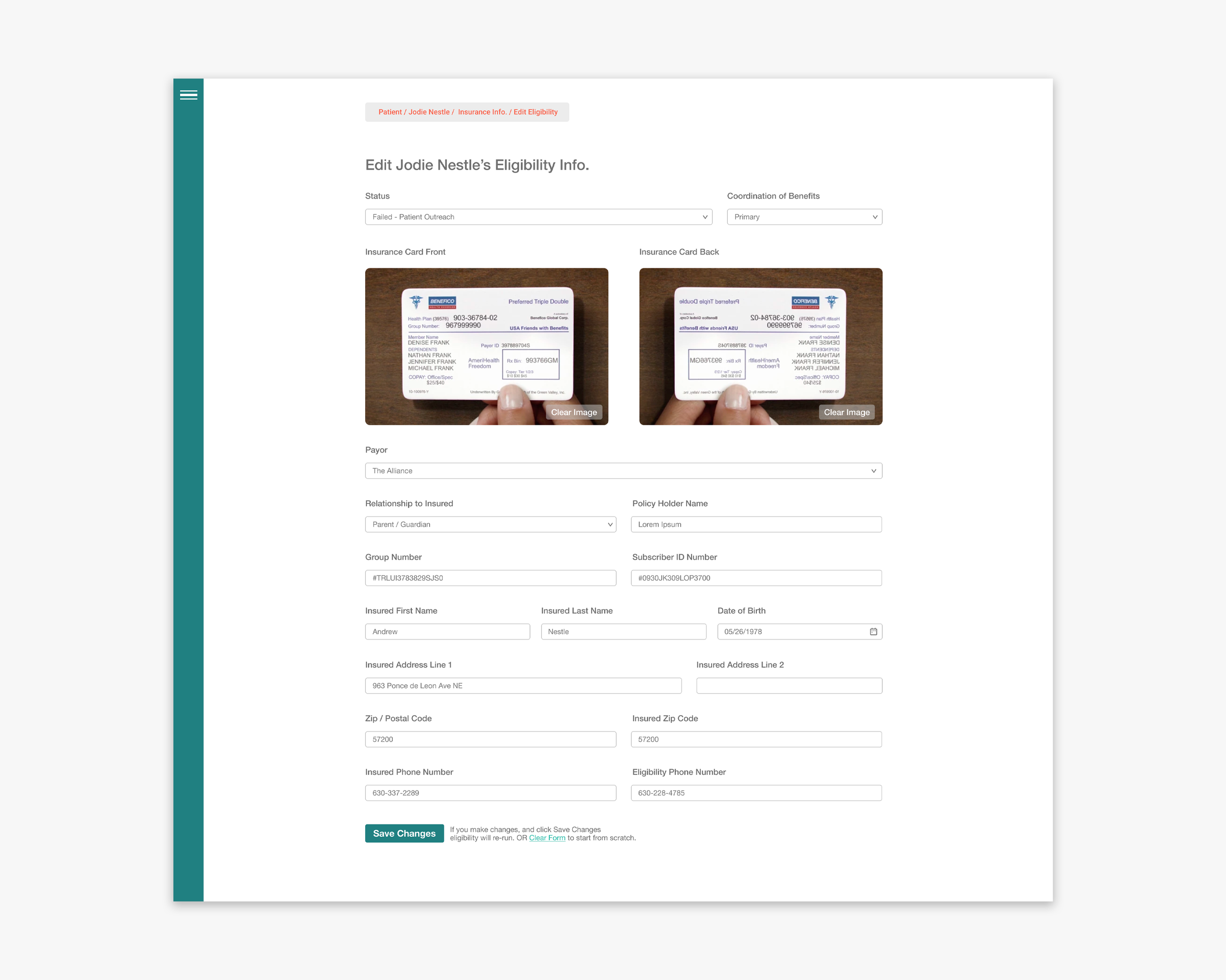
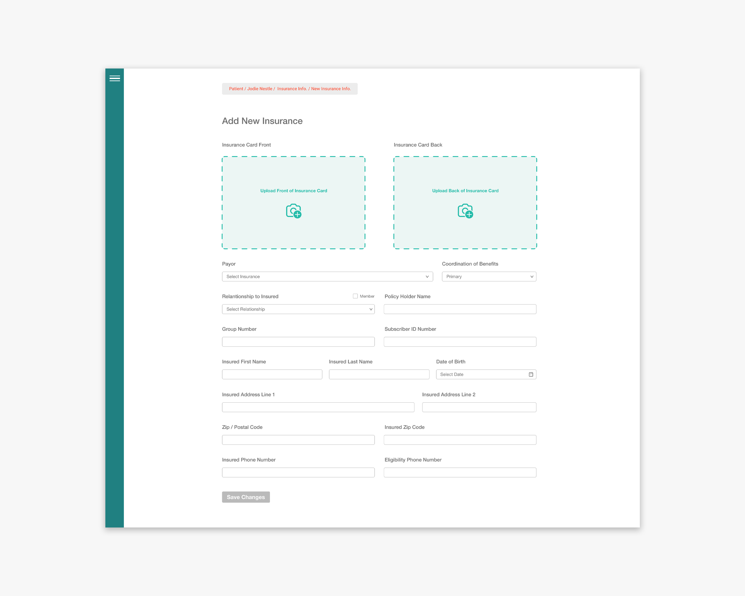
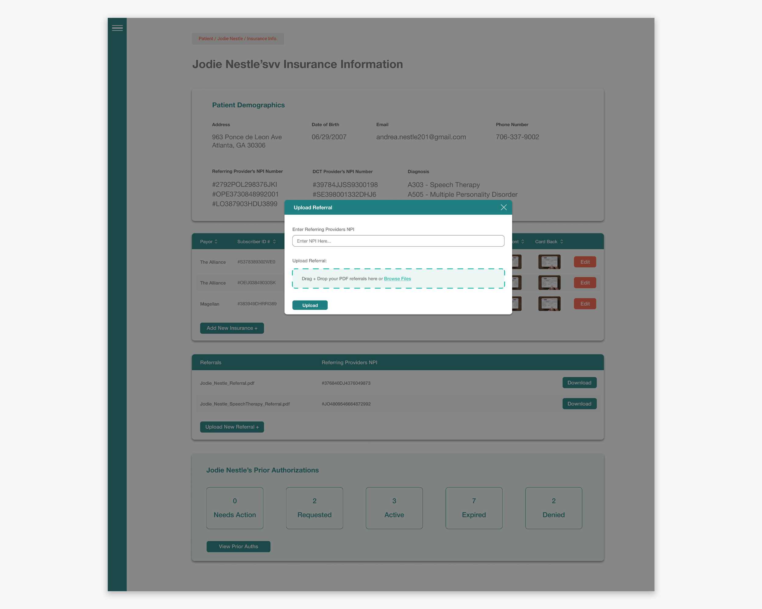
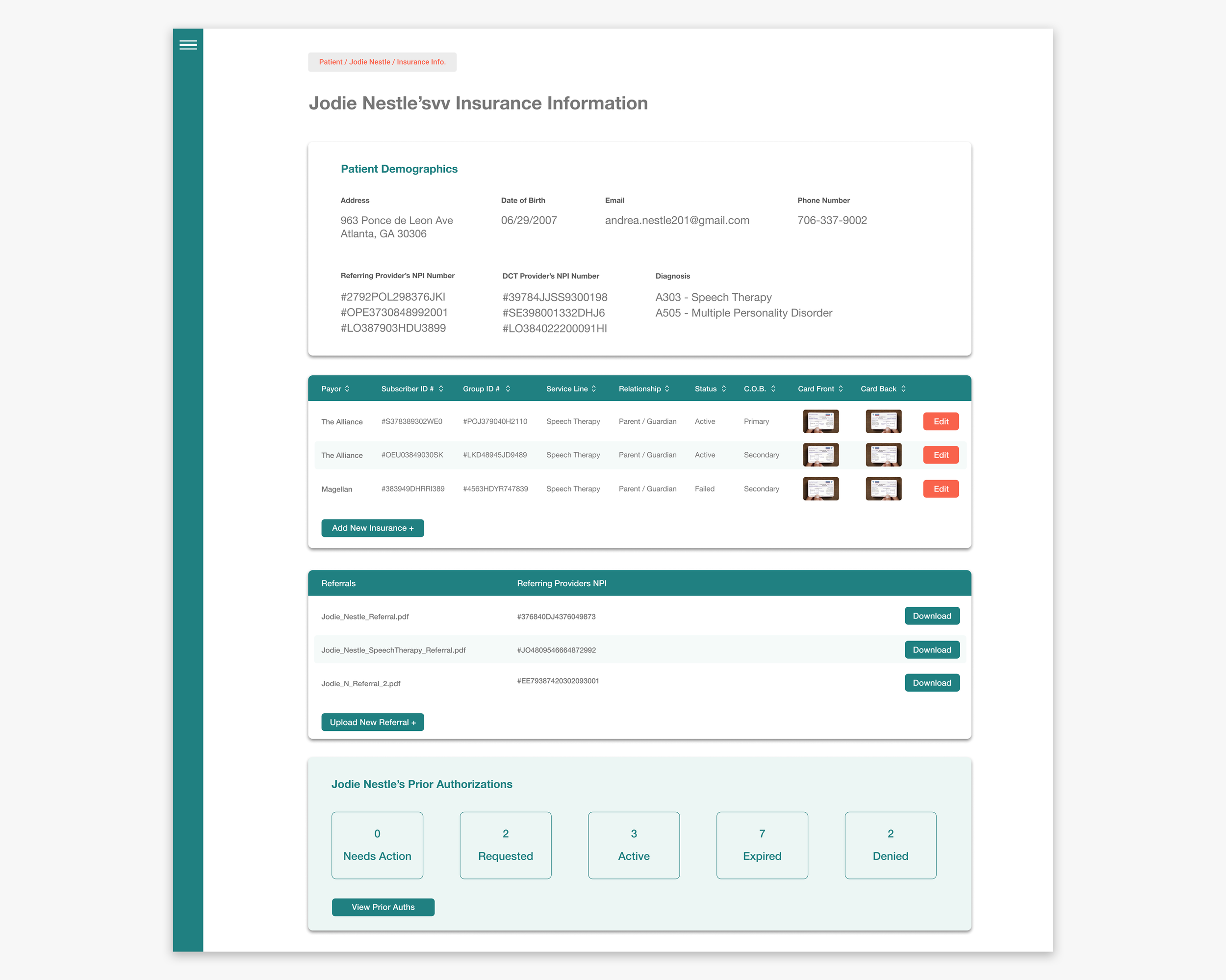
However as DCT signed new insurance contracts they didn’t have a place to store prior auth information for patients. So prior authorization info was floating around in several different excel sheets, and needed to be consolidated in one spot for each patient. This page needed to have all of a patient’s prior auths, have them displayed in a way that was readable at a glance, but also still house all of the important data associated with each prior auth.
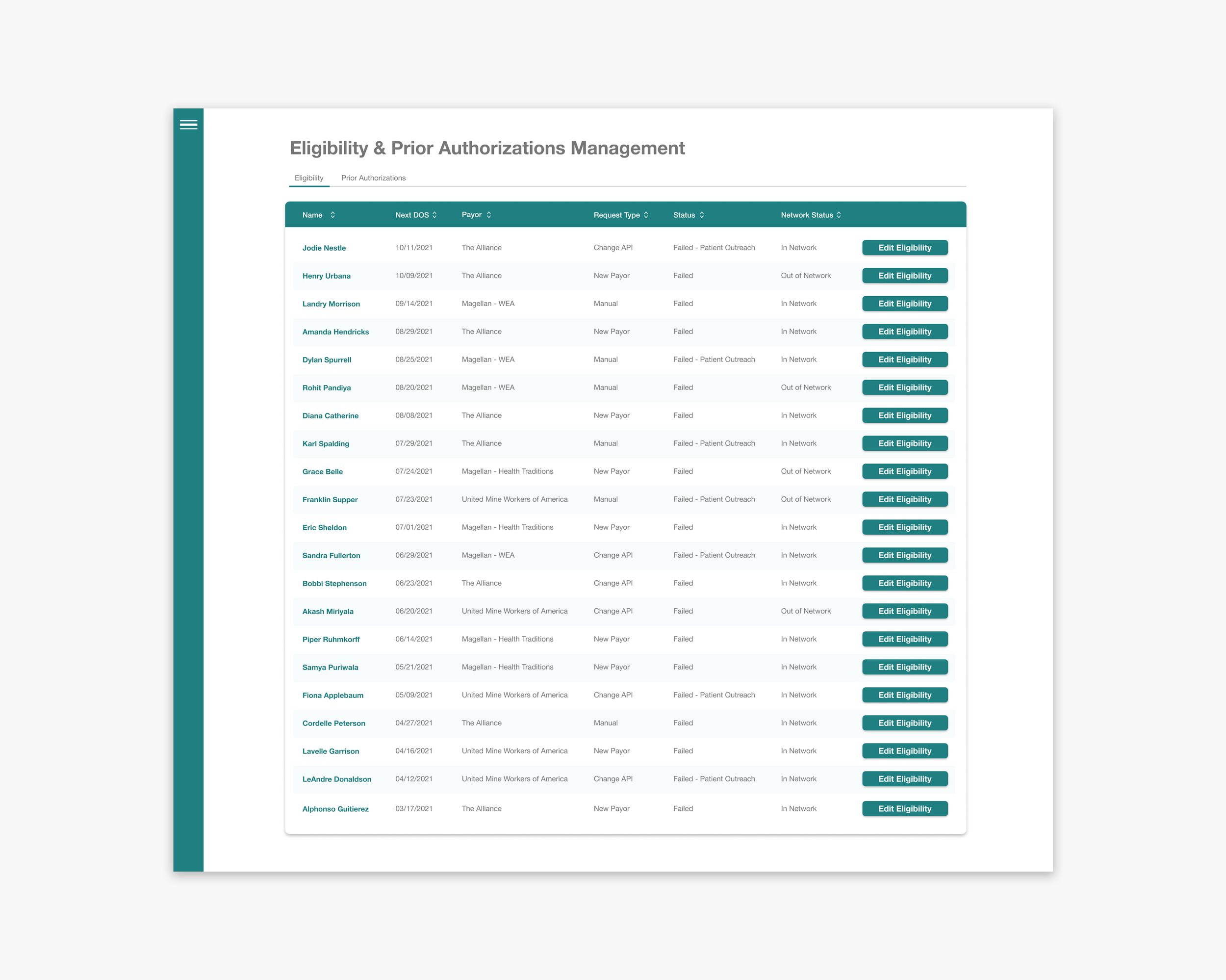
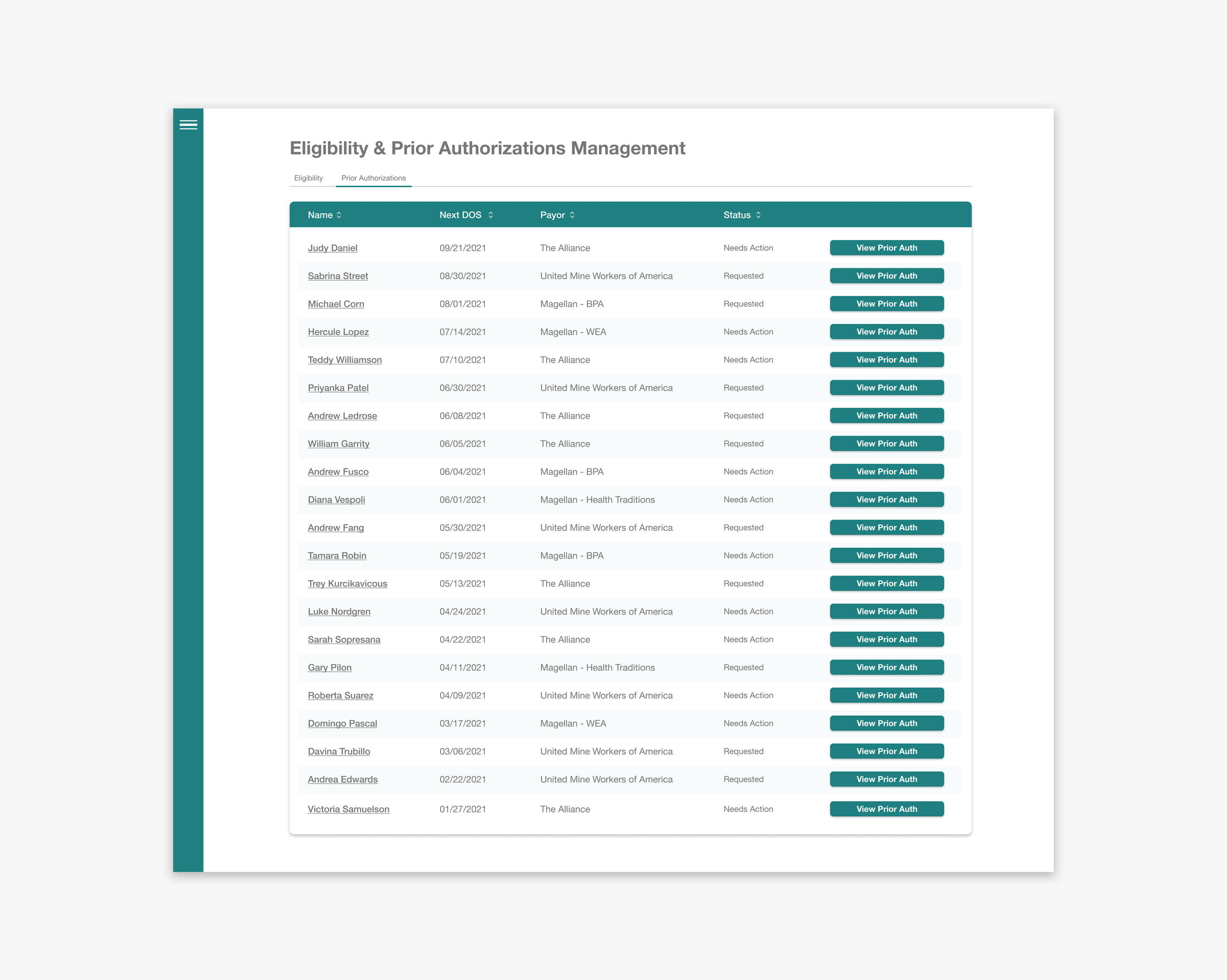
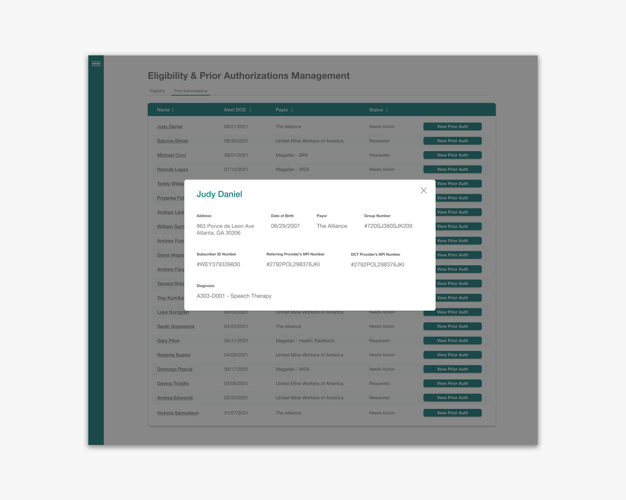
In addition the management of the several hundred incoming prior auths meant DCT needed a queue that handled these items. The queue would be managed by insurance admins who requested a clean view of all the prior auths that they would need to approve, deny, or get further clarification on. Their job often involves looking at a prior auth, reviewing the information, and calling the patient’s insurance to clarify information in order to make a decision. The admin queue needed to display a lot of information, while still retaining a sense of order and cleanliness.
For both users we had the task of distilling a ton of information, making it look bite sized, and easy to parse through.
Proposed Solution
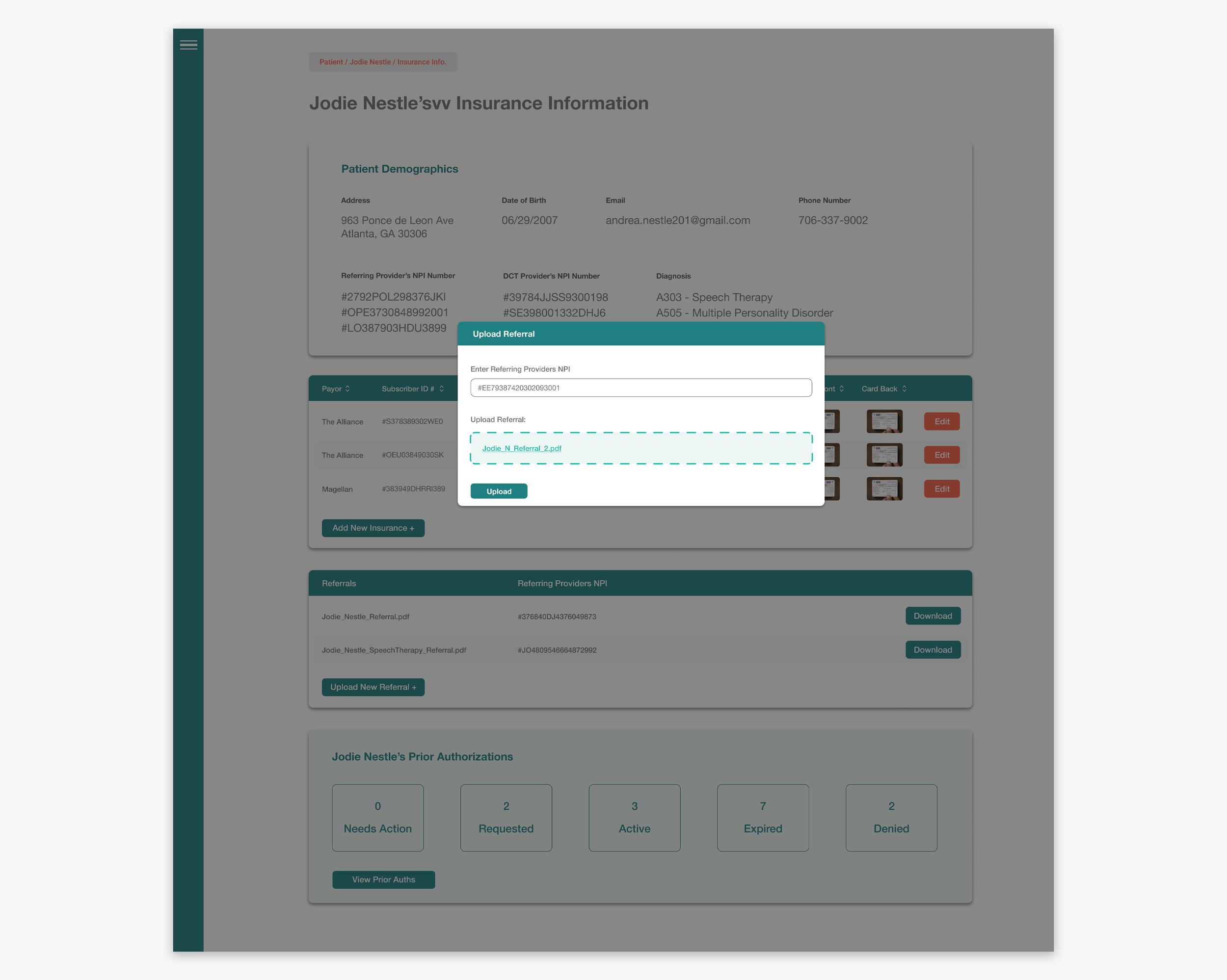
When it came to building patient prior auth pages, for therapists, we had a simple approach. Create a visually legible page that showed the user the lifespan of a patient’s prior auth, displayed the important information first, allowed the user to easily get extra info if needed, and also allowed the user to add new prior auths. We took inspiration from how credit score and insurance websites display statistics and metrics.
The table for insurance admins was a little different. We wanted to create a clean table that allowed them to address prior auths as they came into DCT’s network. Having all of the information present, readable, with the ability to Copy + Paste was crucial. We set out to build something that made the mountain of data they handle, look manageable.
We set out to create an interface that was centered around swift, error-free, interaction which helped the user feel empowered to take on large sums of data at once.
Our Process
Step 2: Ideate + Sketch
After gathering research and identifying the problem we started to ideate, throw paint at the walls, and got into sketching.
Step 1: Identify the Issue
We first learned the intricacies and legal barriers around prior auths. We then talked to therapists and insurance admins to figure out what their dream scenario is when dealing with prior auths. What would make their work flow easiest.
Step 3: Communicate
We brought these ideas and wireframes to the small test group we worked with previously and asked for input, feedback, and their unfiltered thoughts.
Step 4: Wireframe
We then distilled that feedback into actionable items and created low + high fidelity wireframes that centered around ease-of-use, and scalability.
Step 5: Iterate
We returned to that initial user group and our development team to walkthrough our proposed solutions, made sure we were on the right track. We fixed issues as they came up, and always made sure the user felt comfortable in the driver’s seat.
Step 6: Deploy + Test
We then started deploying the feature. And once it was live we ran tests to ensure users were happy and could use the feature. Once it was live we also conducted surveys and identified new edge cases that didn’t come up in the initial build. These issues were subsequently dealt with.
Our Users


Trial & Error
I love to fail often and quickly. Especially if I’m failing forward.
With this project the most difficult step was in the beginning during discovery. Understanding the intricacies of prior authorizations, how delicate insurance timelines are, and how to design around the huge amount of human error in the field was tough.
But I was able to get through it by making mistakes. I had far more ideas on this project get rejected than I’m used to, but it was all in the mission of gaining the right information, and fully understanding the problem before solving it.

Whittling Things Down
This entire project was centered around the distillation of information. We had to learn a whole new field in a very short time. Then take all of that information and build something that our users could adopt to help them accomplish their goals.
However since this project didn’t require intricate userflows, and the main objective was just to display a complicated subject in an un-complicated way, I focused most of my time talking to our users, absorbing all I could so that in the end we delivered a product that was simple to use, and didn’t contain fluff.
Low Fidelity Wireframes

The Lifespan of a Prior Auth
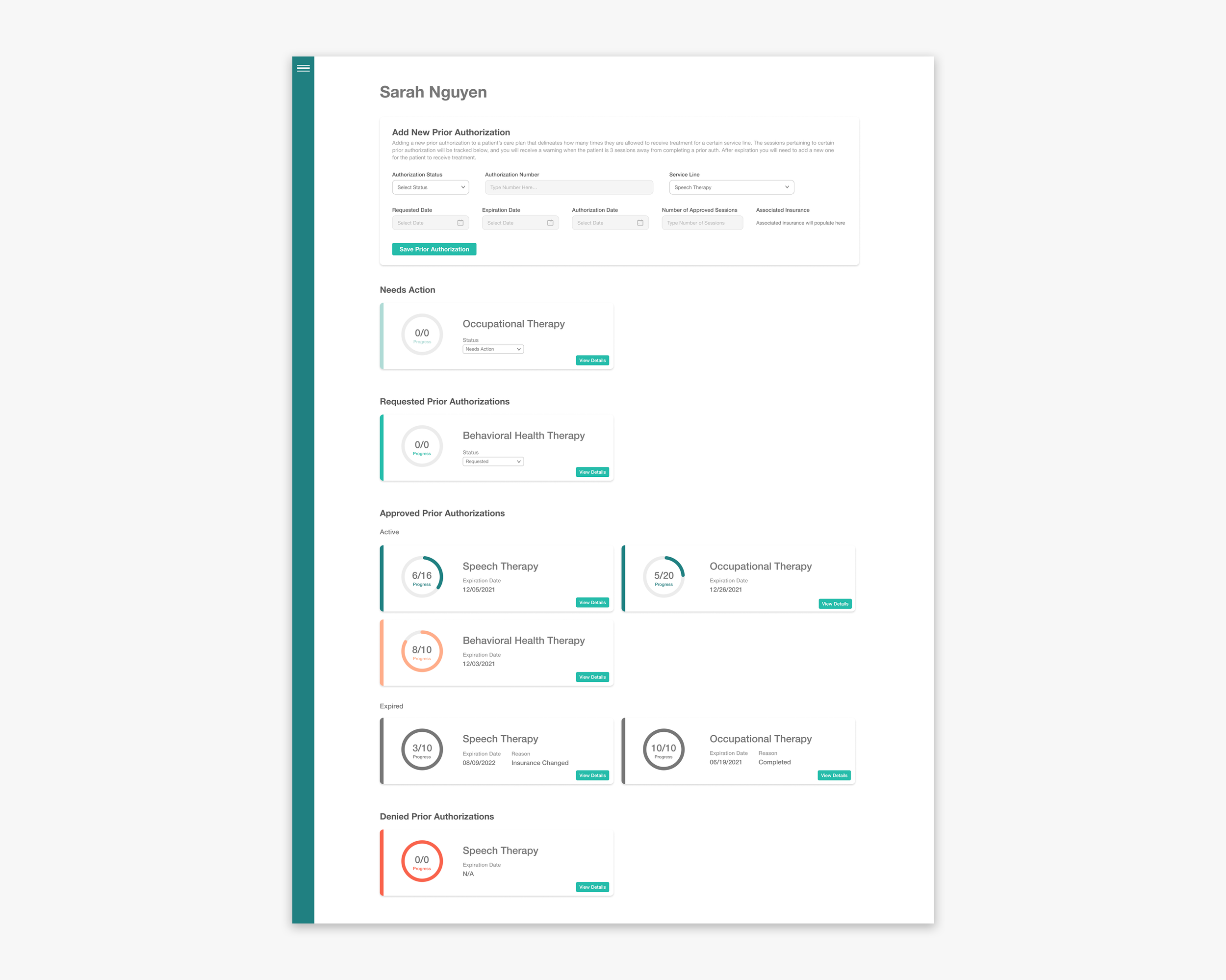
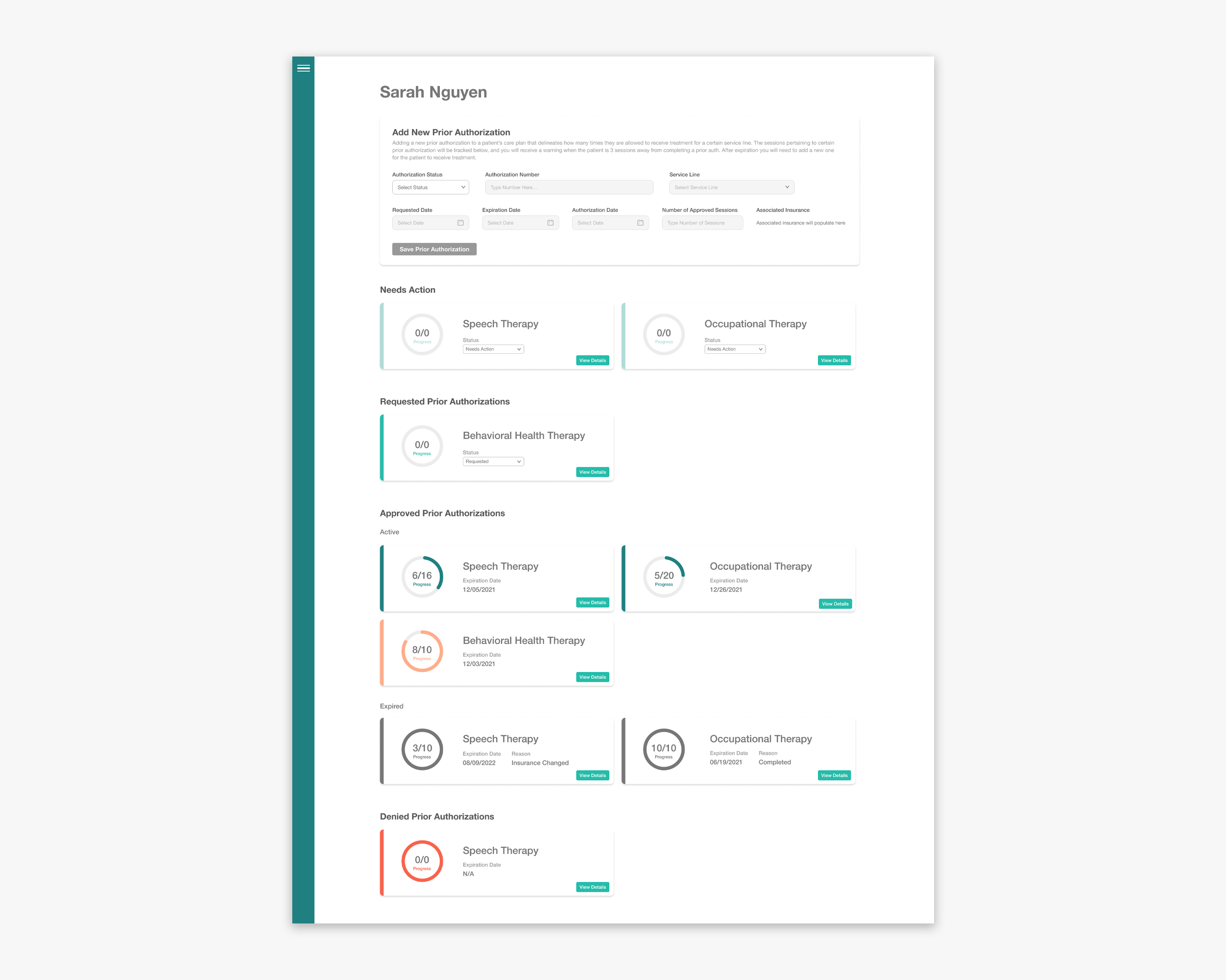
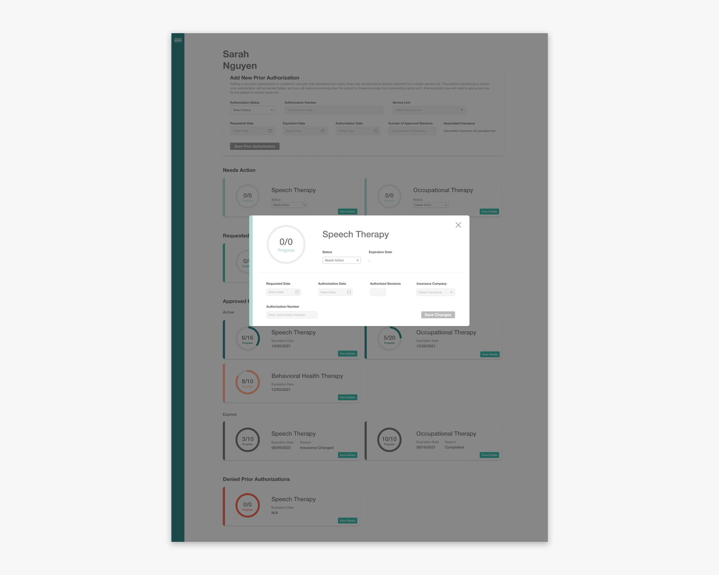
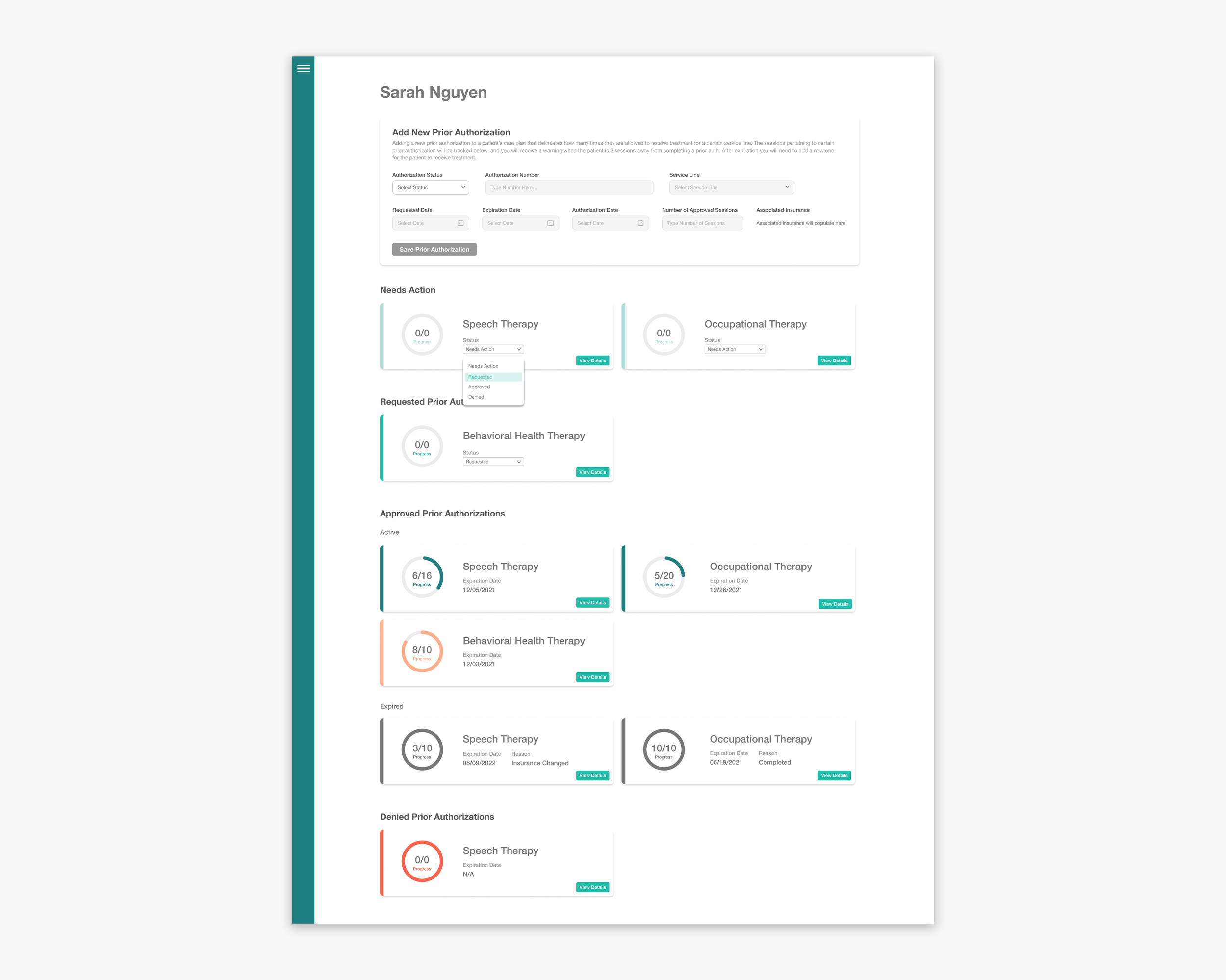

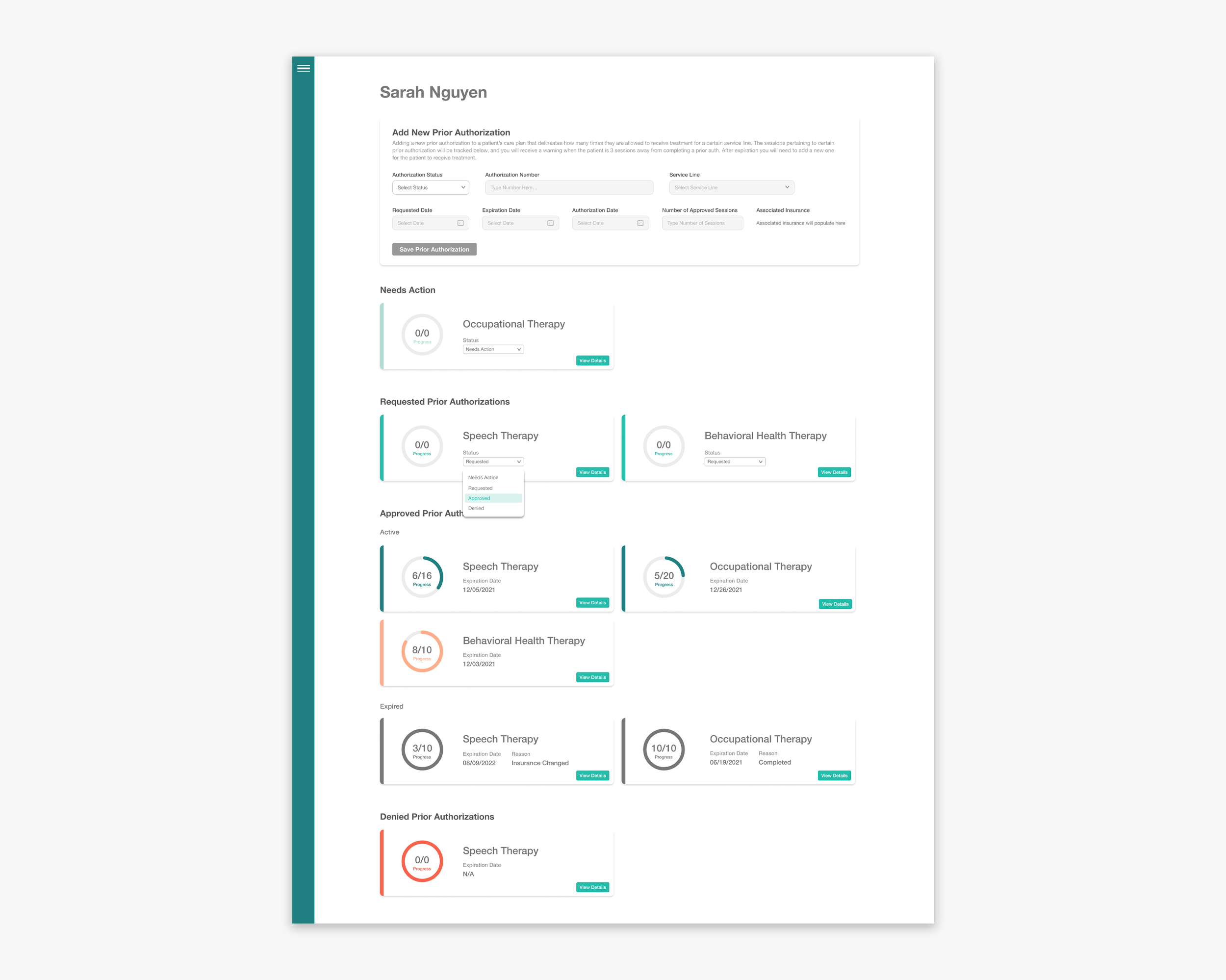
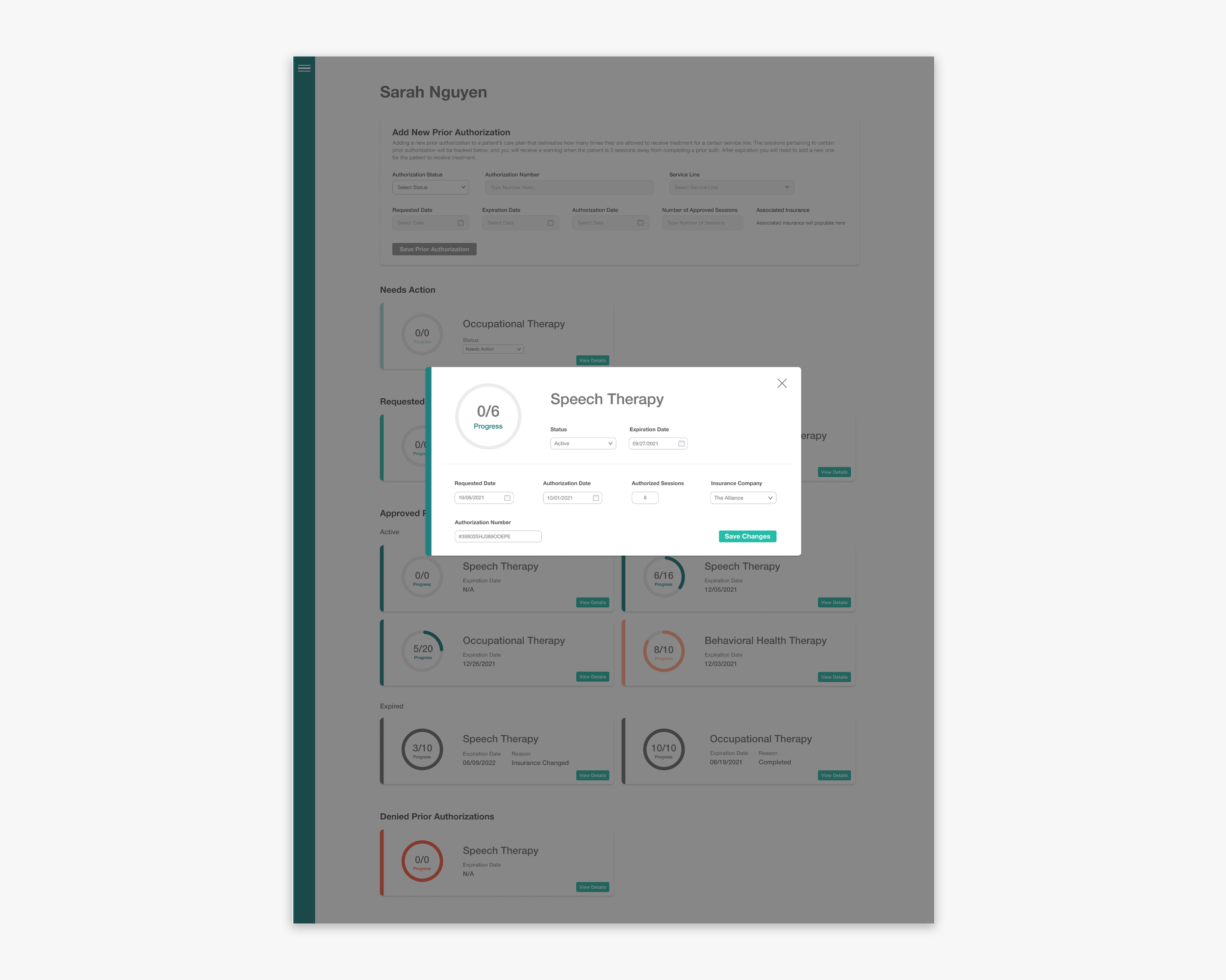
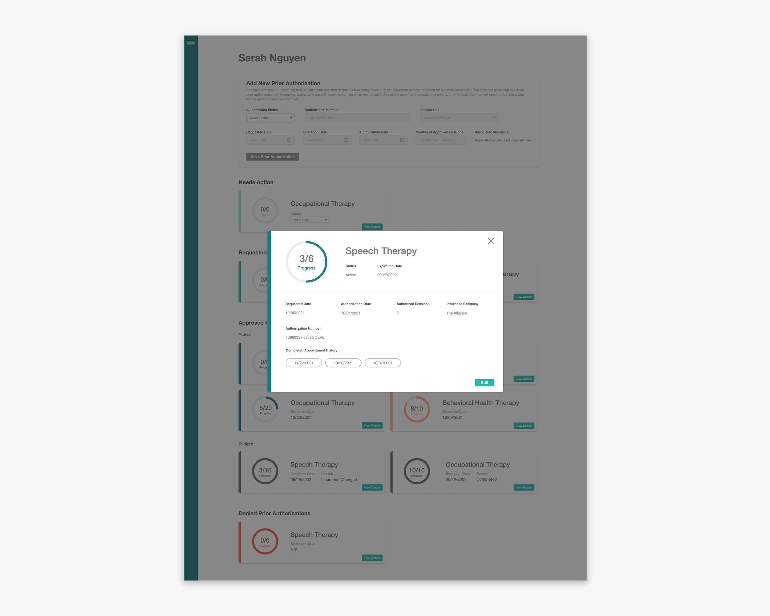
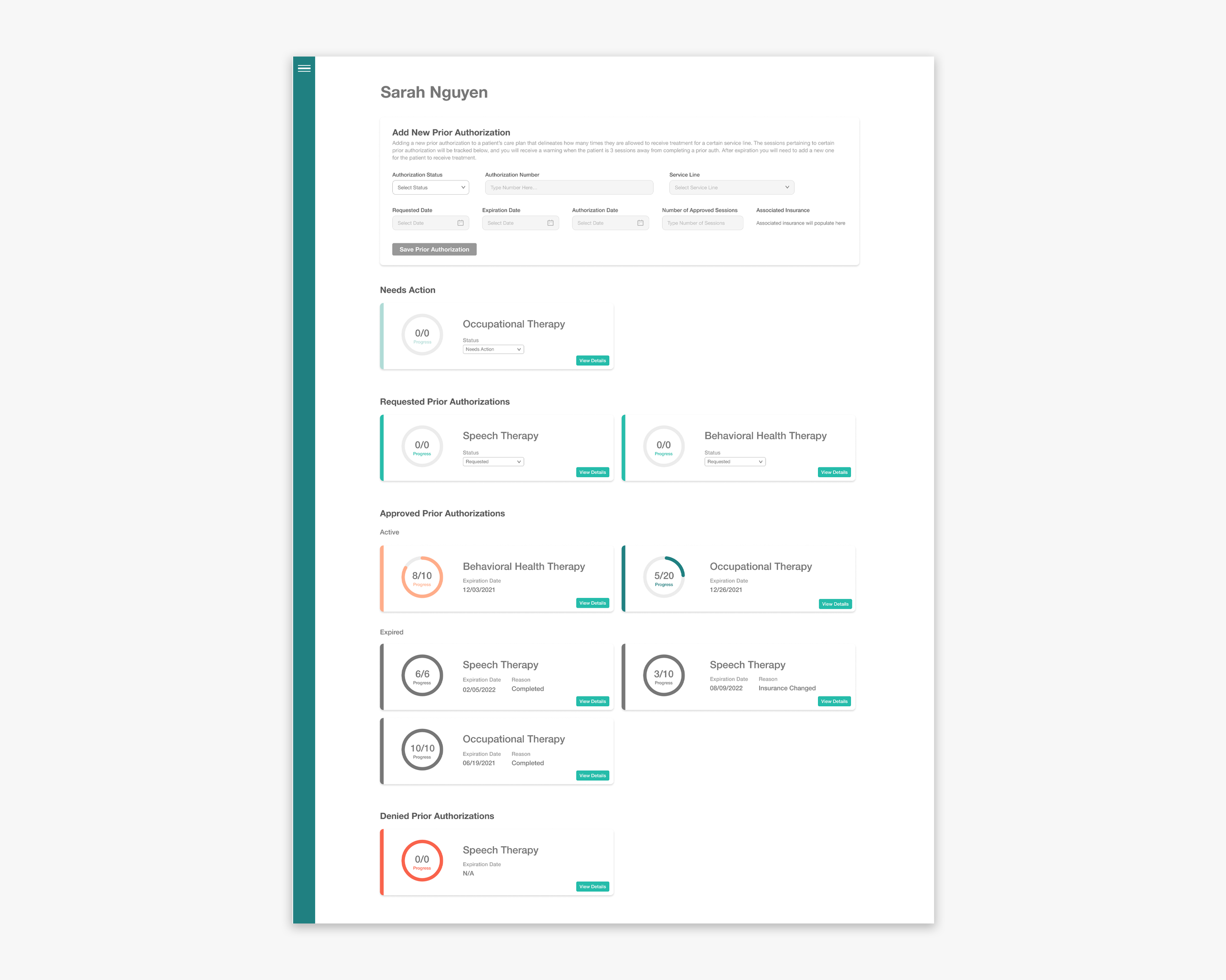
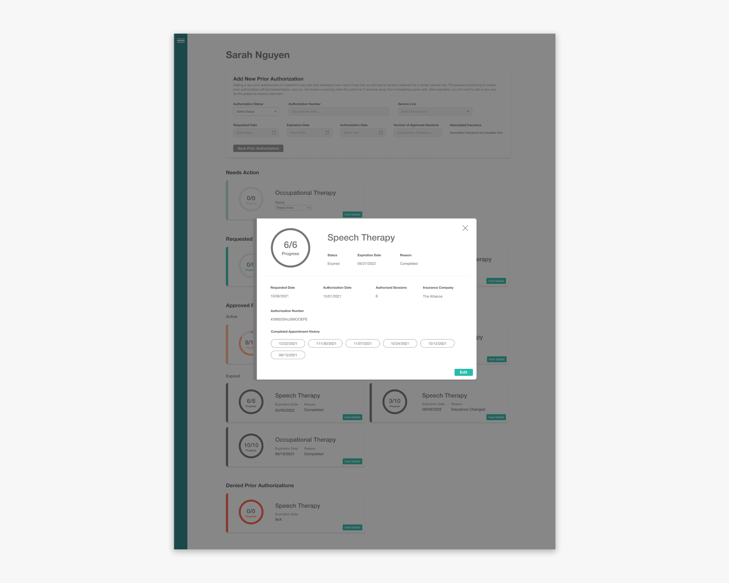
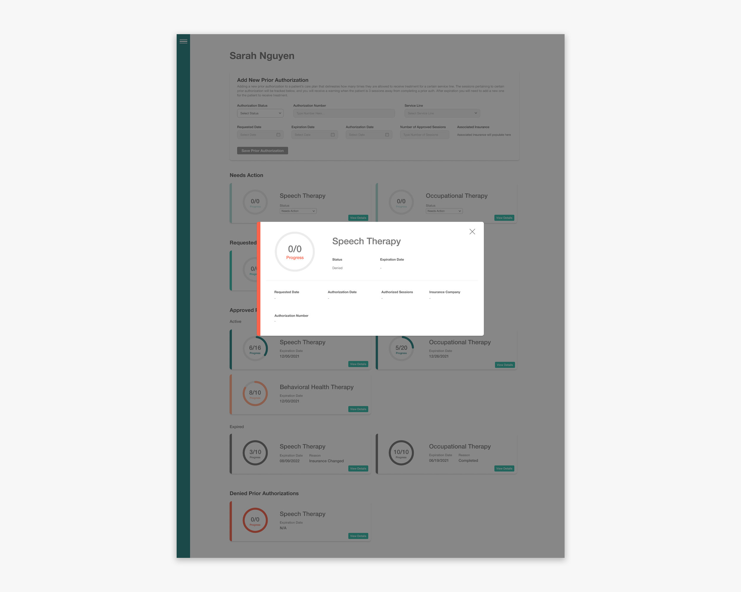
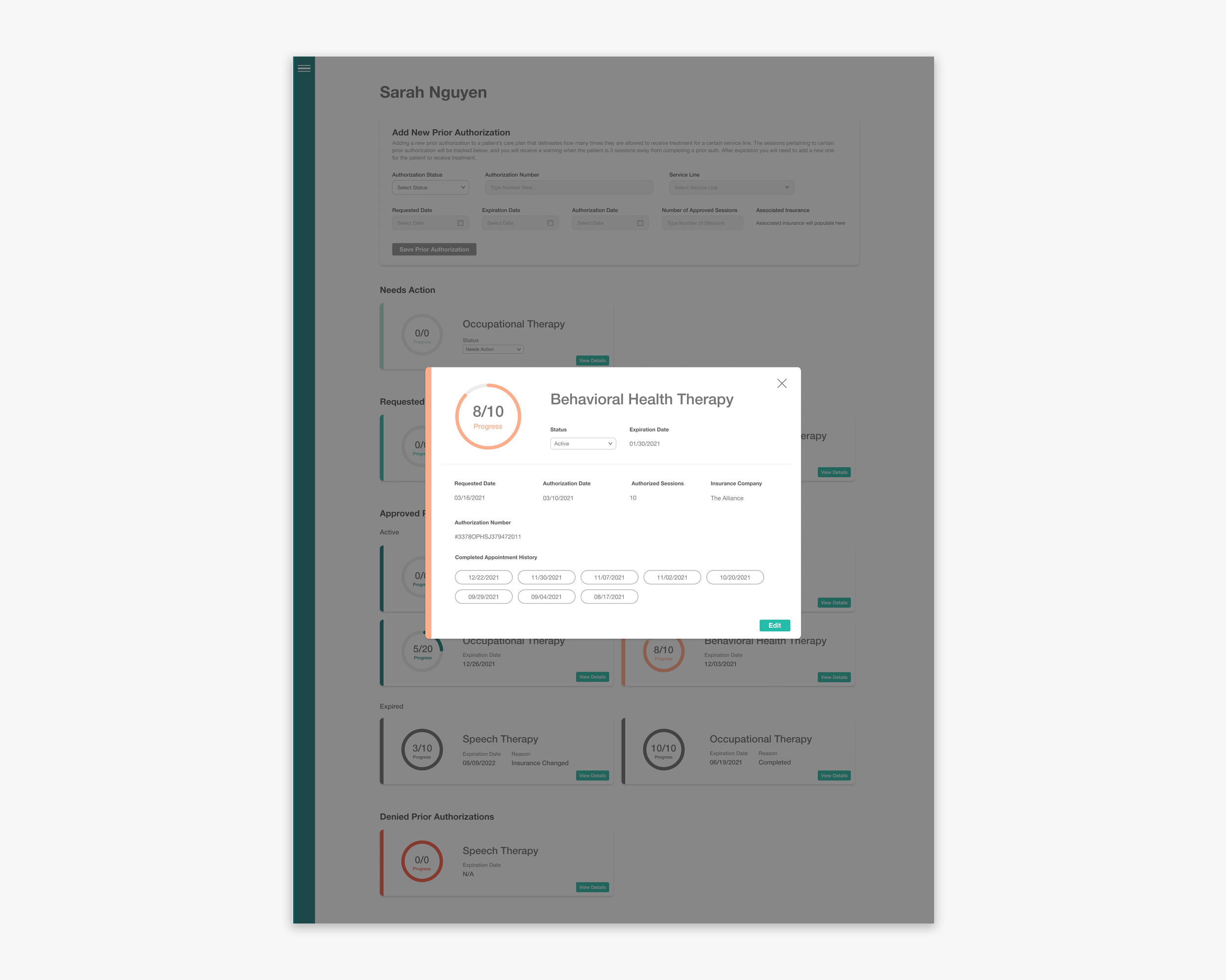
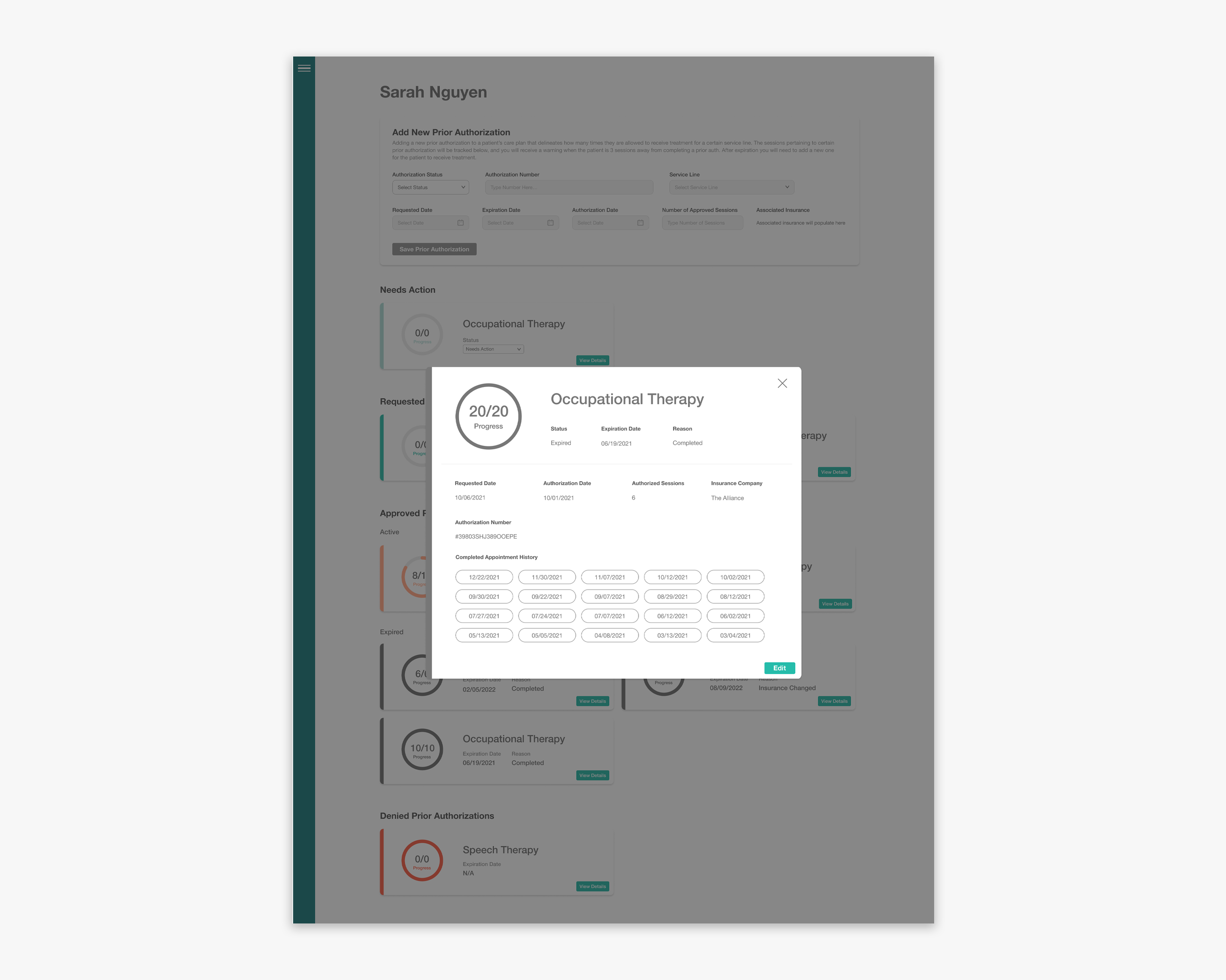
*Because of HIPAA Compliance I am allowed to show actual screen-grabs of Prior Auth Pages
Insurance Admin Queue for Incoming Prior Auths