The Goal
Mental and behavioral health therapy seems almost too intangible to quantify, track, and prove progress in. However several standardized tests can be used to measure a patient’s development over time. These tests are academically accepted. They use a series of feeling-based questions to gauge a patient’s relationship with their anxiety / depression. The results of this test are then quantified and can be tracked, to show a person’s overall mental health trajectory as they receive therapy.
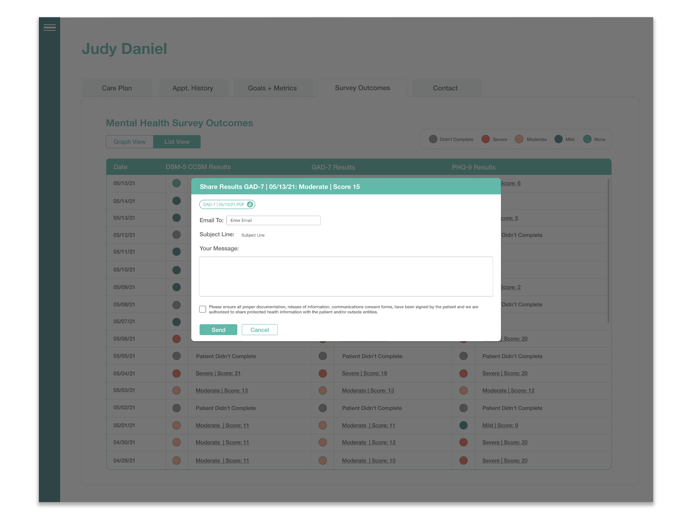
DotCom Therapy wanted to start administering these tests in a non-invasive, and easy way, that ultimately created a habit on the patient’s side. The test needed to be easy to access, easy to answer, and quick to move through. In addition the results of these tests needed to be easy to read, downloadable, and viewing progress in the results was essential.
Mental health outcome tracking would help patients see their progress when it came to their therapy, and would allow them to check in with their mental health. It also helps therapists see their patient’s growth, and to tailor their sessions according to that growth. And ultimately, it would also help DCT show new clients, and their board, that therapy was helping their customer base.
We were tasked with getting already busy and skeptical patients to routinely take an assessment about their mental health, and display those results in a pleasing and informative way.
Proposed Solution
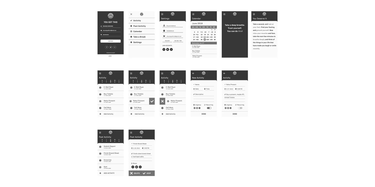
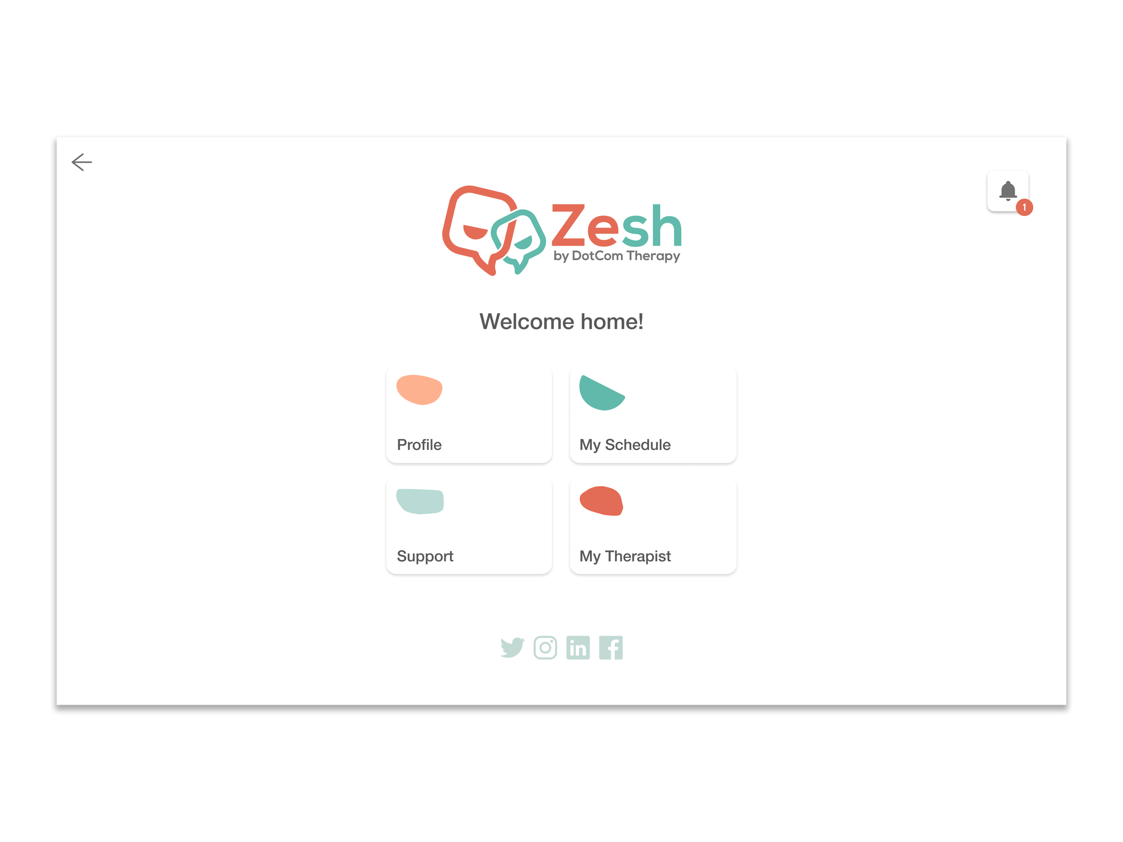
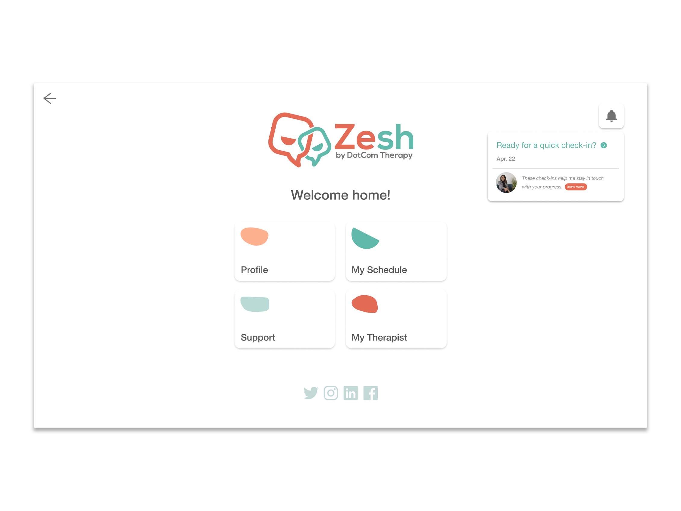
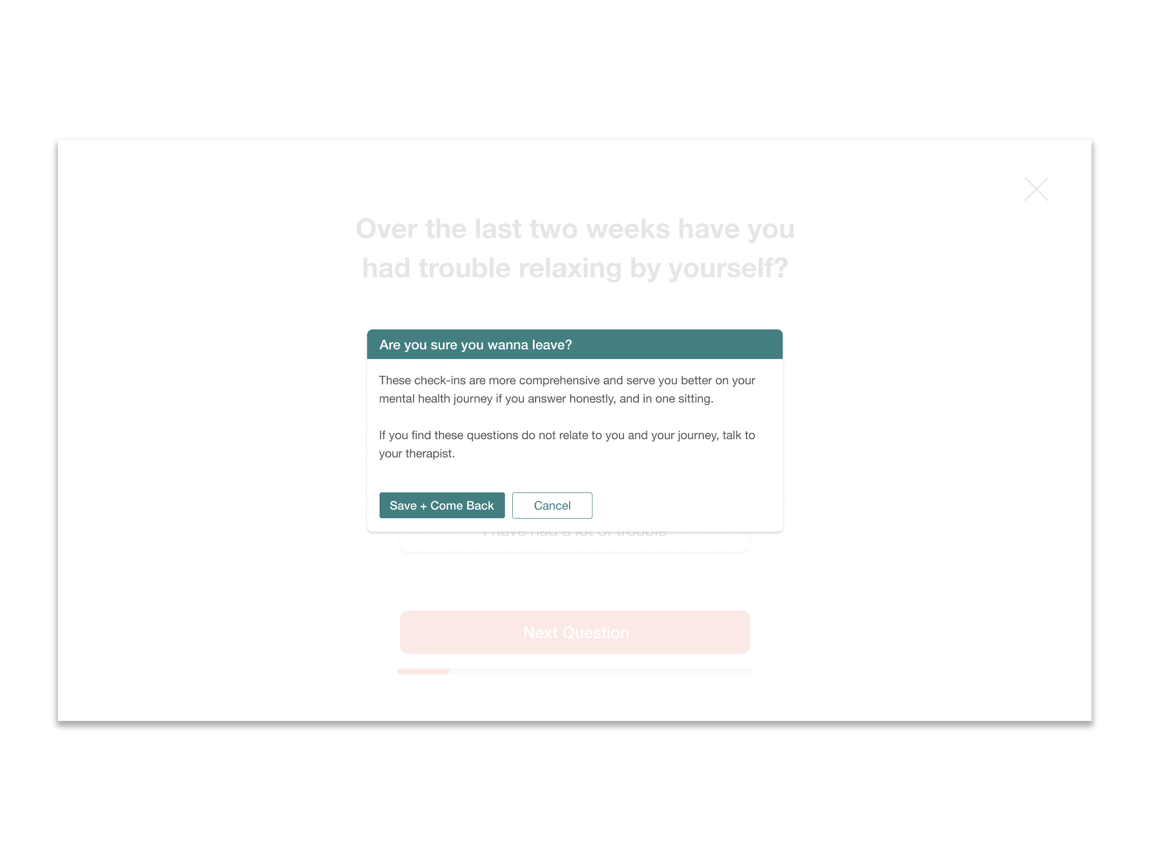
The first place we started was with our primary user group: the patient. Taking what is an academic, rigid, test and making it an easy pill to swallow was the biggest task. In order to do that we proposed creating a new notification for the patient that said an assessment was ready for them. We kept all the language inviting and friendly, called the survey’s ‘Check-Ins’ to reduce formality, and made the notification feel like a message was coming from their therapist, to build credibility.
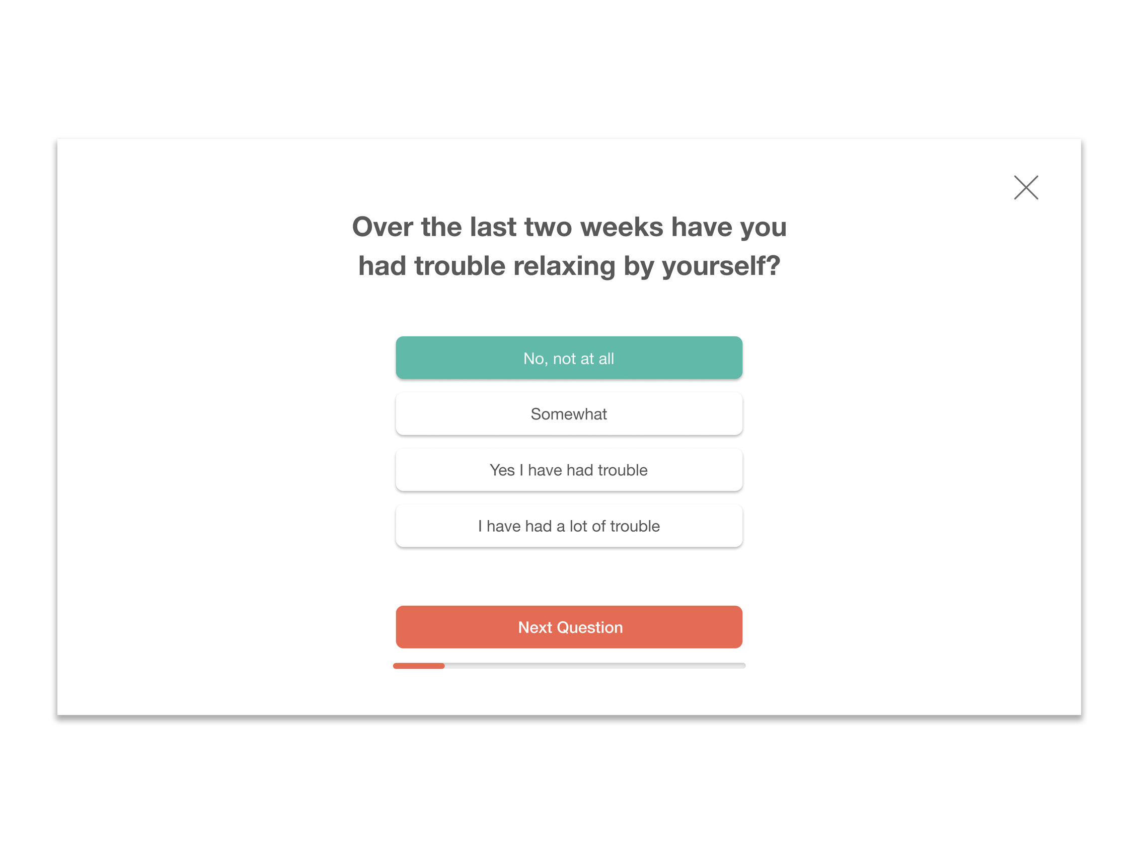
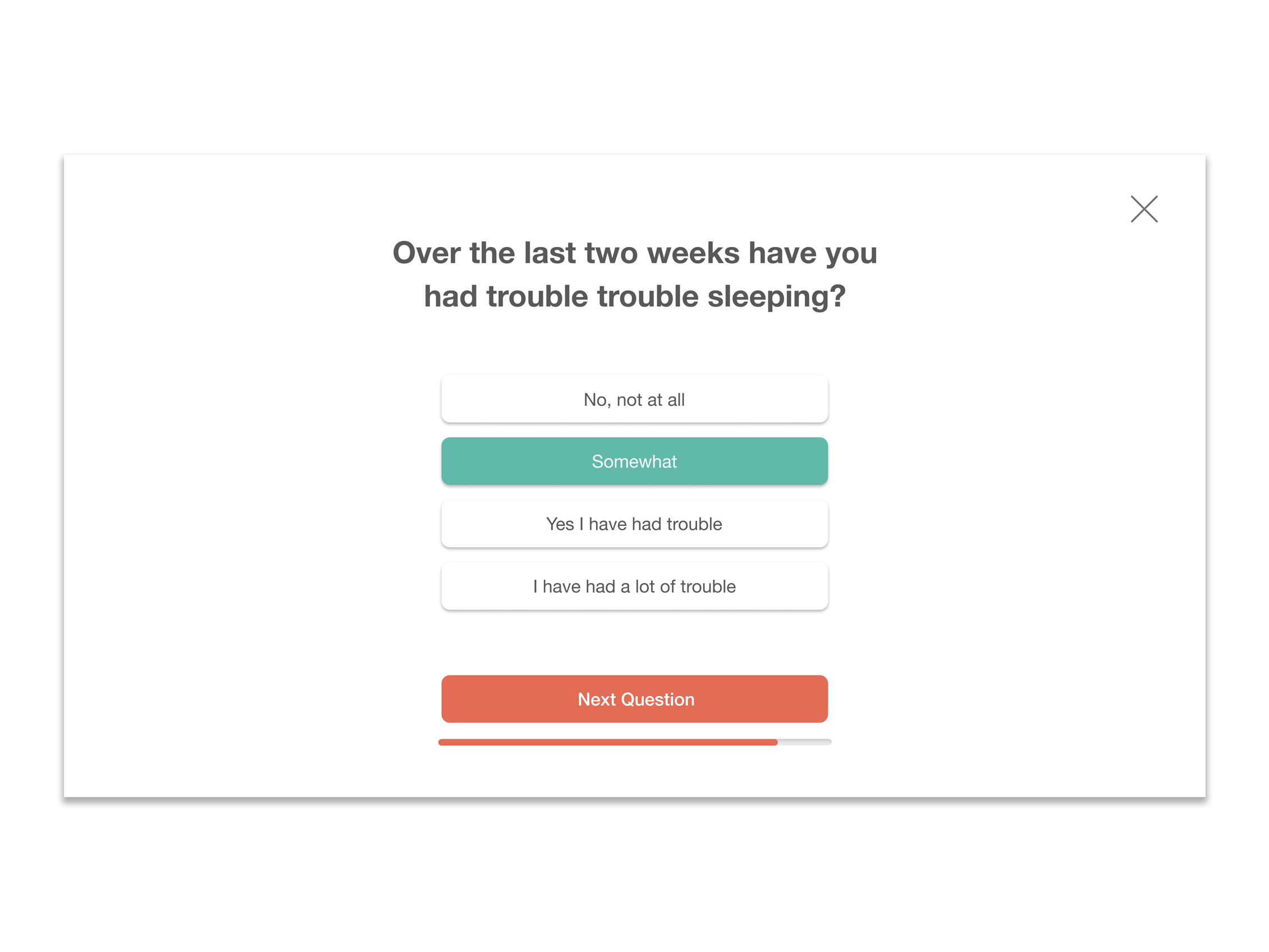
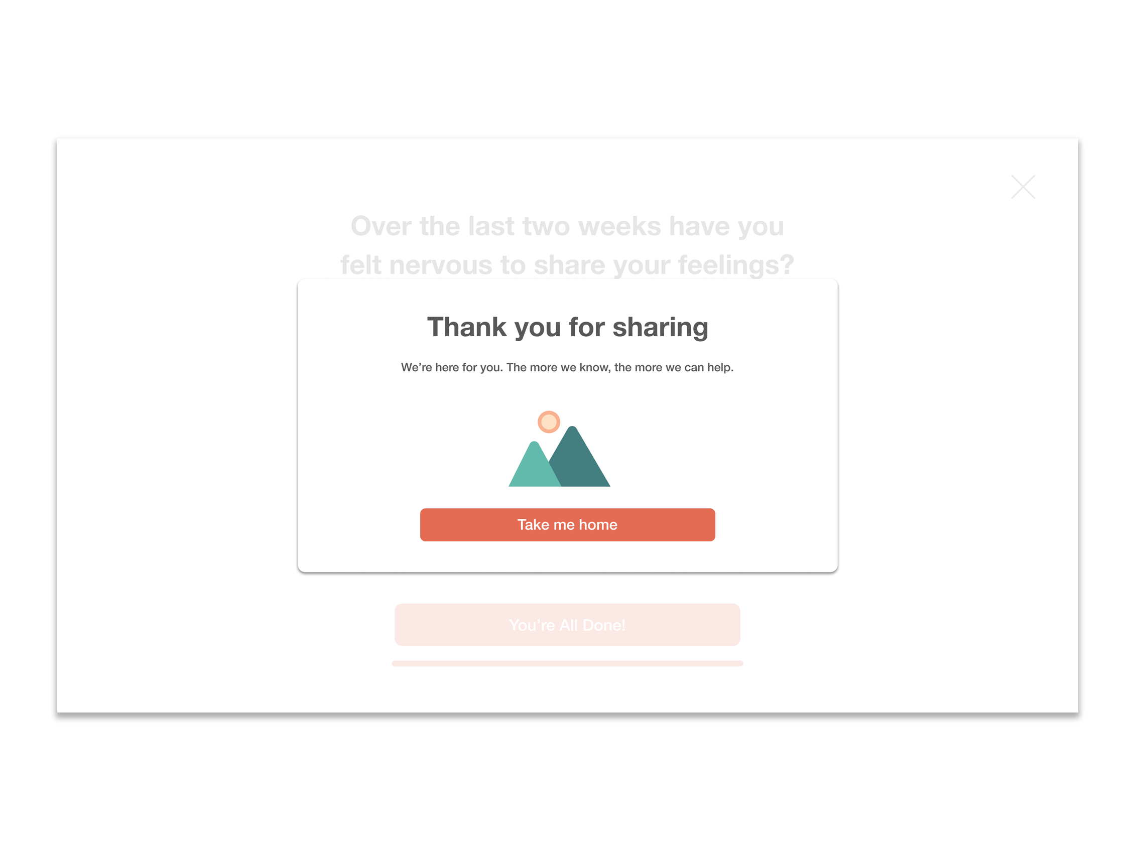
While taking the test we made buttons big and easy to interact with, and showed them a progress bar which created transparency with the user. We peppered in encouraging copy that pushed them across the finish line, and at the end, a pop-up thanked them for their participation, assured them of the test’s privacy, and explained why we were administering it.
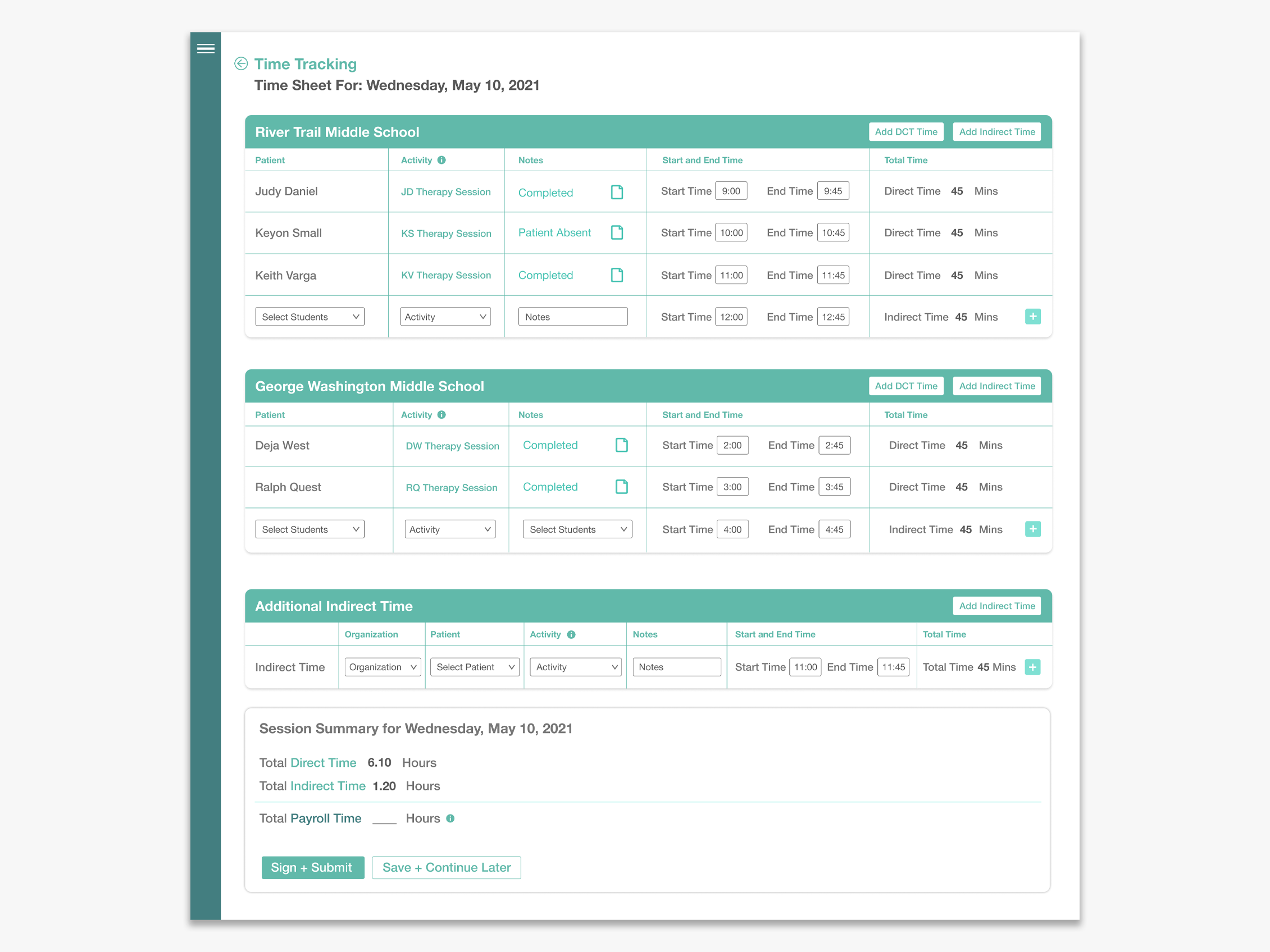
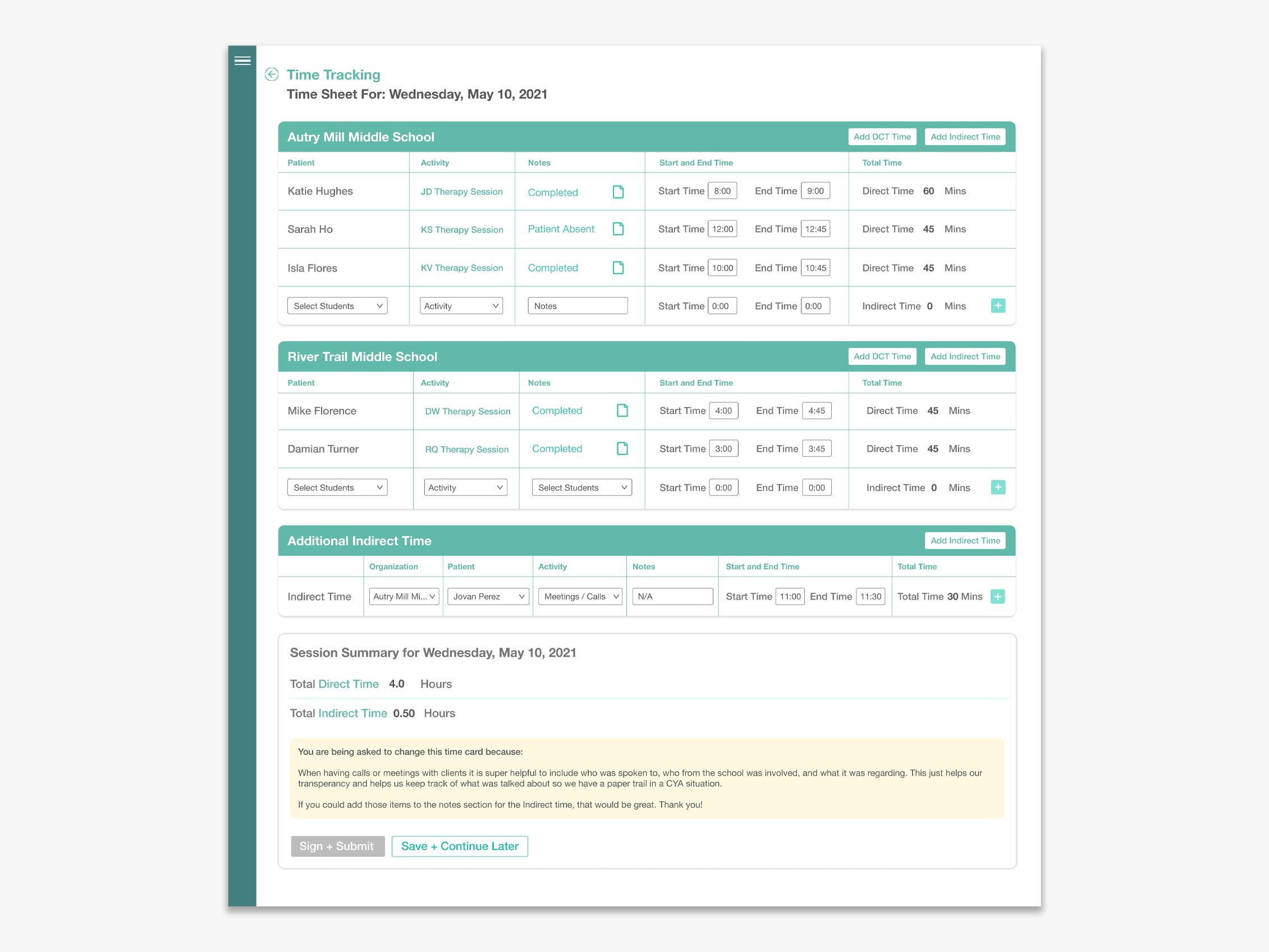
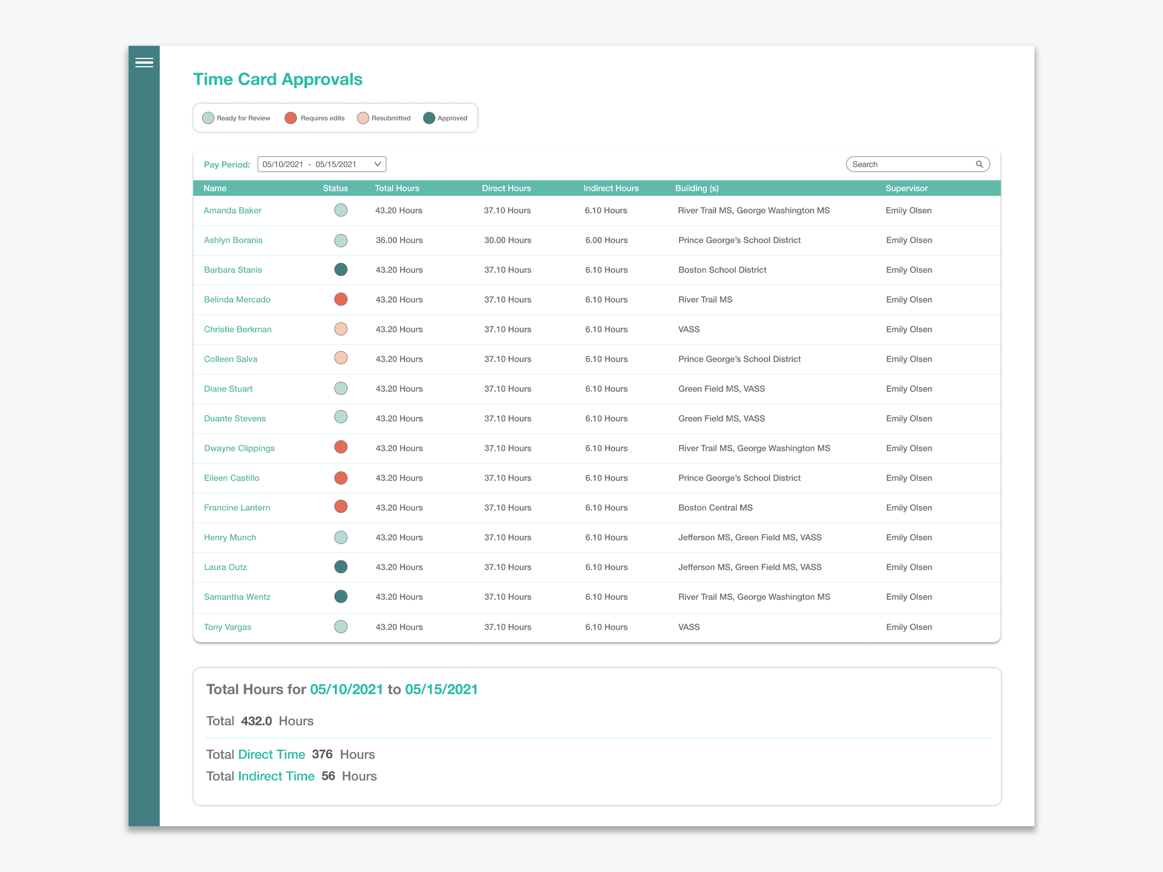
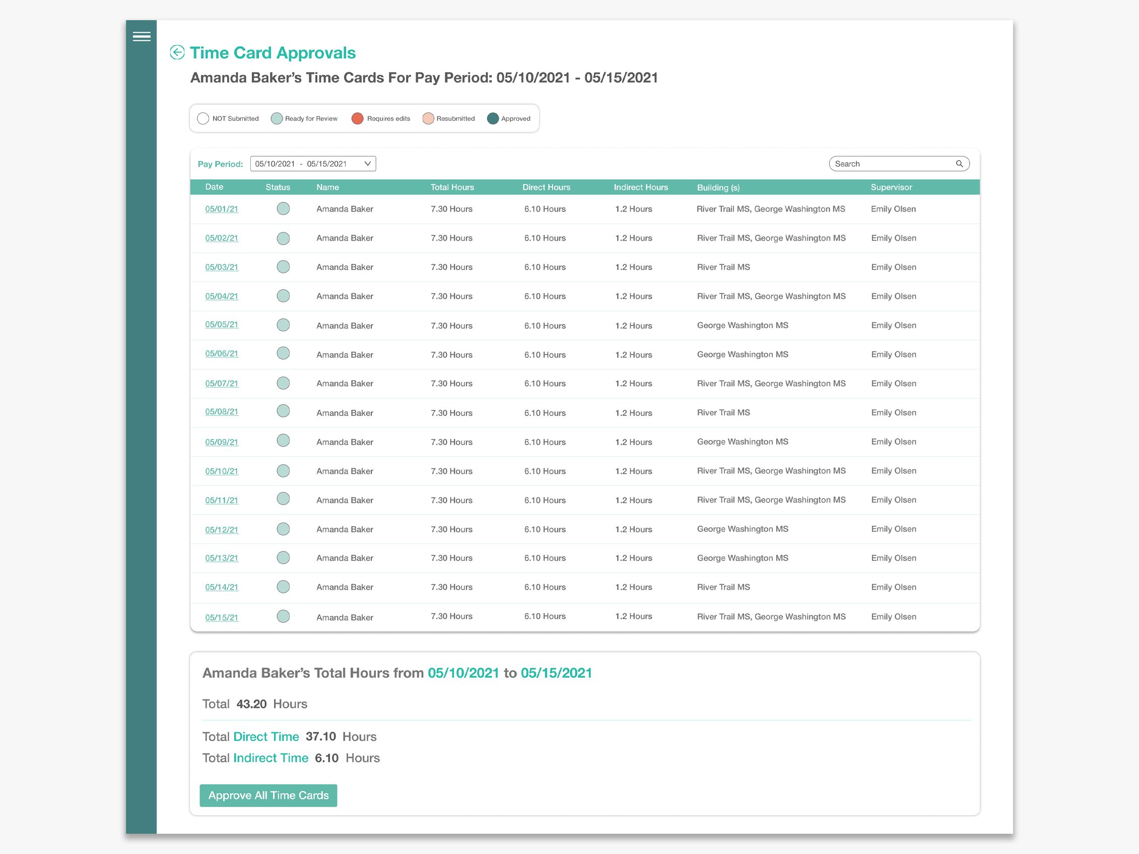
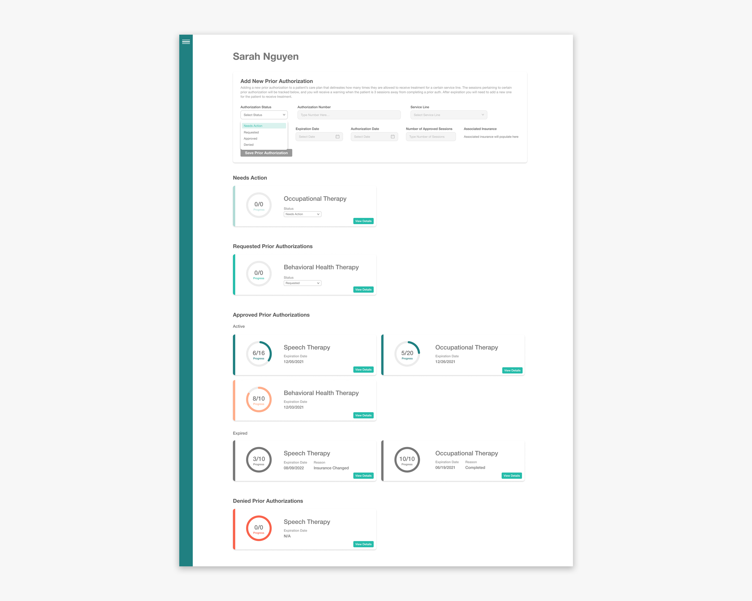
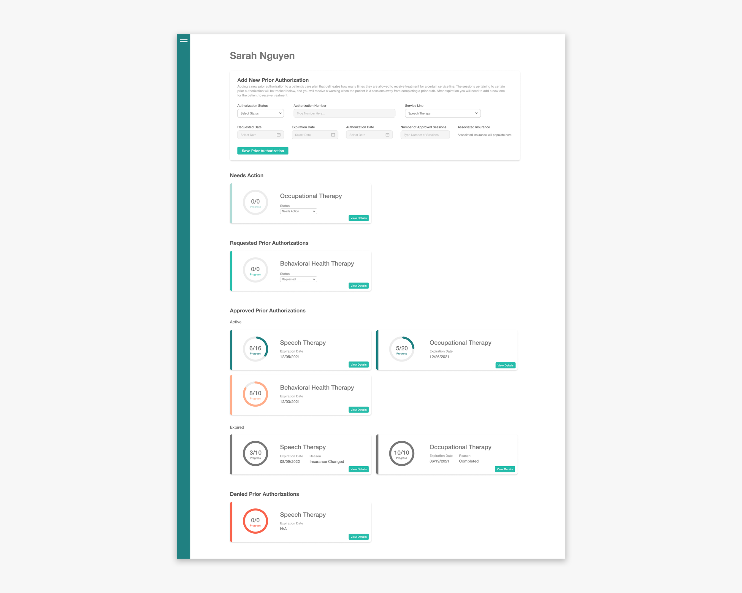
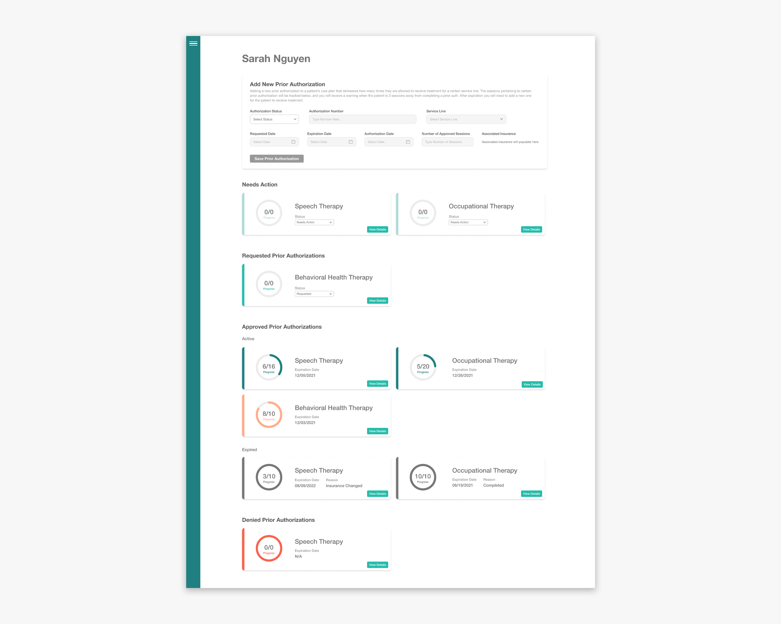
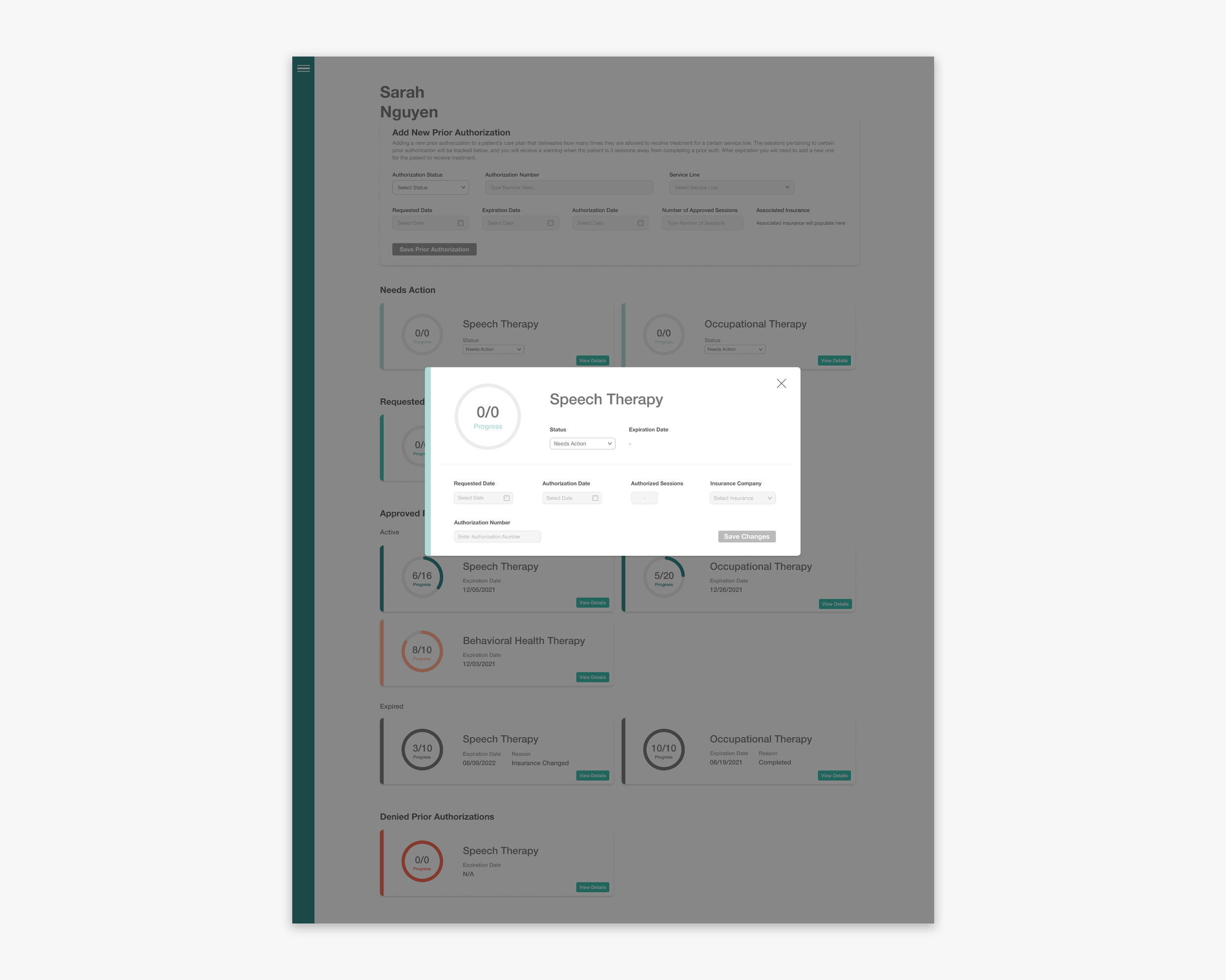
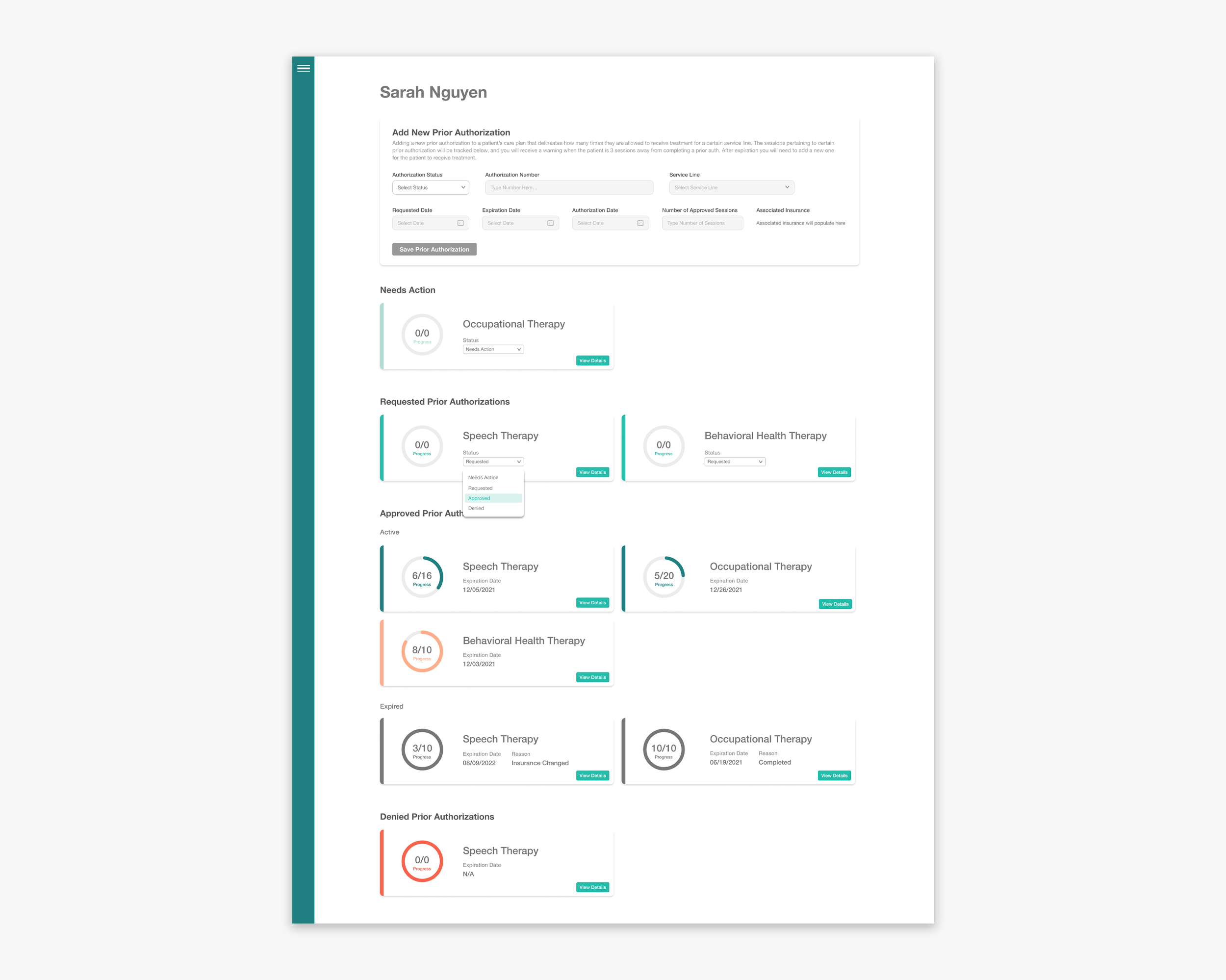
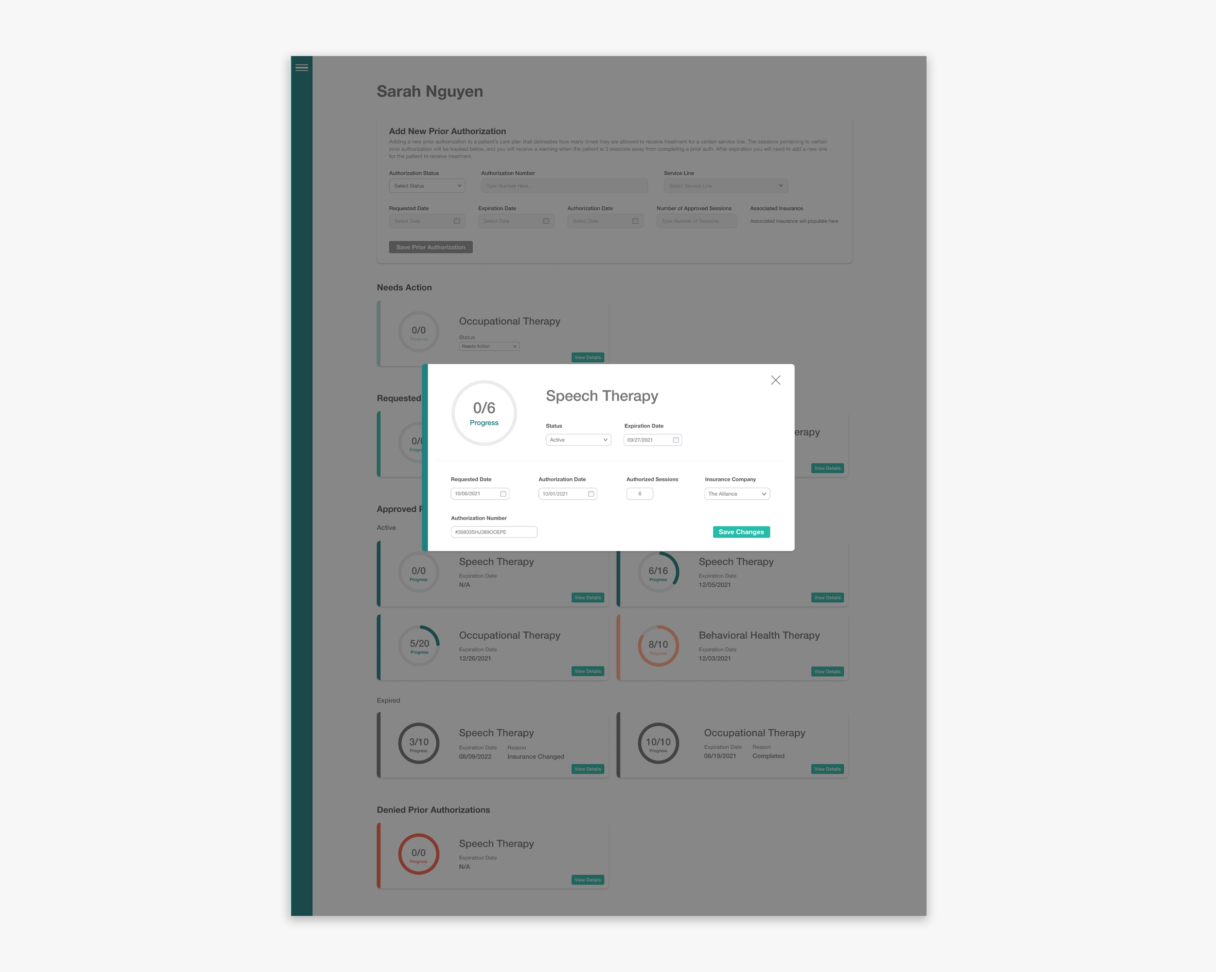
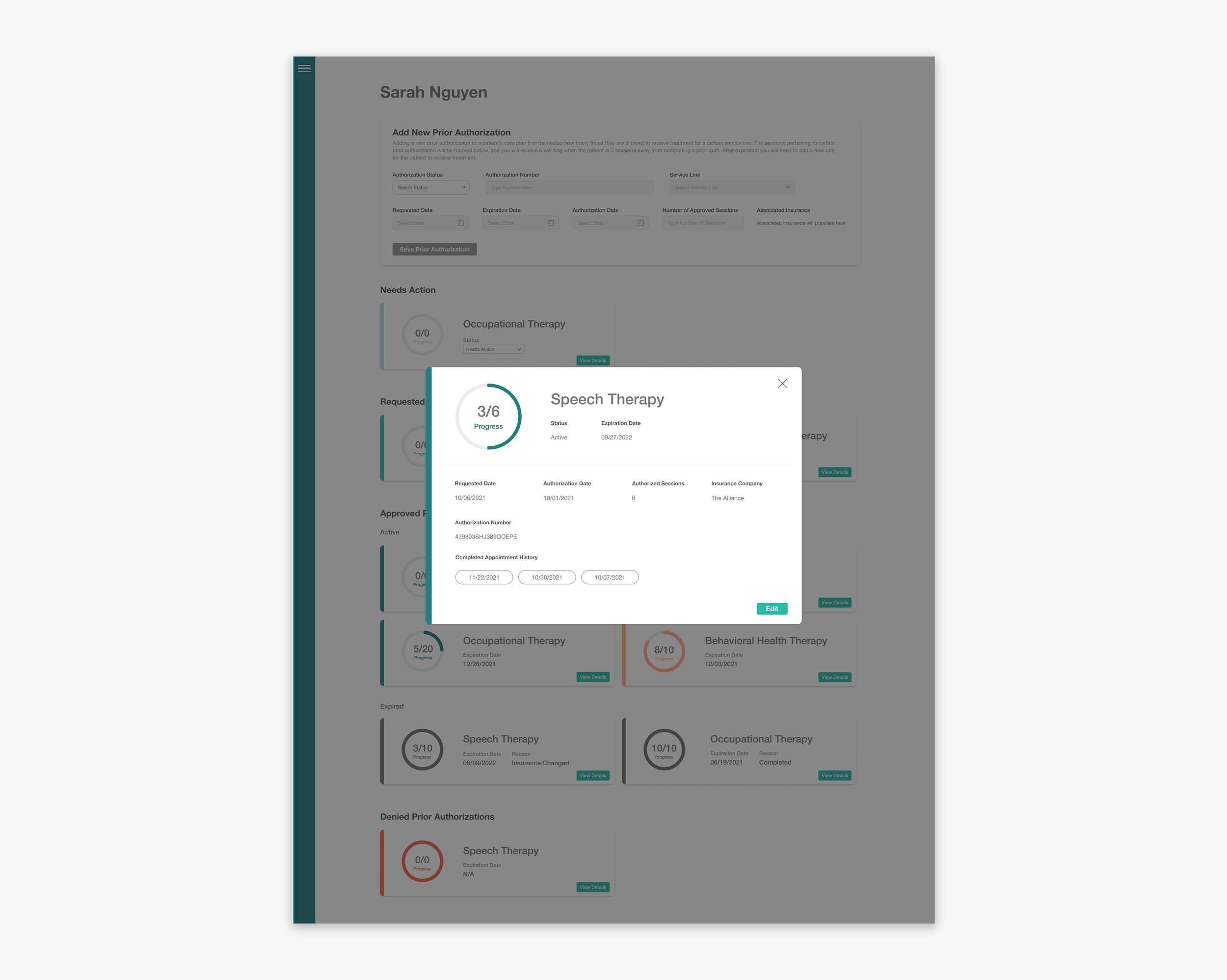
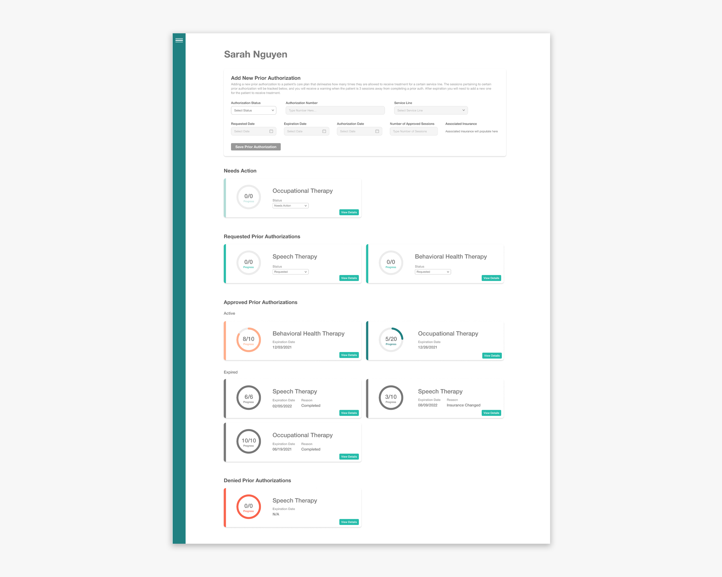
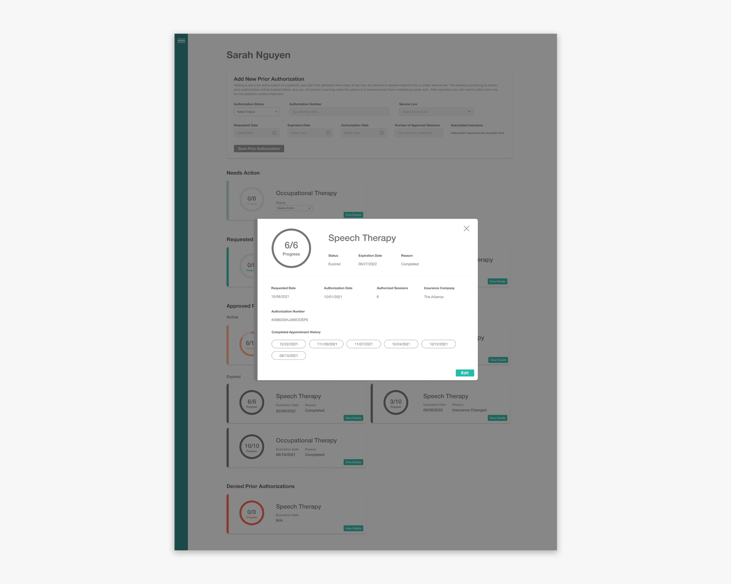
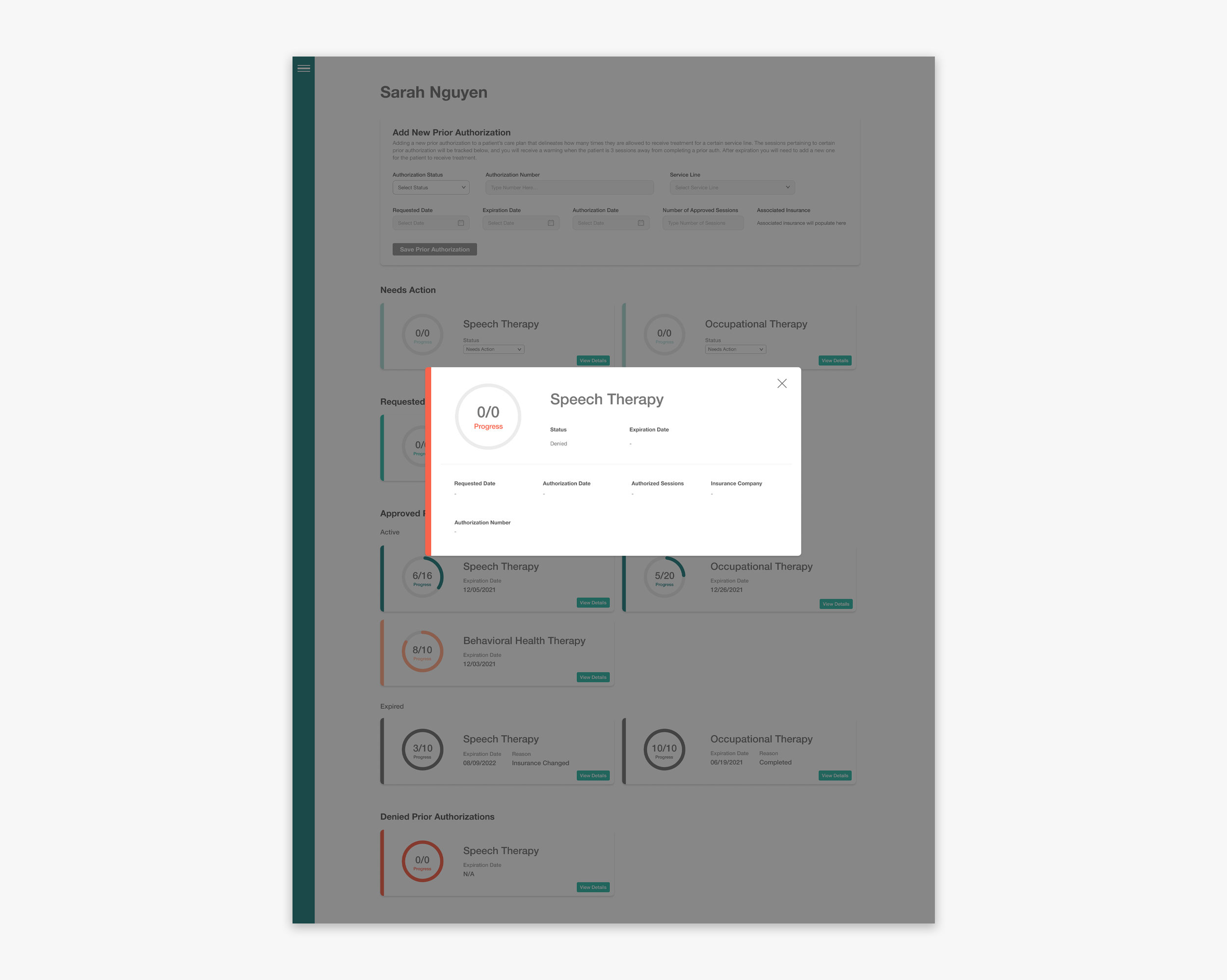
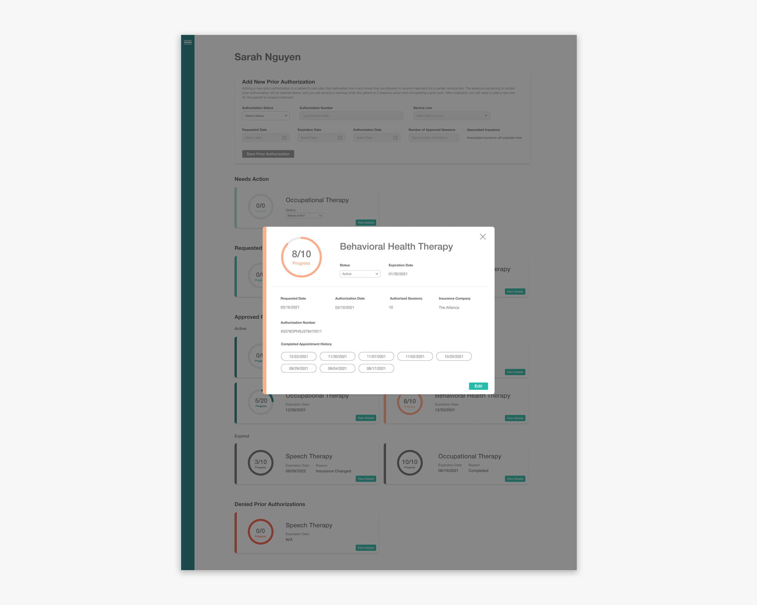
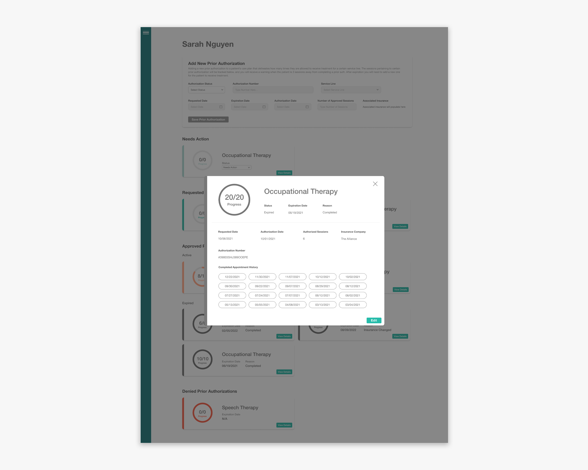
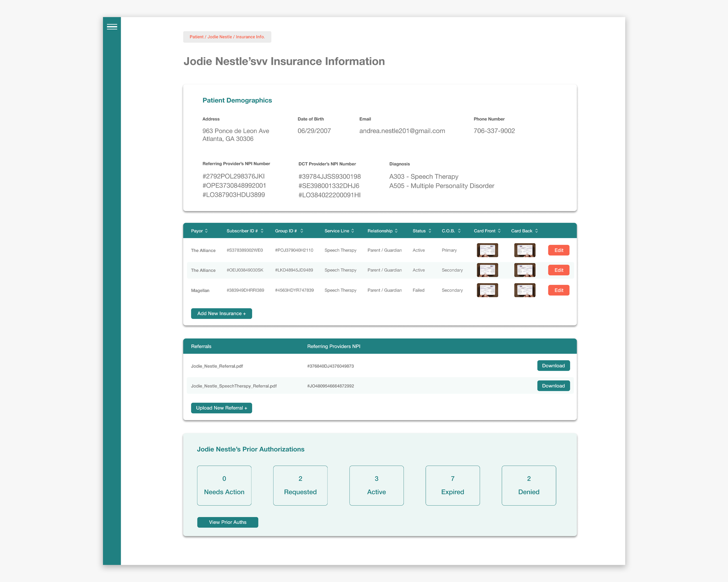
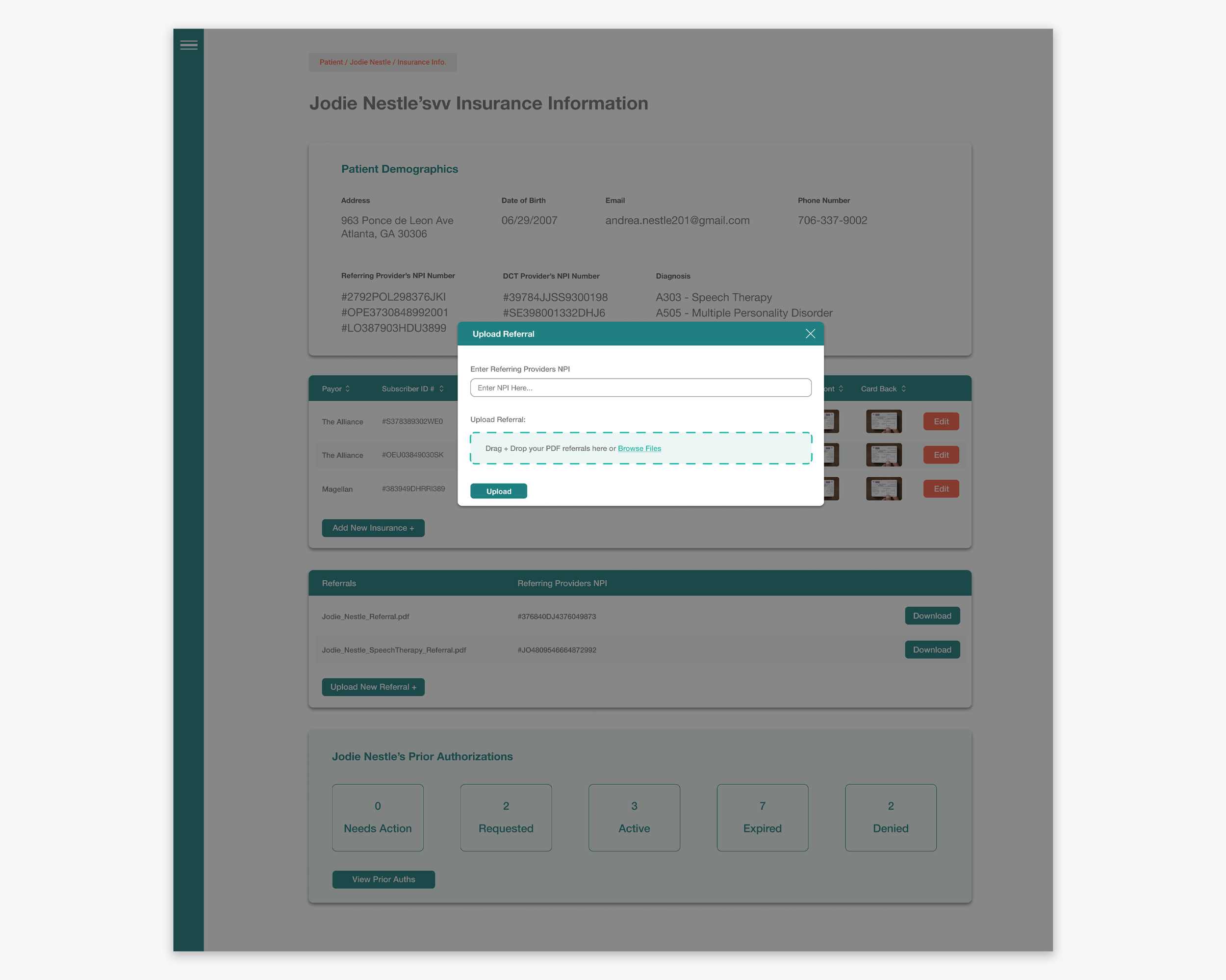
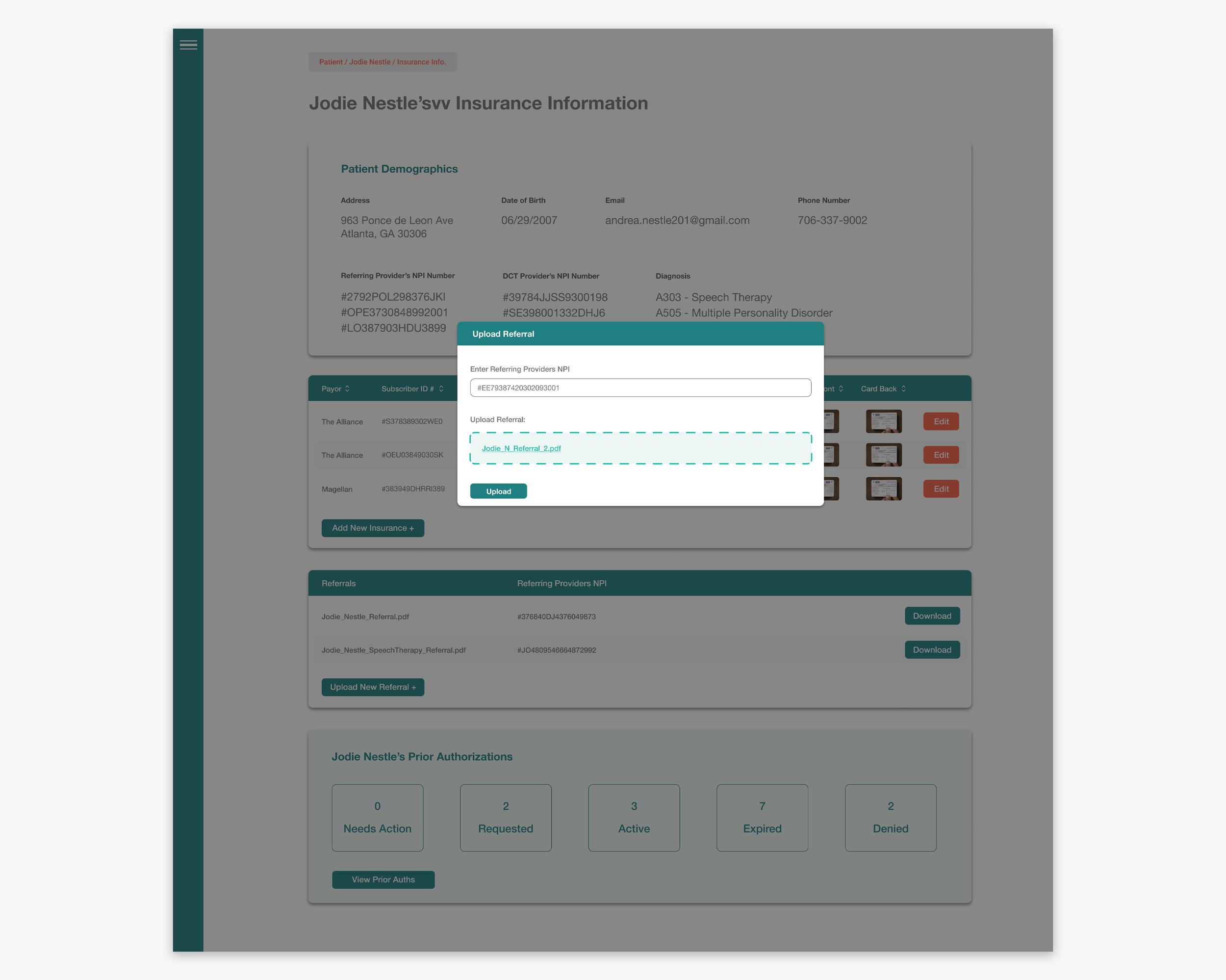
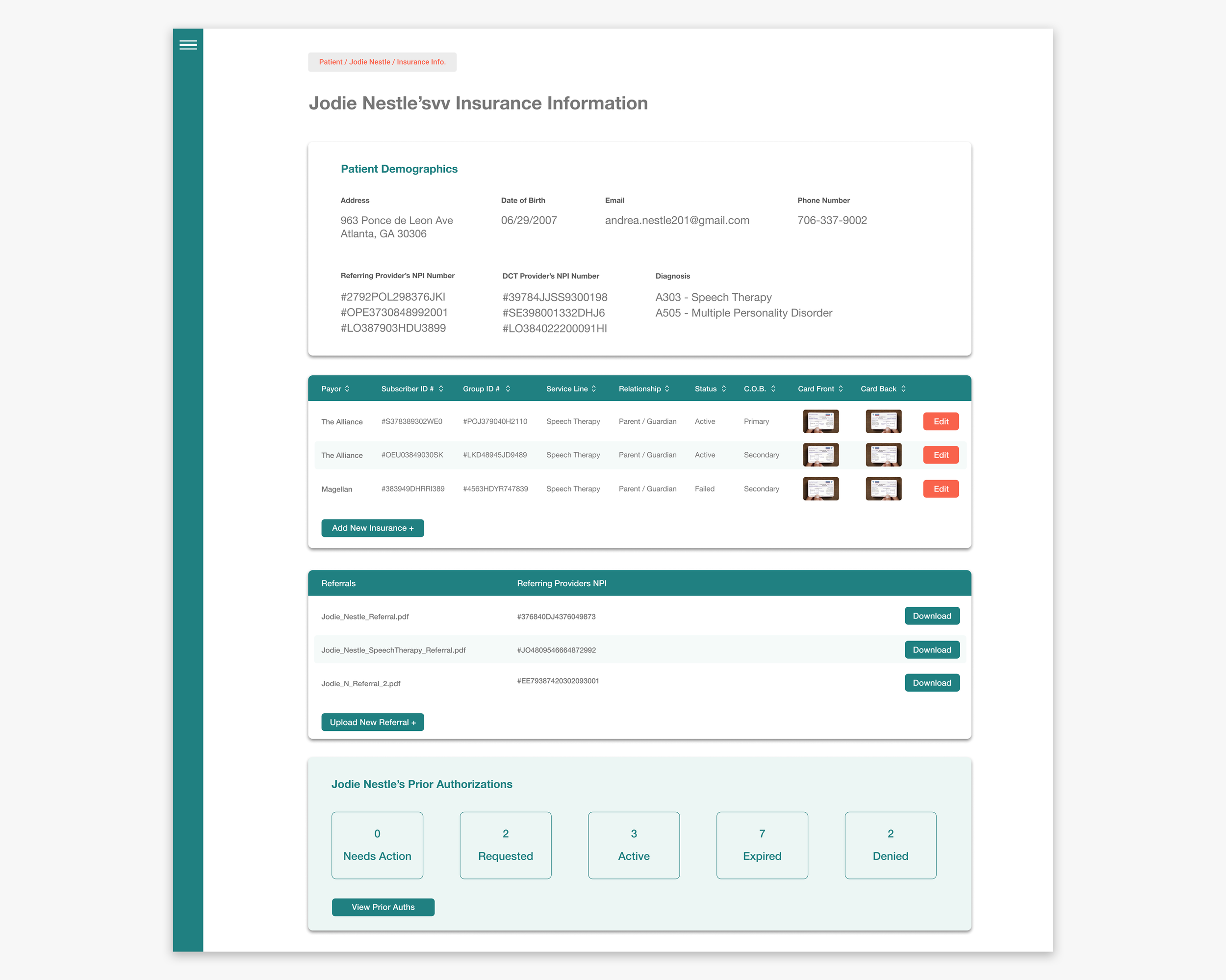
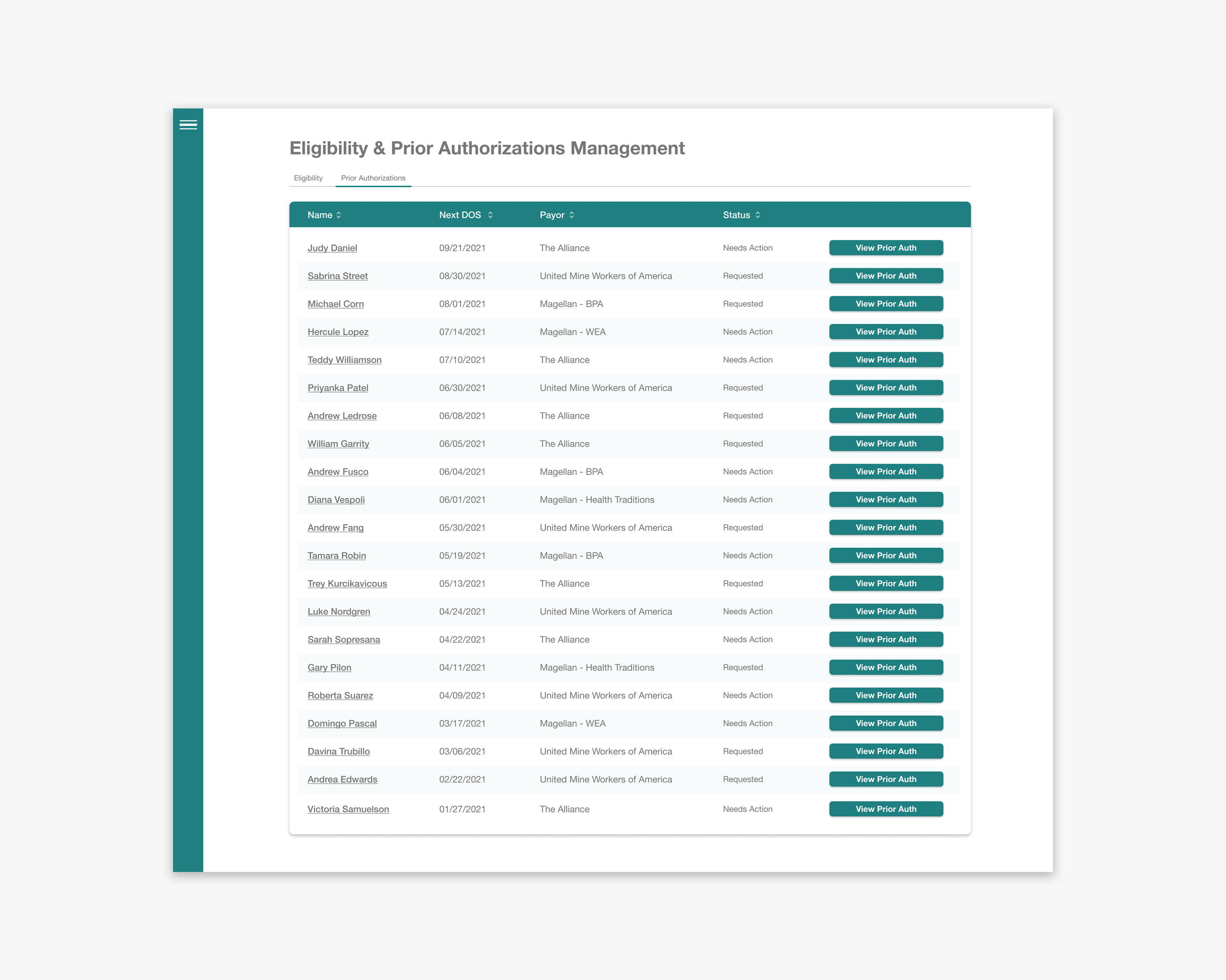
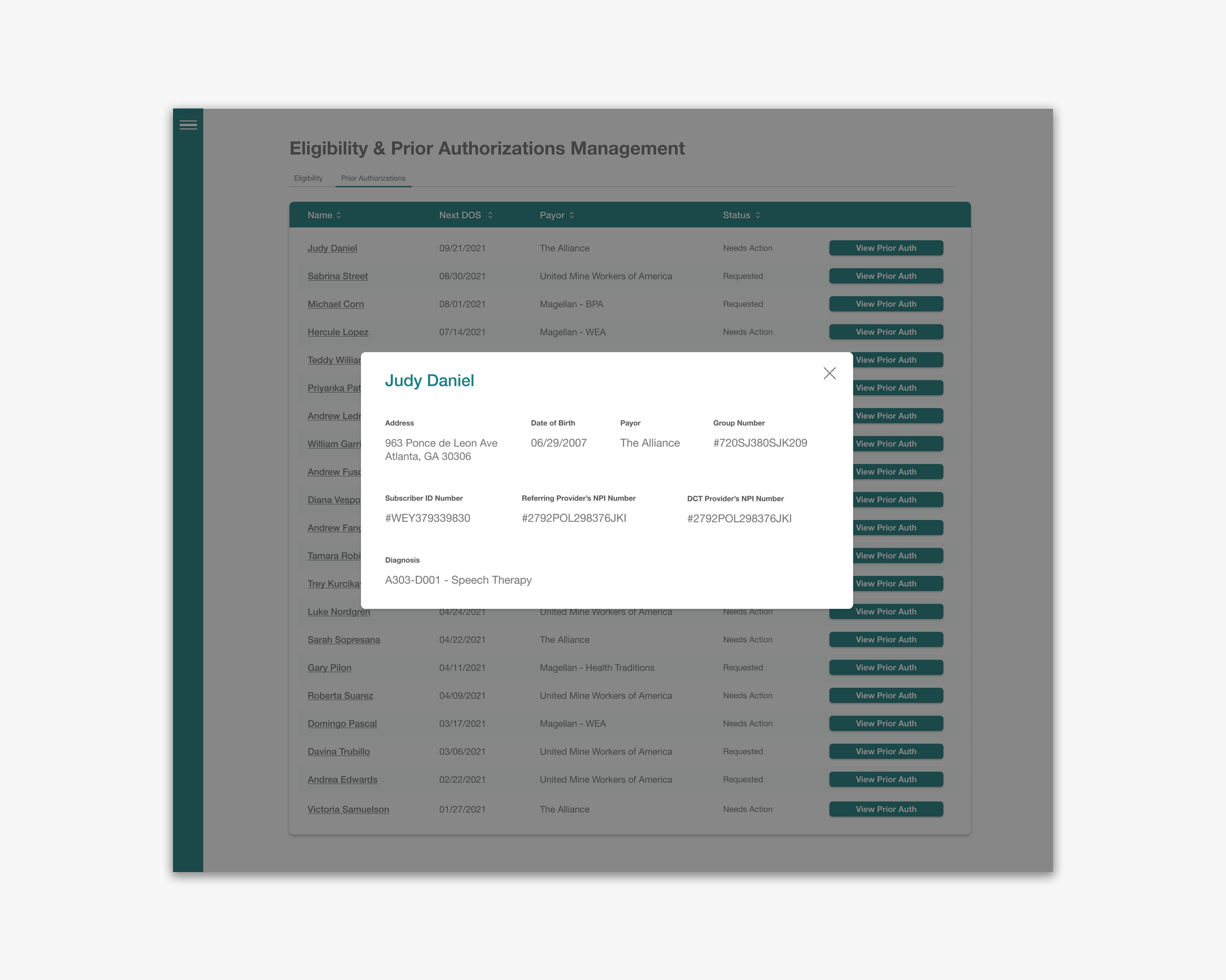
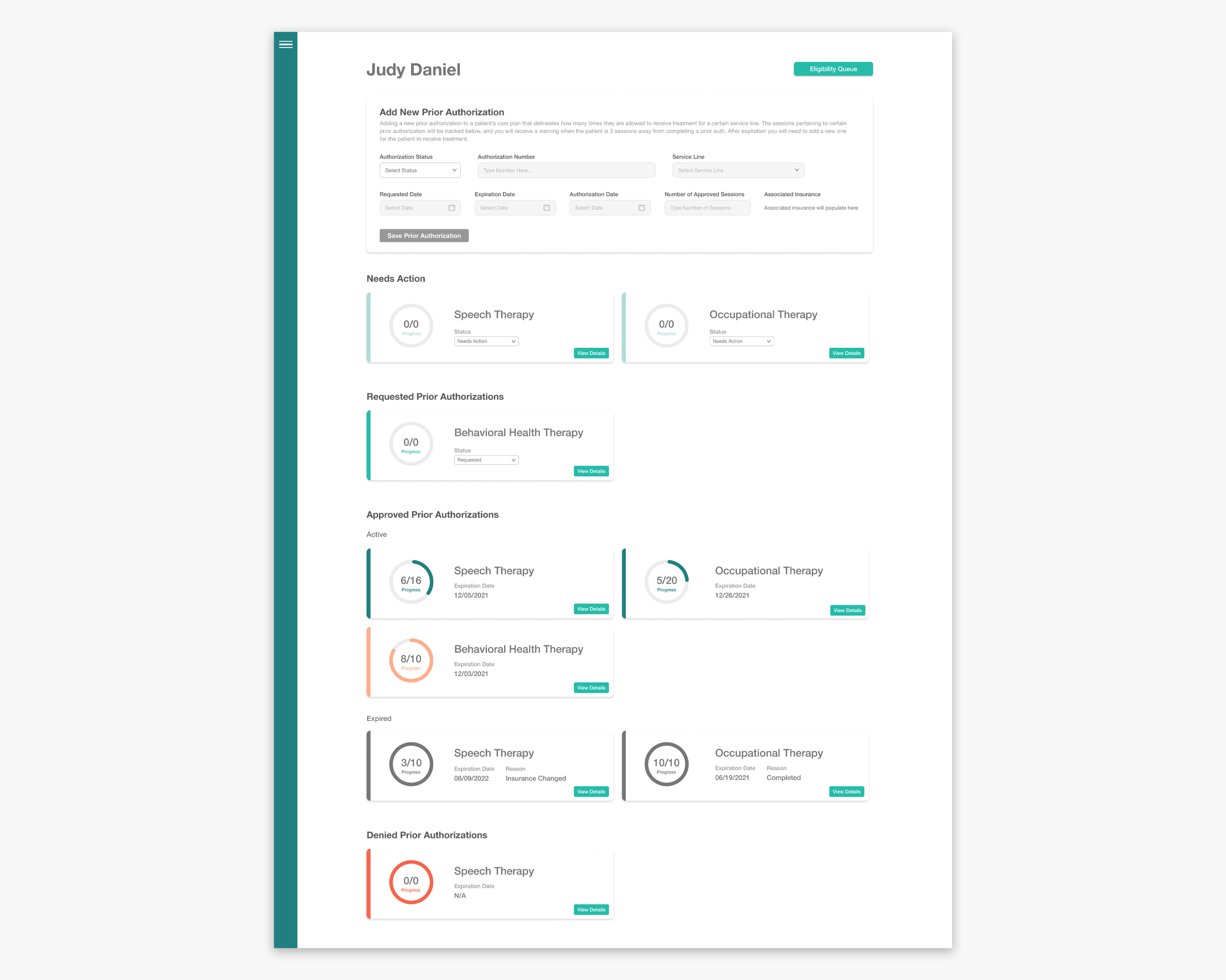
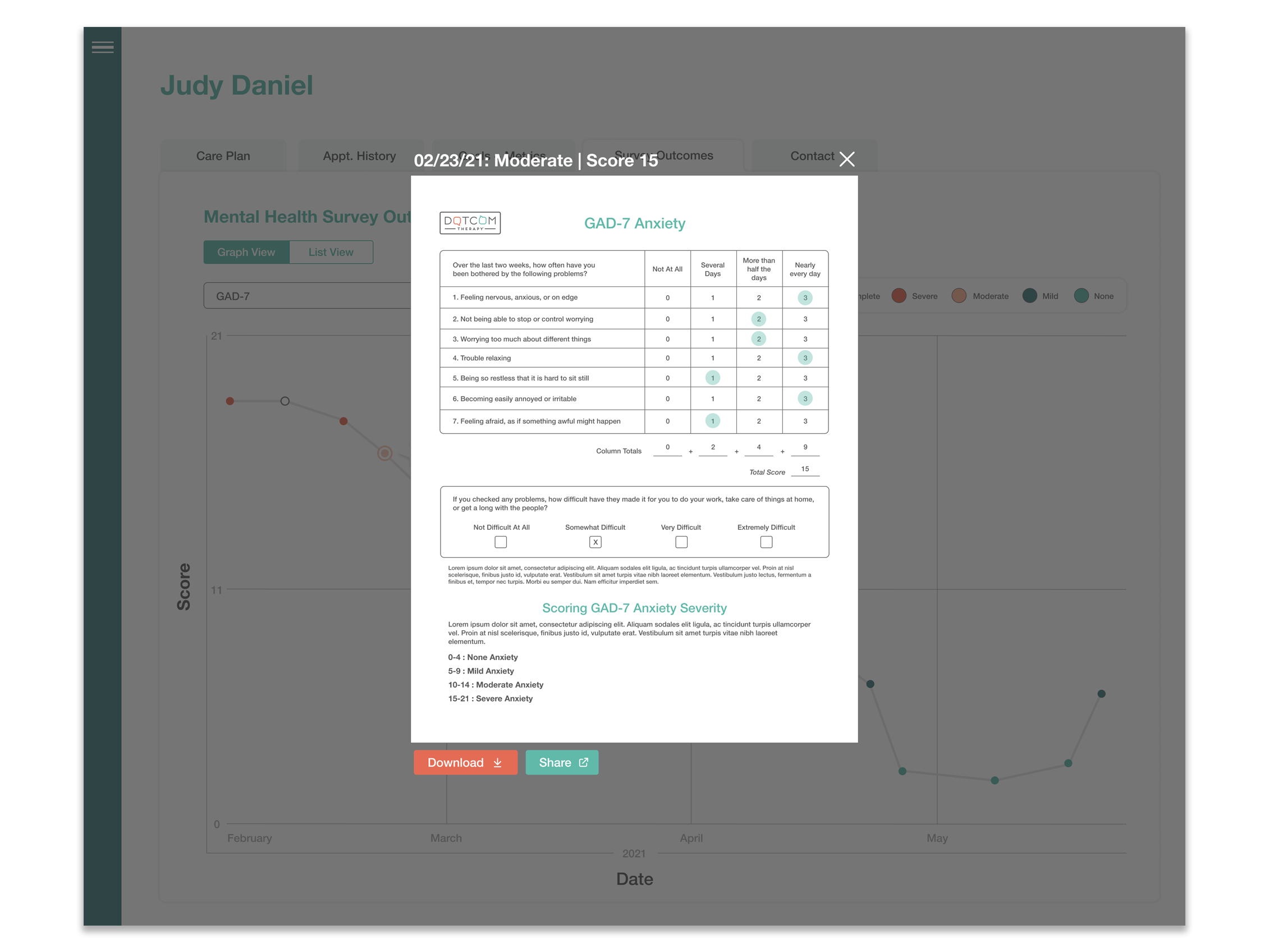
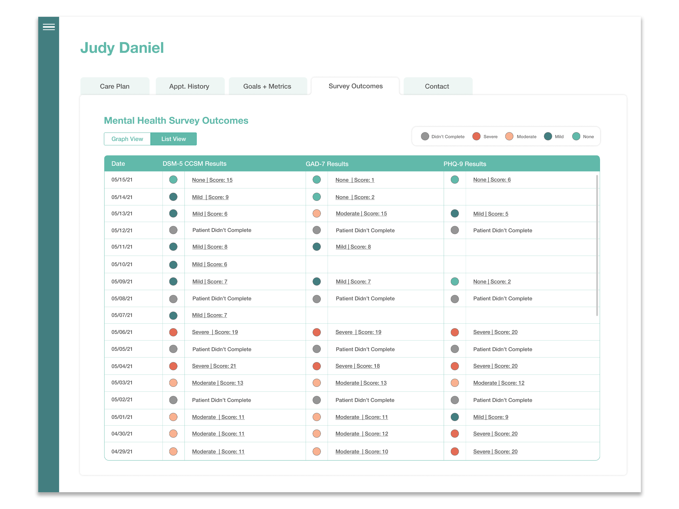
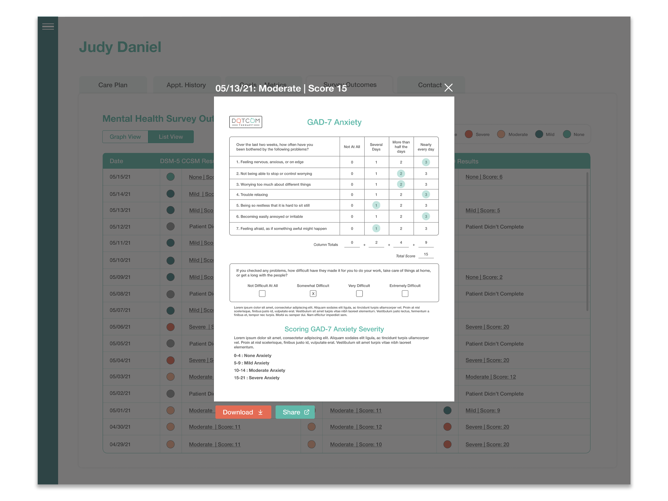
On the back end of the test, for therapists, we proposed a new tab on the patient’s page that displayed all of their results in a list form, and a line graph that showed development over time. We made sure each of the tests was downloadable as a PDF, and easy to read. In addition we devised a color coded ‘sticker’ system that showed the results of each test, at a glance. That way each test result could be easily identified when looking a patient’s chart / list.
All of this was done to show a patient’s progress over time, and to make their progress as a patient easy to read, so that trends became easily identifiable.
Our Process
Step 2: Ideate + Sketch
After gathering research and identifying the problem we started to ideate, throw paint at the walls, and got into sketching, for the patient’s ideal user flow, and the the actual screens used by the user.
Step 1: Discovery
Talk to patients and figure out where they are in their therapy journey, and what would their limits be when it came to assessments about their mental health. Also talk to therapists and identify how they’d like to view results of these tests. And finally do some market research and comp. analysis.
Step 3: Communicate
We brought these ideas and wireframes to the small test group we worked with previously and asked for input, feedback, and their unfiltered thoughts.
Step 4: Wireframe
We then distilled that feedback into actionable items and created low + high fidelity wireframes that centered around ease-of-use, and legibility.
Step 5: Iterate
We returned to that initial user group and our development team to walkthrough our proposed solutions, make sure we were on the right track. We fixed issues as they came up, and always made sure the user felt comfortable in the driver’s seat
Step 6: Deploy + Test
We then started deploying the product. And once it was live we ran tests to ensure users were happy and could use the feature. Once it was live we also conducted random surveys and identified new edge cases that didn’t come up in the initial build. These issues were subsequently dealt with.
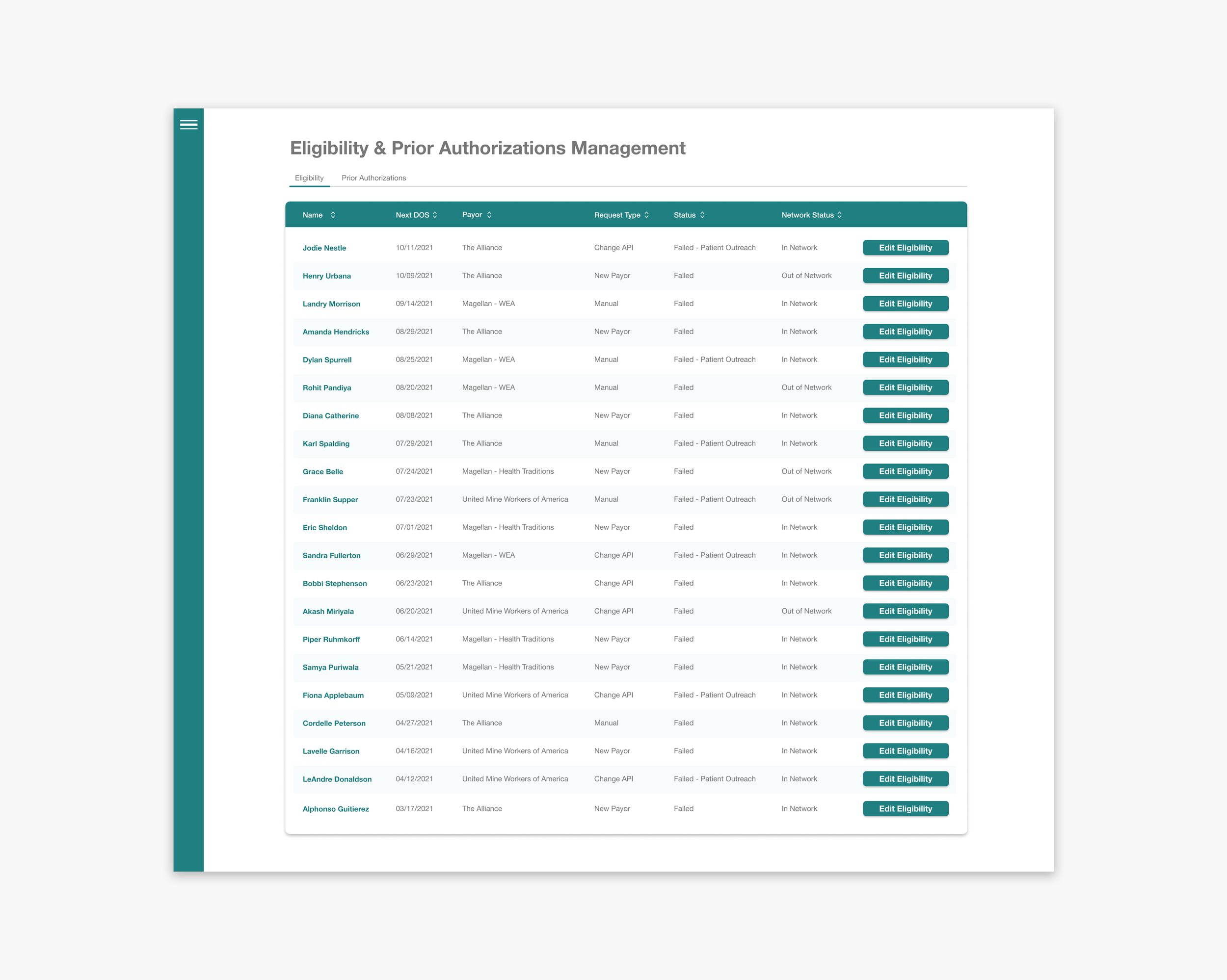
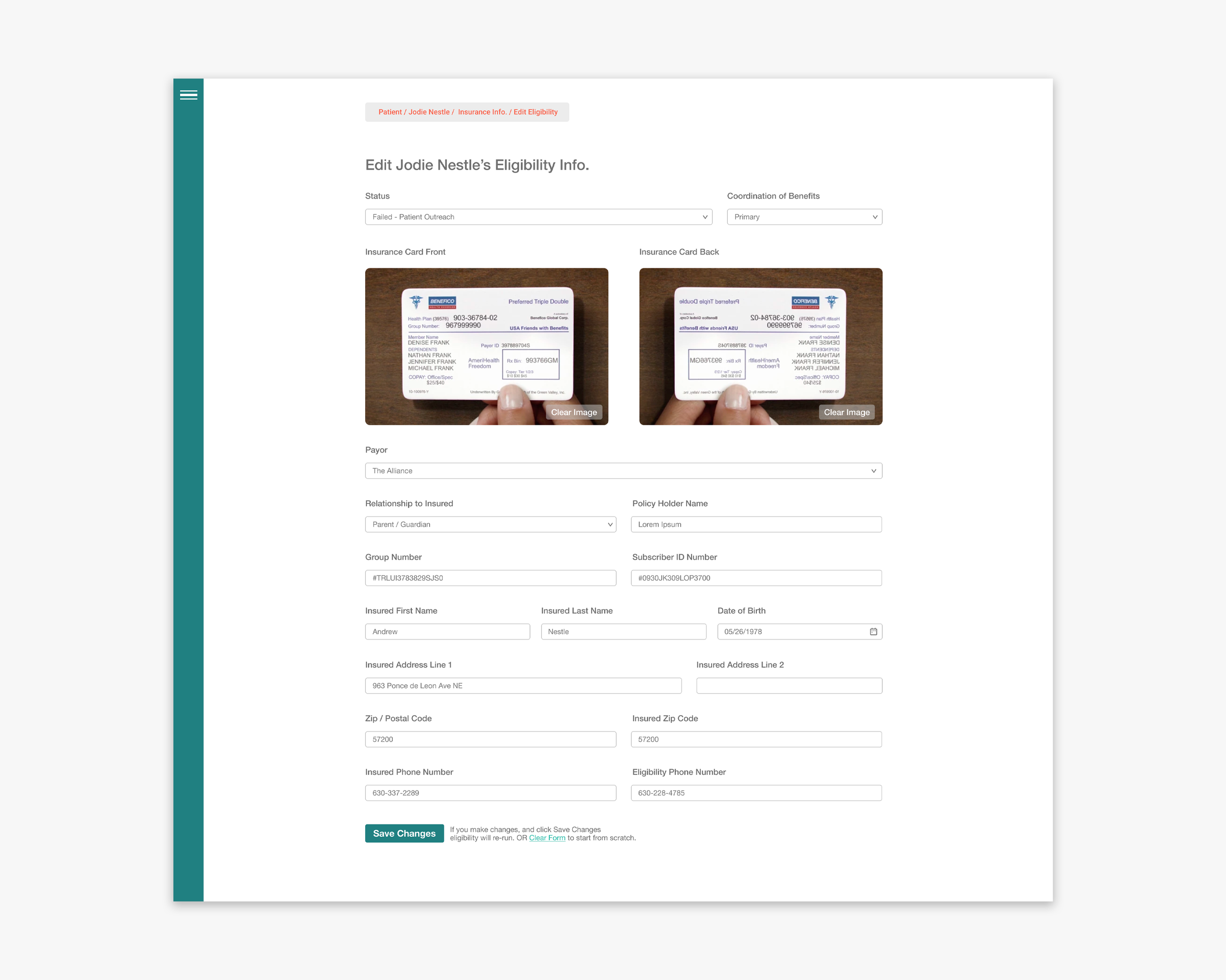
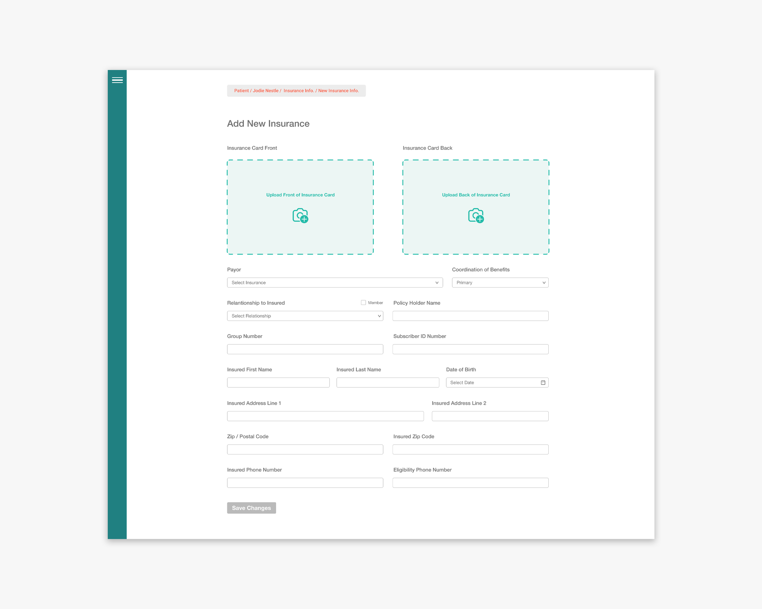
Our Users


Ideal User Flows


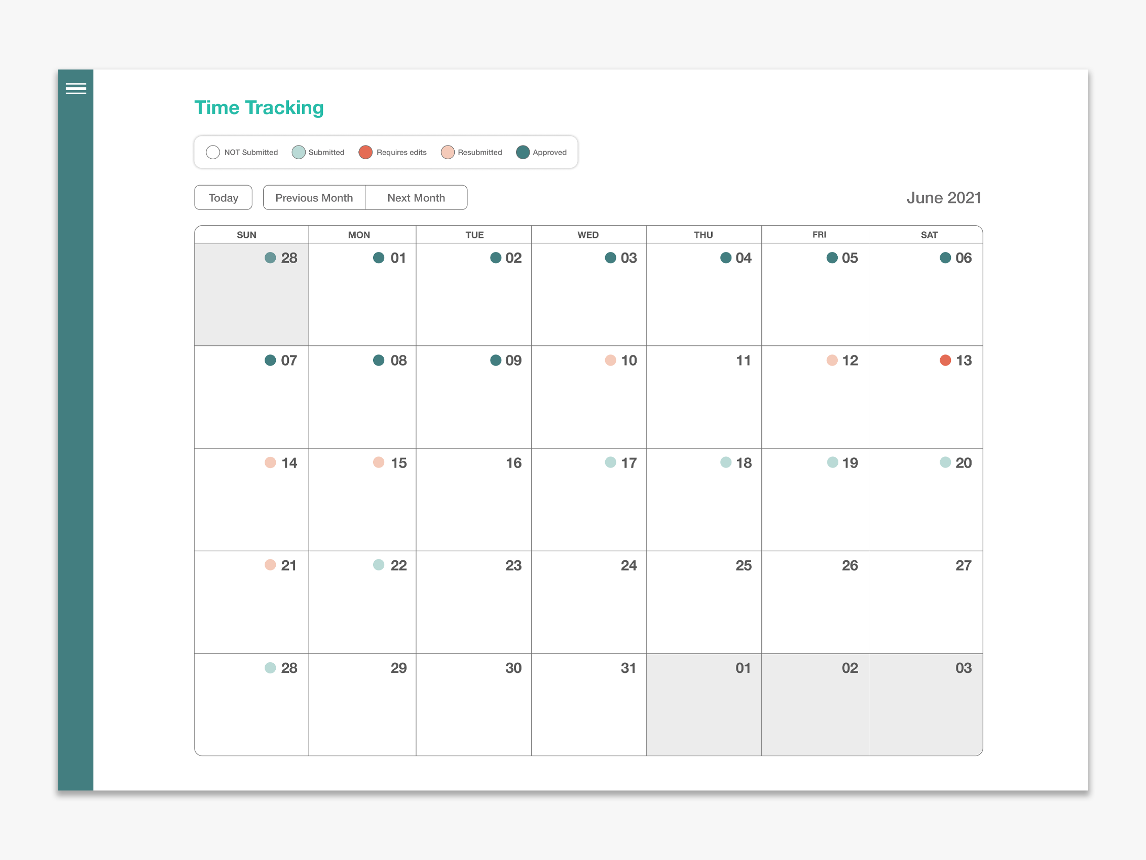
Color Coding Check-In Results
Using DCT’s brand colors we decided to devise a color coding system that made results of the Check-Ins easily readable and decipherable at a glance.
When reading a line graph, the line’s trend shows you results, but having color there makes it even more legible. The same goes for a list view. When looking at a long list of multiple tests ordered by date, it’s easier to spot trends when we have color as an indicator.
Only discrepancy between the coloring for the graph vs. list was that the empty white bubble didn’t read to well on a list view, and the grey bubble looked too similar to the dark teal bubble on a zoomed out graph.
Low Fidelity Wireframes

Patient Check-In User Flow
Therapist Screens - Outcome Tracking
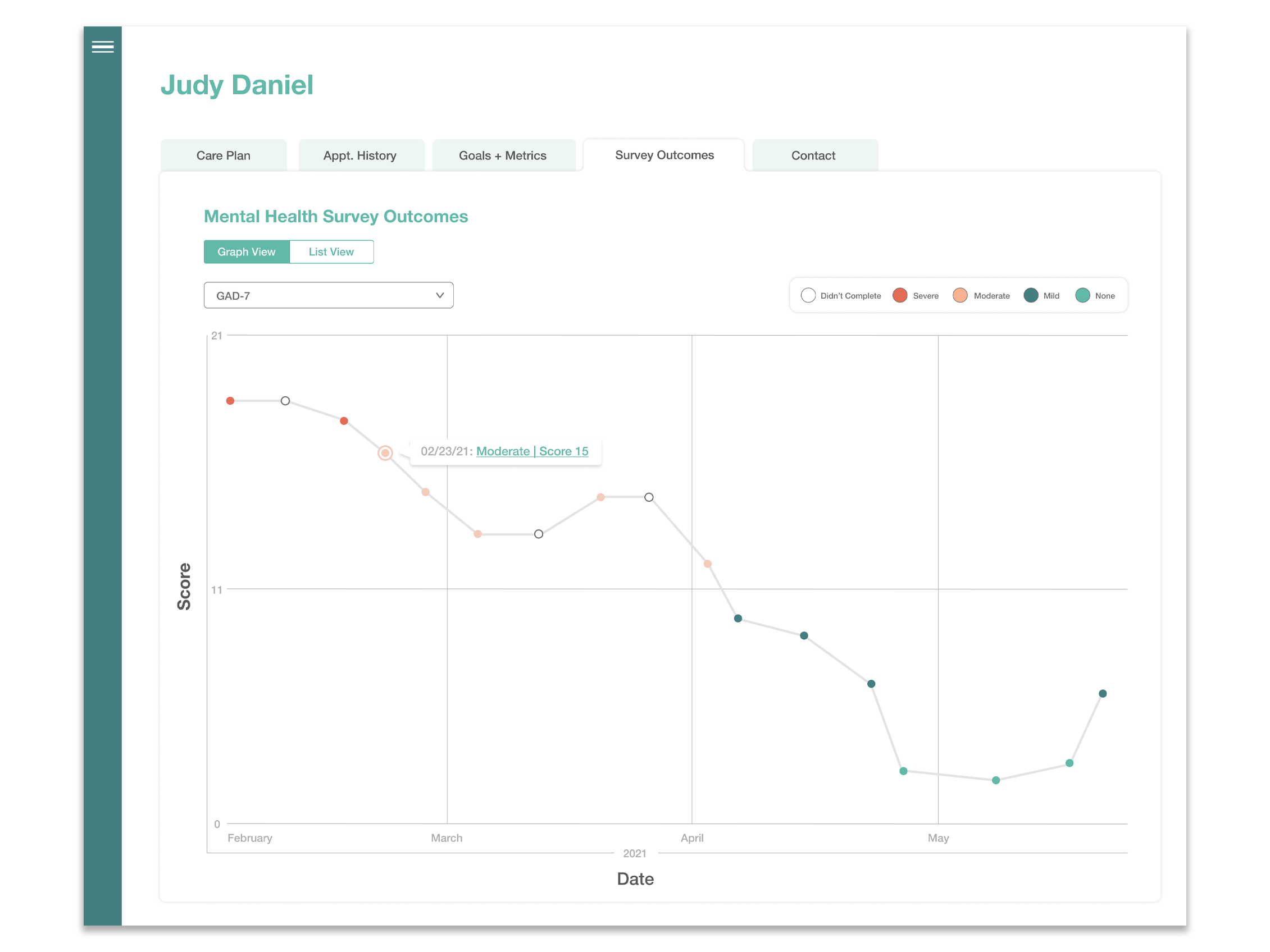
*Because of HIPAA compliance I am not permitted to show actual screengrabs of outcome tracking