DotCom Therapy
DotCom Therapy is an online therapy organization that services thousands of patients through their partnership with hundreds of schools, universities, insurance providers, and businesses. Since starting their 10 year run they’ve never gotten a chance to set their feet and take a retrospective look at their branding, and brand elements.
Because of this DCT’s brand was a bit all over the place when I was asked to re-focus the company. Colors were being added by employees at whim, they were using multiple script fonts, and the overall look was pretty scattered. This led to a wild-west scenario in the marketing department which was trying it’s best to corral the company’s many looks.
When I was brought on, my main task was to re-focus the brand, and establish a rigid parameters for the DCT brand. then take those parameters and create brand elements, icons, print collateral, items for the swag shop, and ultimately the website. These brand elements would also influence all of the Ux / Ui work I did at DCT.
DCT wanted to focus it’s branding and establish rules for it’s branding. They wanted to retain the femininity as the great majority of its employees and clients were female, but didn’t want that to be overwhelming. They brand needed to feel gentle, approachable, positive, fun, and exciting. When interacting with DCT the company wanted patients to feel nurtured, understood and celebrated along their therapy journey.
Before
When I started to re-focus DCT’s brand I had to take a look at if there were existing rules in place. And all I found were two versions of their logo, and 6 colors that never had hex codes or specificity tied to them. People within the company were often guessing when it came to matching these colors on collateral or social media.

After
The first thing we set out to do was round the corners of the logo slightly. The 90 degree angle felt very mid-2010’s and rounding it modernized the logo, and made it feel more contemporary. After that we set out to establish the full color pallet, codify them by etching out Hex codes, and established a clean primary font. Montserrat is simple, readable, but most importantly it is vert readily available. This way when teachers in Nevada, or therapists in Alaska are creating items under the DCT umbrella they at the very least have the font to make things look cohesive.


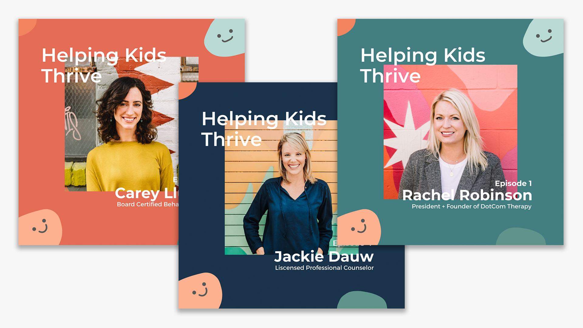
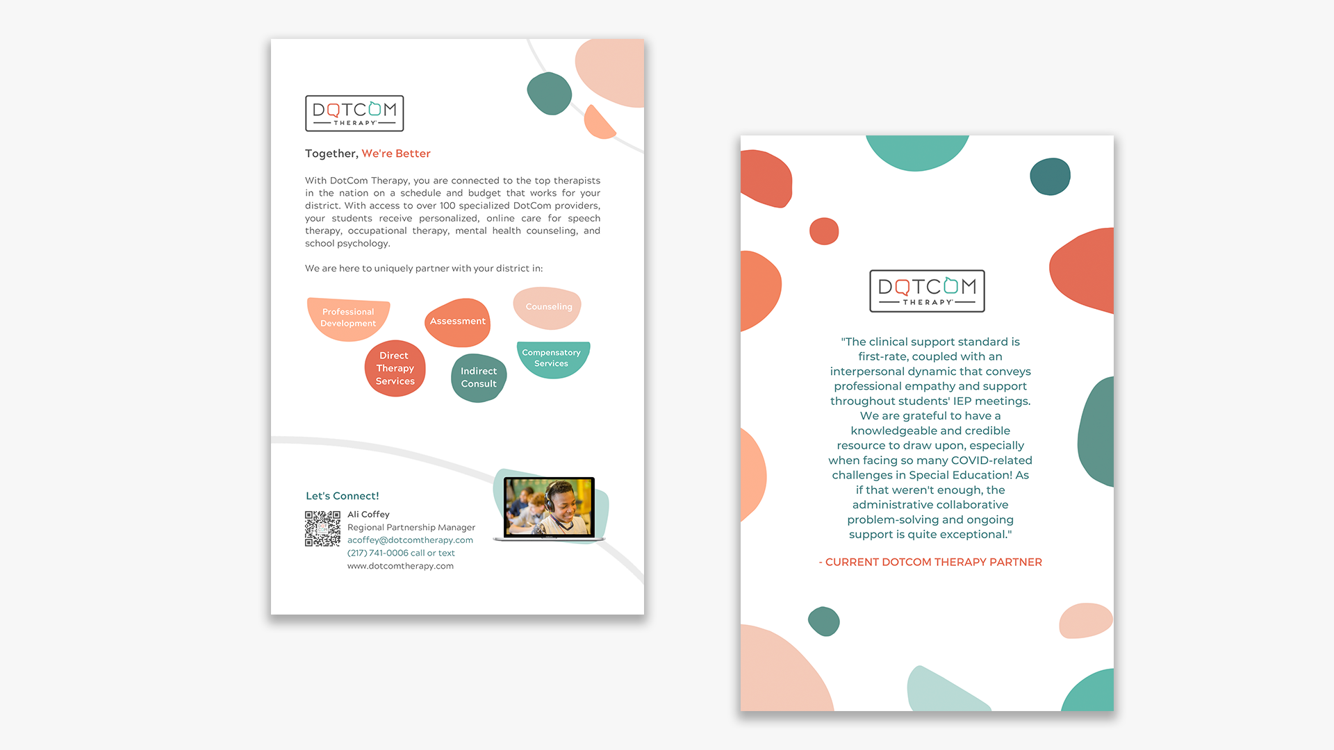
Brand Elements: Confetti
Whether it’s opening an email, using the app while scheduling therapy, or even just signing up to be a patient, DCT wanted all of it’s patients to feel celebrated when interacting with the brand. For this reason the team and I introduced this decorative brand element. These blobs have been sprinkled around images, on print collateral, on the website, all over the app and serve to add a pop of color and make the experience of receiving therapy at DCT a joyful experience.
These shapes are soft, and have ambiguous forms that allude to the fact that therapy, mental health, and feelings in general are intangible and amorphous. They fit into each other like puzzle pieces and almost seem to hug each other gently: the exact feeling DotCom Therapy would like to elicit from patients.

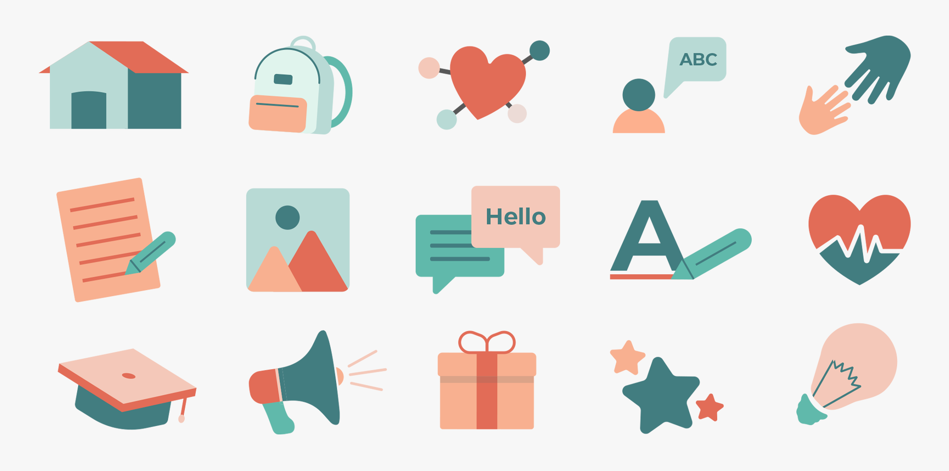
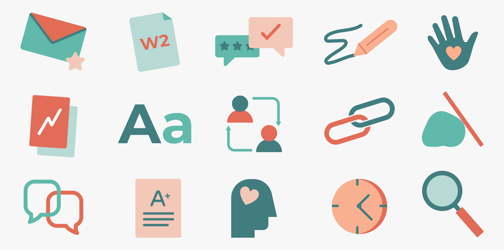
Iconography
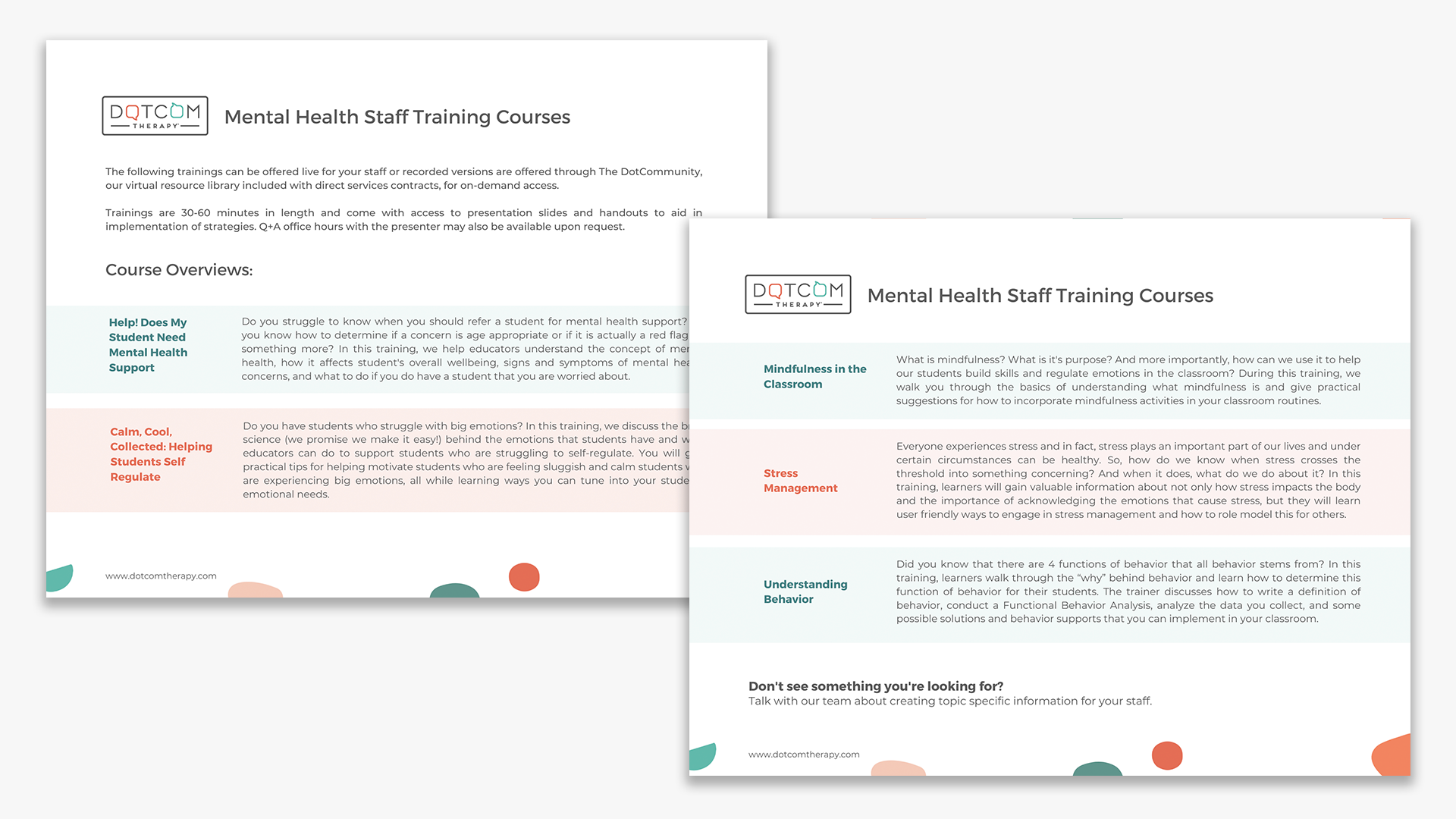
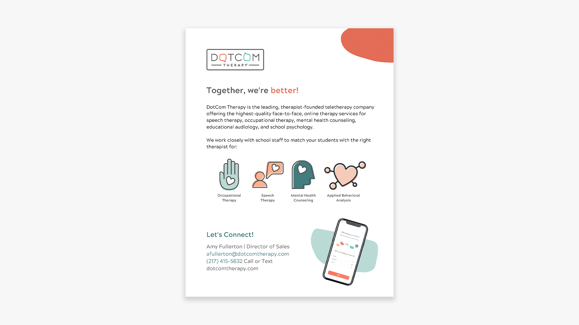
After establishing the brand elements I began creating a library of icons that would populate the website, social media, sales docs, and a dozen other types of collateral. The therapy space is full of abstract and often new concepts that the DCT team is tasked with translating to close deals, and help patients understand their journey better. Icons help to translate some of these higher concept ideas. We felt like line-less illustrations that focused on bright colors and soft edges served to make things visually appealing, in the DCT style, and came off as friendly and playful!
Collateral
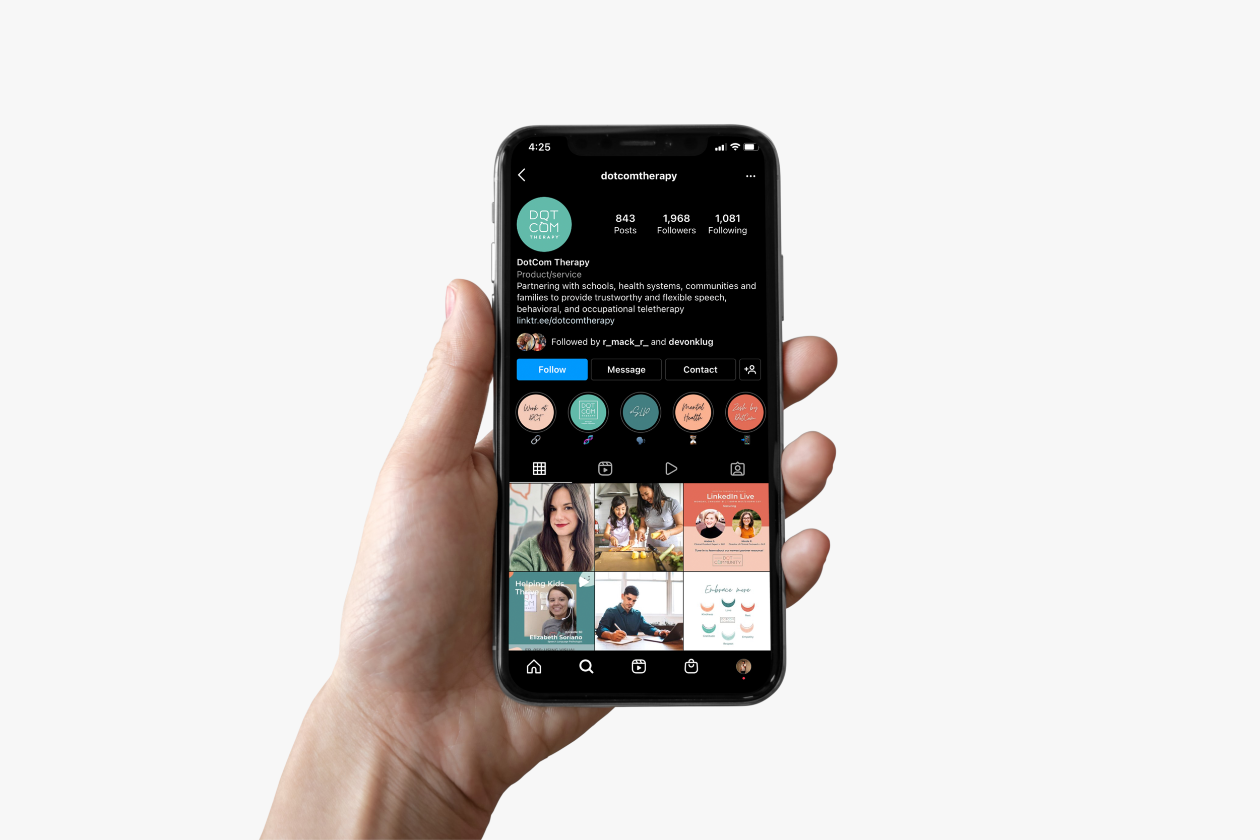
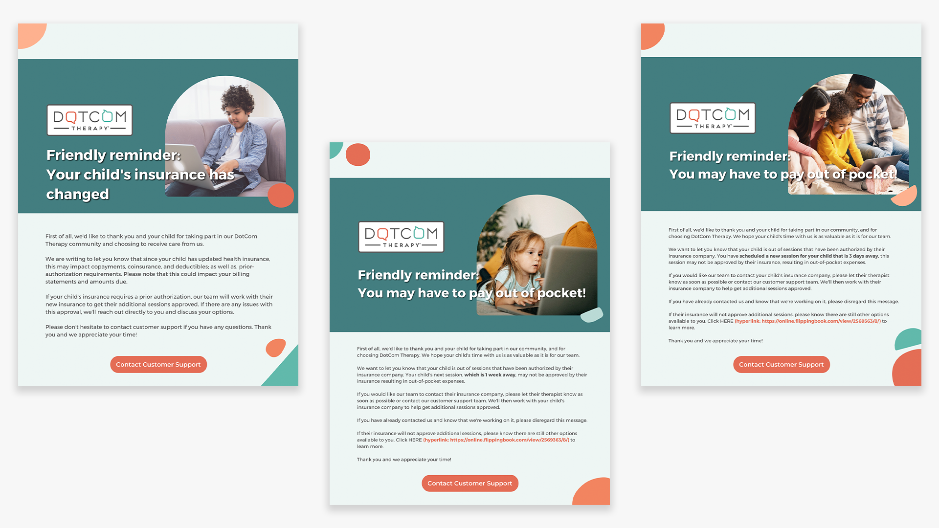
From podcast cover art, to print collateral, to social media graphics, sales sheets, and email design: I began applying the brand system to all corners of the DCT network. And things started to look more cohesive, uniform, and congruent.
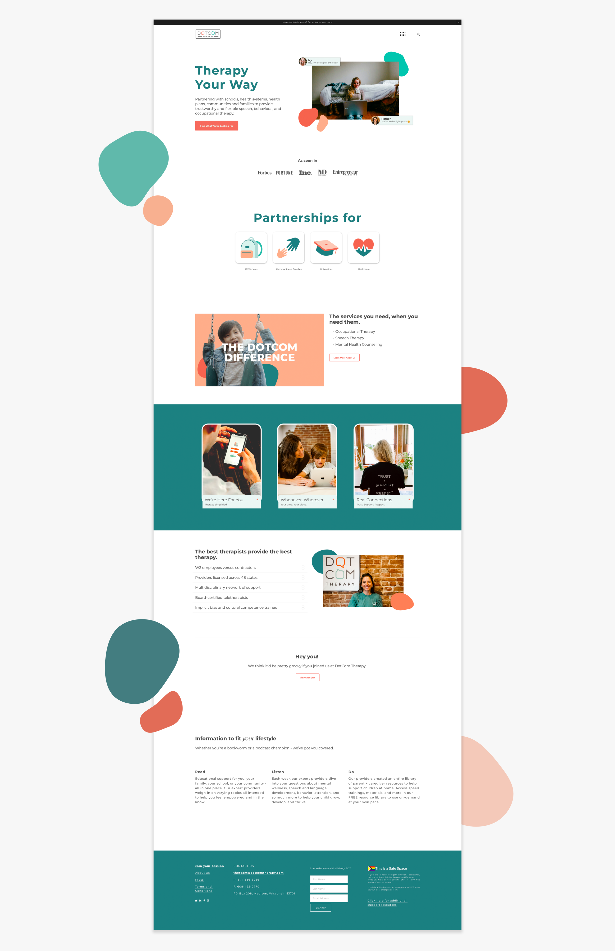
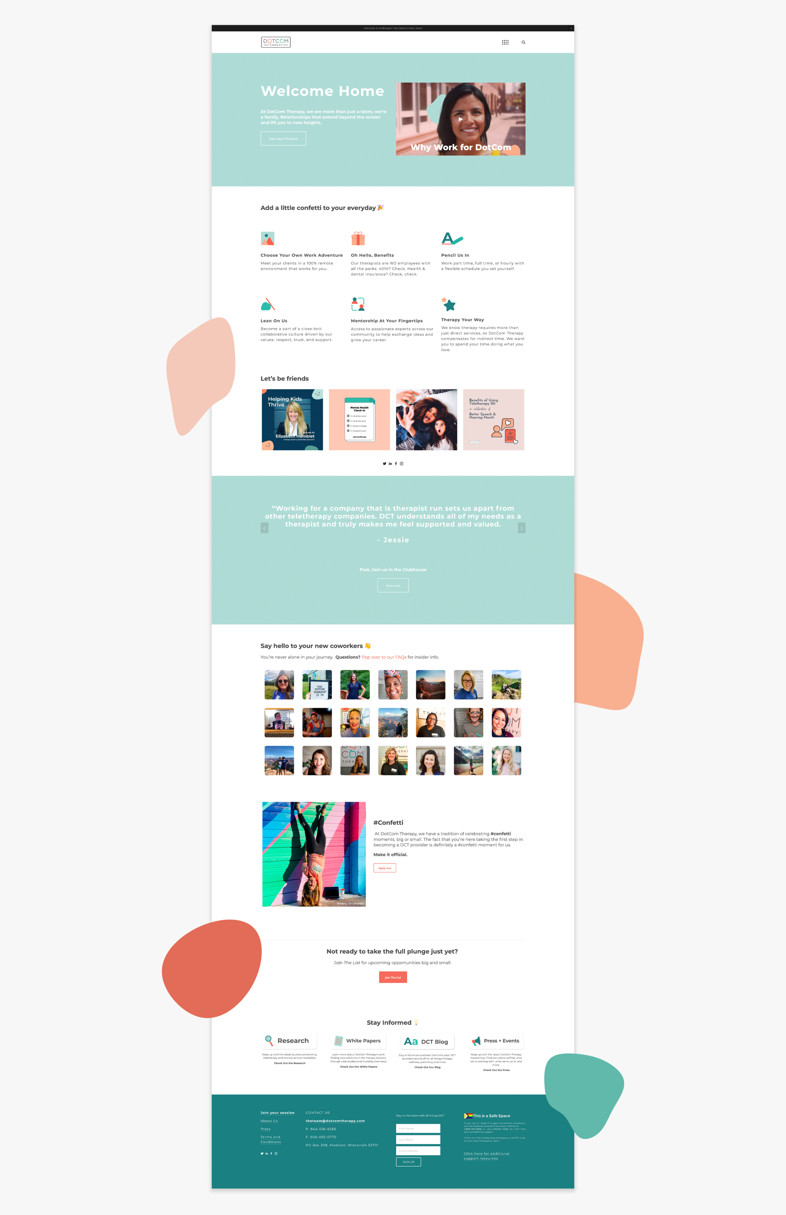
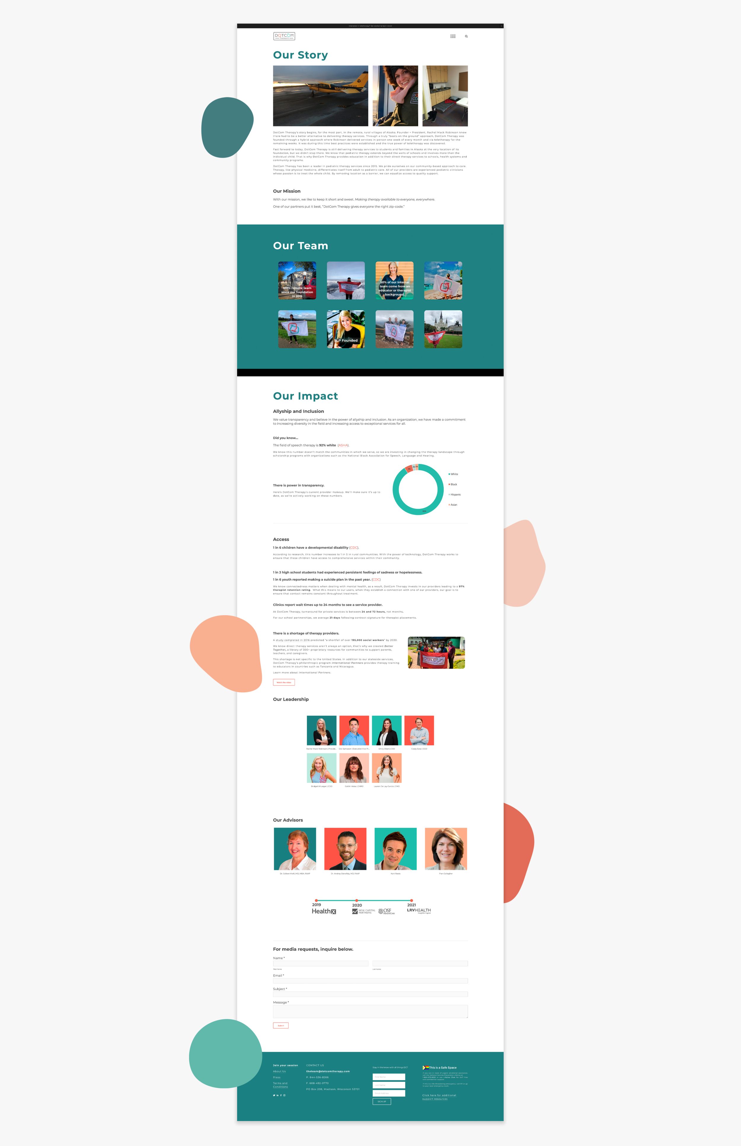
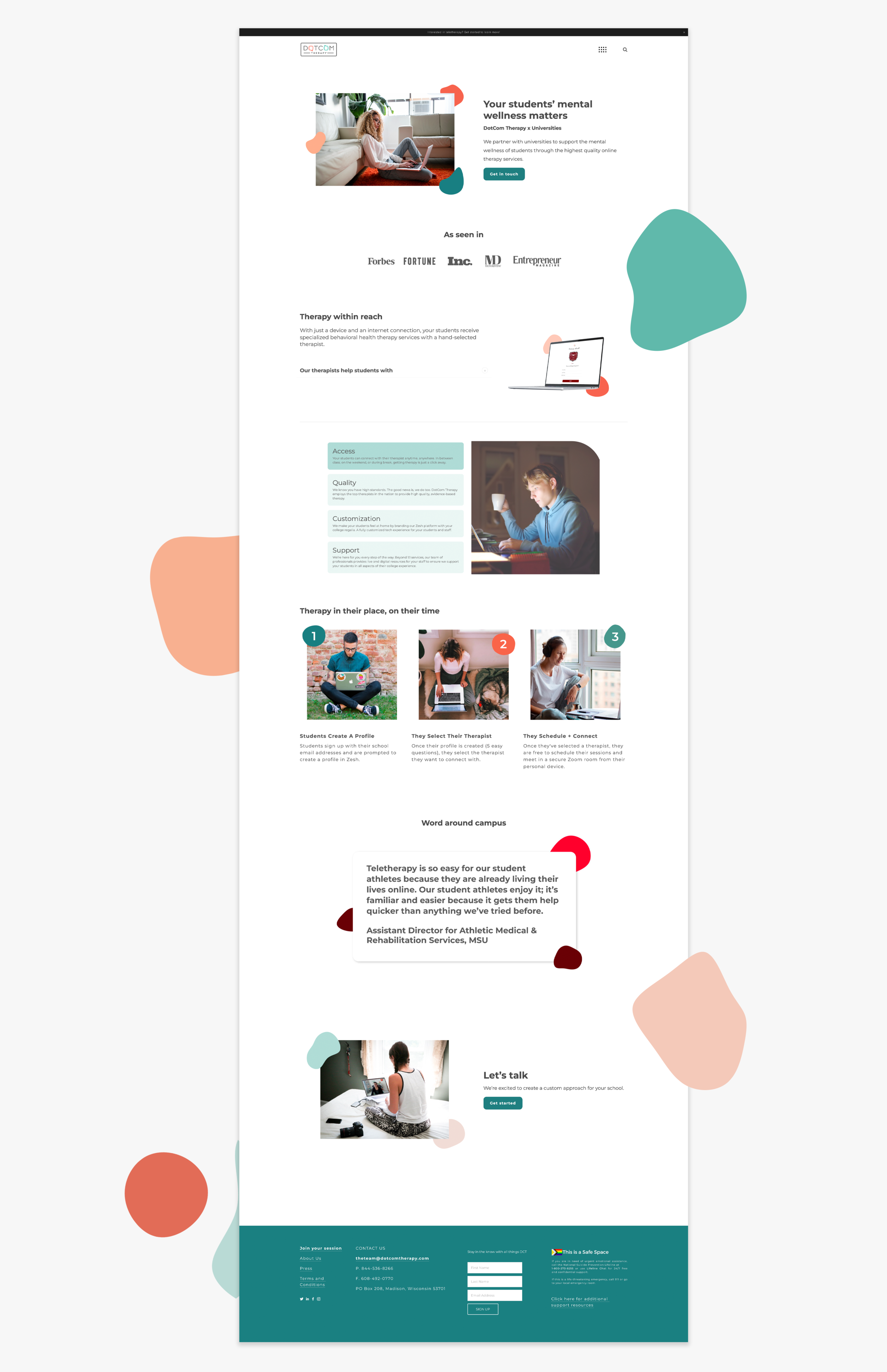
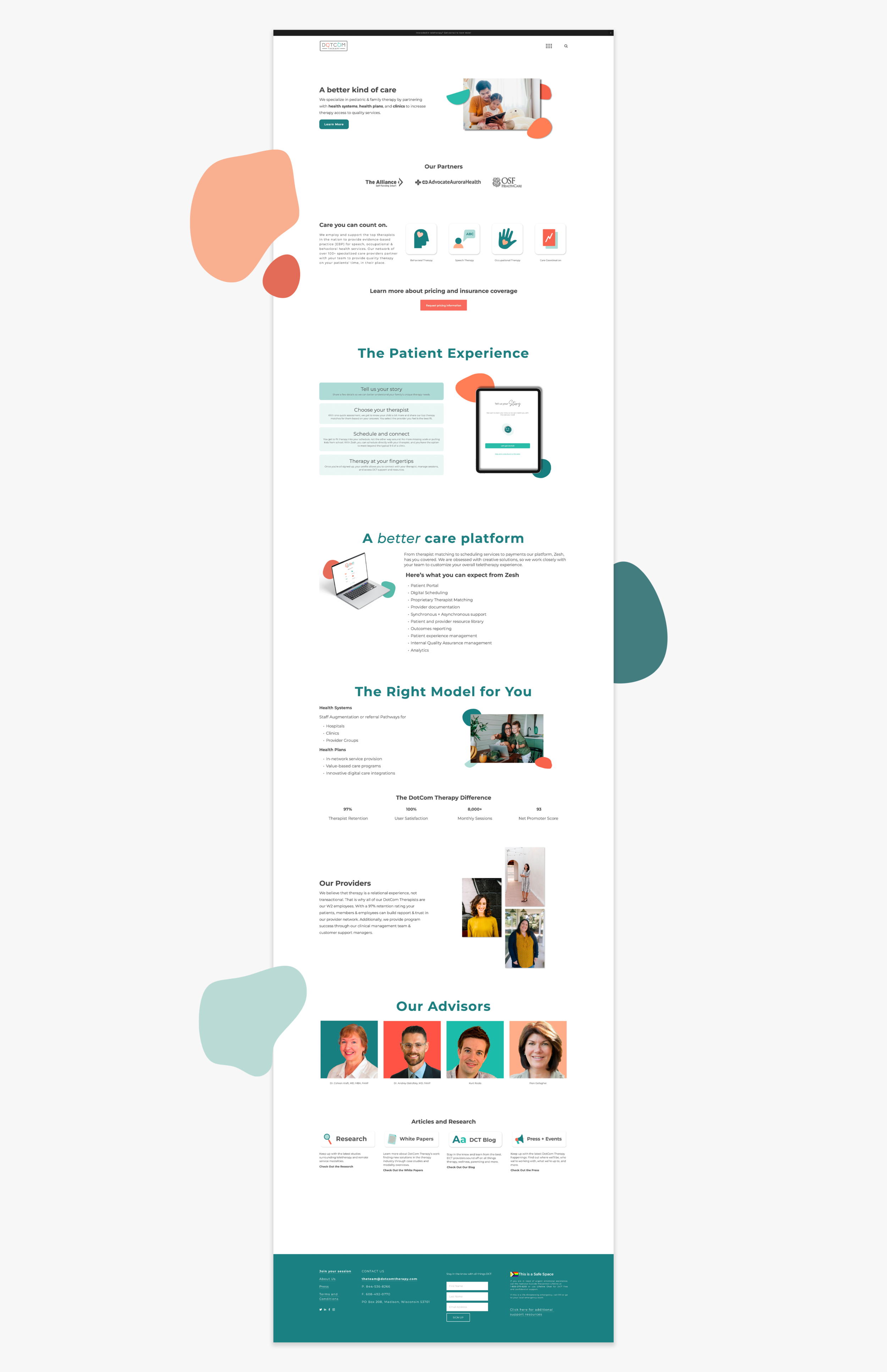
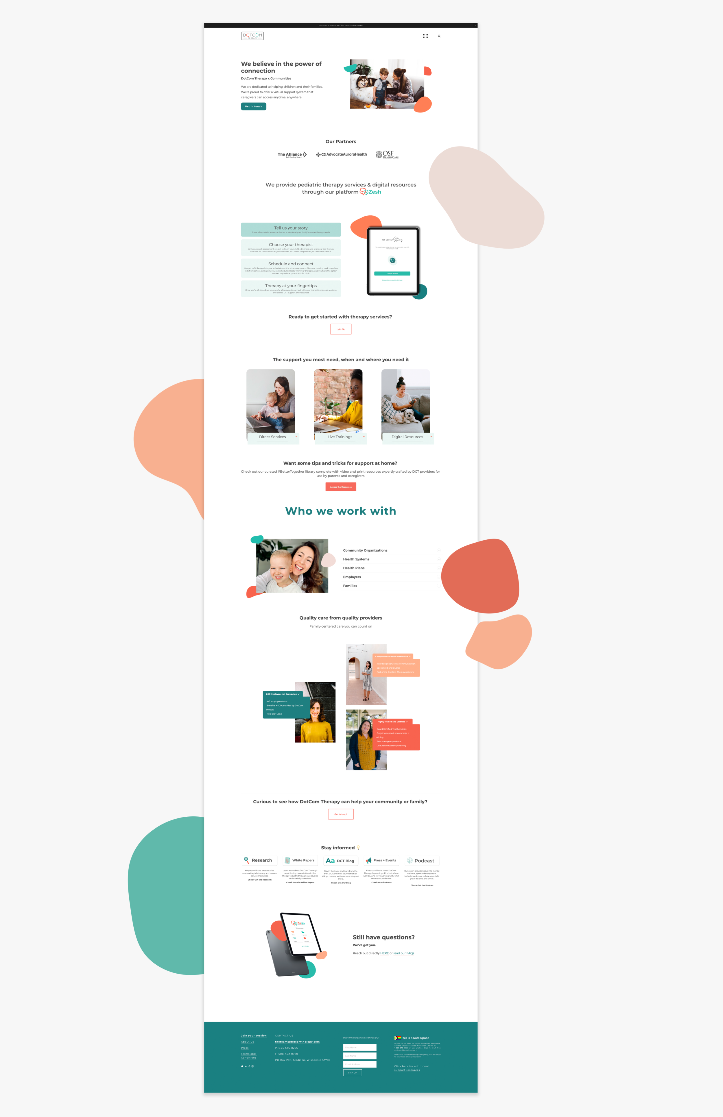
DCT’s Website
After the brand had settled and the rest of the oil tanker, that is DCT, got acclimated to the new brand, my team and I got to working on the DotCom Therapy website. The site’s primary function was to distill DCT’s complex processes and verticals into accessible, bite sized pieces to drive better sales and create better contacts. We prioritized white space, cleanliness, and pops of color to invite the user into DCT’s world and uplift them with every click and scroll.
This project is better seen if you simply visit the website.
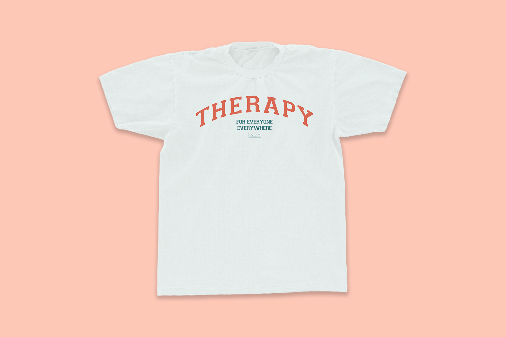
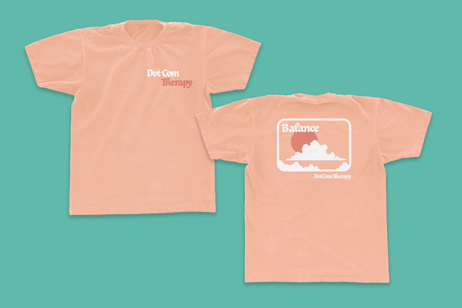
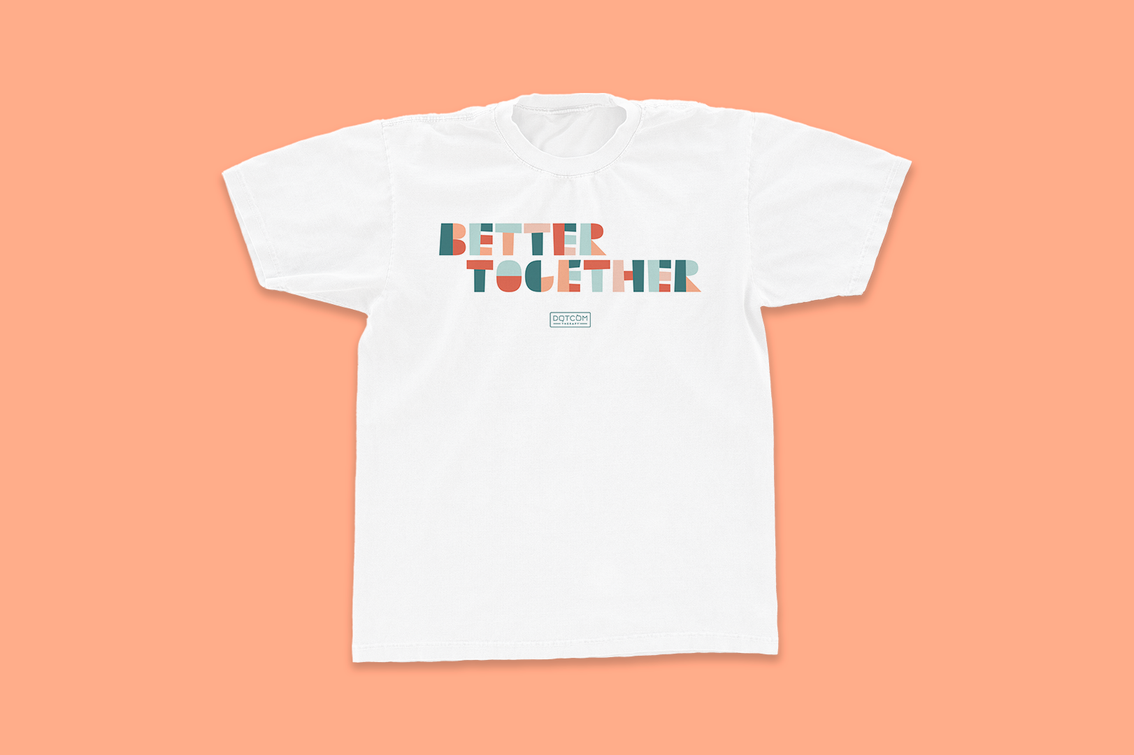
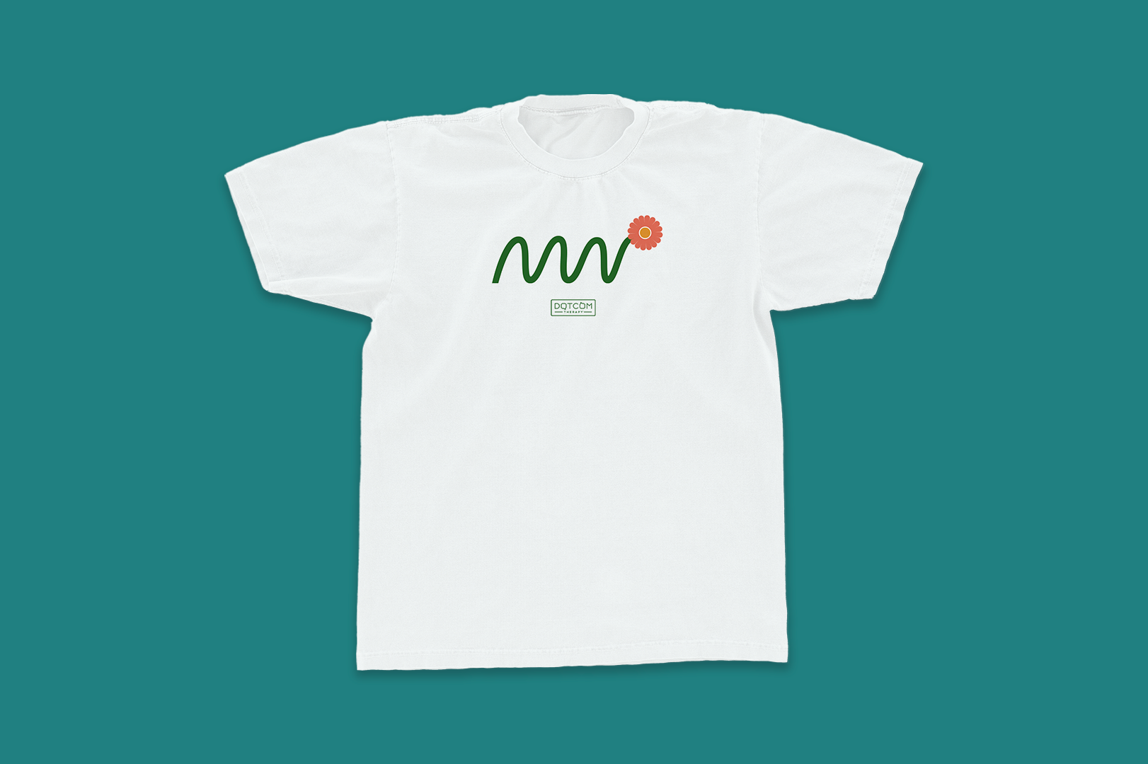
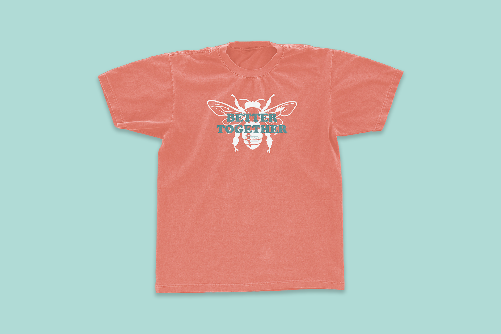
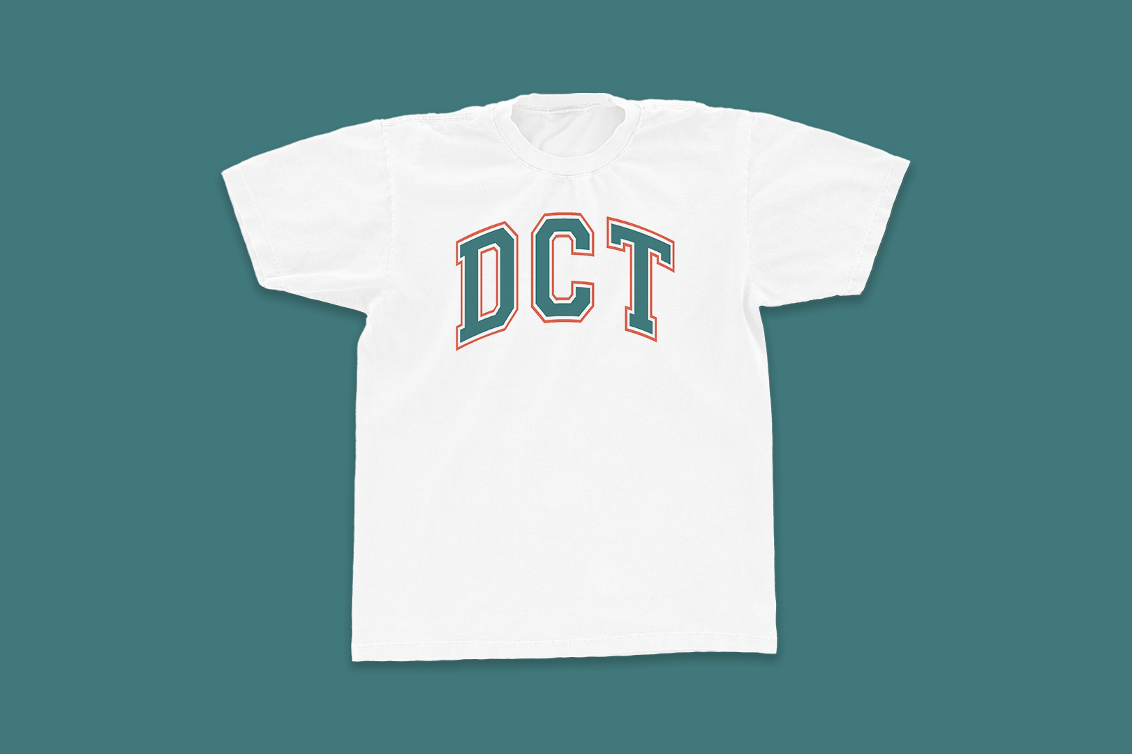
SWAG
One of the perks of my job at DotCom is creating all the merch for our annual swag give-away. I take the year’s internally adopted phrases, new initiatives, and inside jokes and create fun gifts for our therapists, corporate team, and all the friends of the company. These items go neatly packaged to employees and we open them together on zoom and it’s gotta be my favorite day every year. This is also when I get to bend my own branding rules, have fun, and play the most.