Shaunak Godkhindi
 

The Auxin Leader

Is a leadership training course that helps business owners and team leaders create sustainable and manageable growth in their organization by taking a people-focused approach to team building. Father-son-founders John and Chase Brantley have created a series of videos and worksheets that are sent to clients every week. 

Each video has a new and fun theme. Sometimes it’s the Twilight Zone, sometimes it’s Wes Anderson, sometimes it’s Fargo. Regardless, each video  asks the viewer to engage in deep and meaningful conversation with their employees, which in turn allows them to see an employee’s passions, wants, and desires. This helps leaders make more informed decisions about that employee and the direction of the company. 

This training program has shown proven success when John Brantley taught it at General Mills, the NBA, the US Navy, and a multitude of other companies where they found quantitative results after it was implemented. And John now wanted to record the program in the form of videos, PDFs, and digital content that would make this course accessible to anyone who wanted to create long lasting growth in their company. 

John and Chase picked Auxin because it’s the chemical in plant-life that helps a plant reach light the quickest by pushing the plant from the center-out. They wanted something that felt positive, radiant, and friendly that still retained confidence and power. They needed it to be attractive to c-suite execs, while still retaining an aspect of fun- just like the program they were creating. 


My Approach

We set out to create a logo that looked like light spreading it’s reach from the center-out. The broad, square shape gives the logo a strength and confidence, while all of the rounded edges make it friendly and approachable.

The 45 degree angle is suggestive of growth and positive trajectory, and the ‘star’ light shining in a night sky. The colors are ‘businessy’ but not stuffy, and the form overall is exciting and engaging without being in-your-face.

In blind tests we’ve heard the logo reminds people of a firework, sparkler, flower, matchstick, explosion, and star. All concepts that only further allude to Auxin’s mission to create growth from the center-out.


Scraps from the cutting room floor

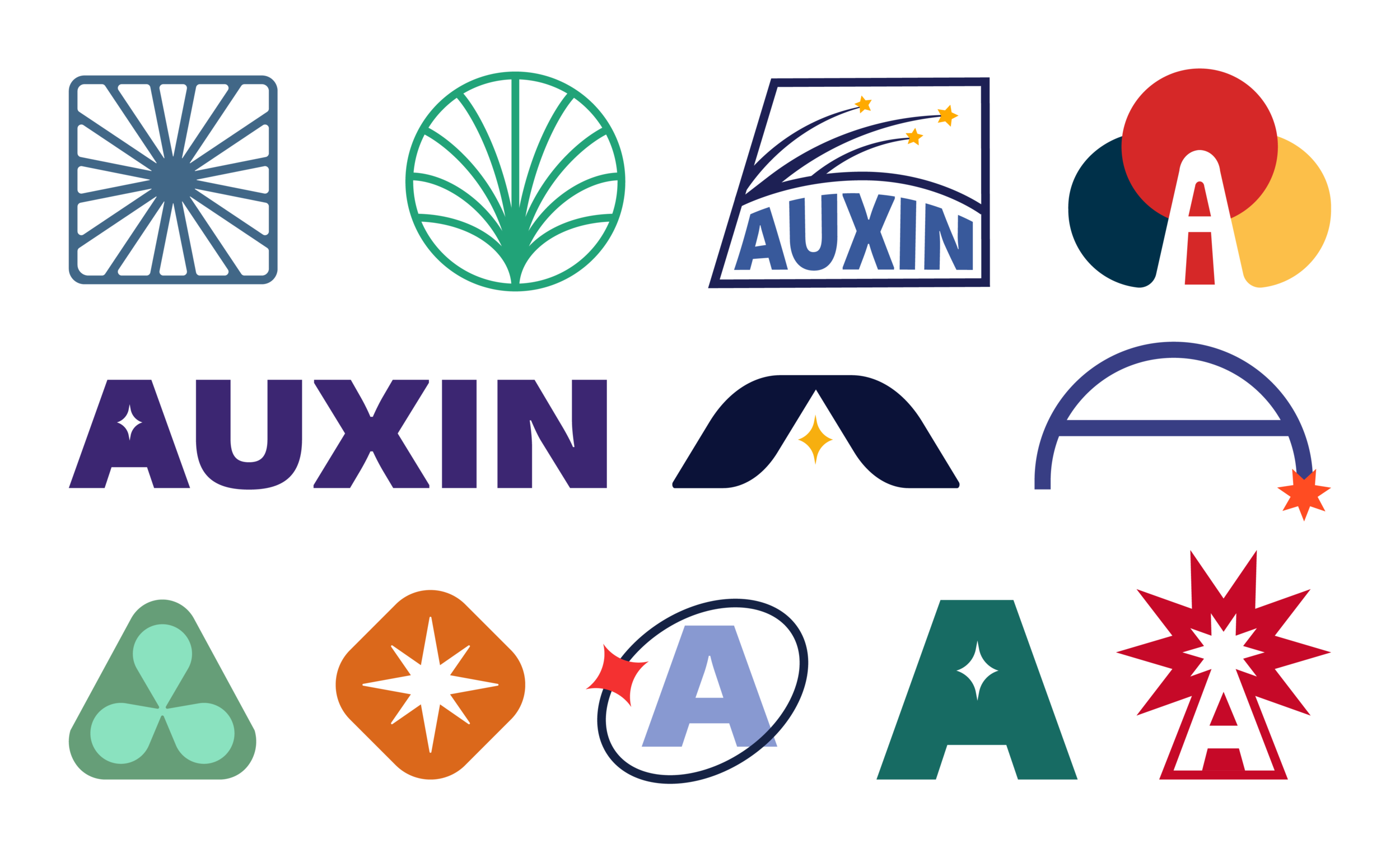
From abstract shapes, to concepts more closely tied to growth and space, I like to start by casting a wide net and playing with everything.

I’ve learned that it’s best to leave no stone unturned in the discovery and initial phases of concepting. Everything has potential energy, and we should be in a state of play until we find a path that’s heading to our destination.


auxinmedia.png
 

DotCom Therapy

DotCom Therapy is an online therapy organization that services thousands of patients through their partnership with hundreds of schools, universities, insurance providers, and businesses. Since starting their 10 year run they’ve never gotten a chance to set their feet and take a retrospective look at their branding, and brand elements.

Because of this DCT’s brand was a bit all over the place when I was asked to re-focus the company. Colors were being added by employees at whim, they were using multiple script fonts, and the overall look was pretty scattered. This led to a wild-west scenario in the marketing department which was trying it’s best to corral the company’s many looks.

When I was brought on, my main task was to re-focus the brand, and establish a rigid parameters for the DCT brand. then take those parameters and create brand elements, icons, print collateral, items for the swag shop, and ultimately the website. These brand elements would also influence all of the Ux / Ui work I did at DCT.

DCT wanted to focus it’s branding and establish rules for it’s branding. They wanted to retain the femininity as the great majority of its employees and clients were female, but didn’t want that to be overwhelming. They brand needed to feel gentle, approachable, positive, fun, and exciting. When interacting with DCT the company wanted patients to feel nurtured, understood and celebrated along their therapy journey.


Before

When I started to re-focus DCT’s brand I had to take a look at if there were existing rules in place. And all I found were two versions of their logo, and 6 colors that never had hex codes or specificity tied to them. People within the company were often guessing when it came to matching these colors on collateral or social media.


After

The first thing we set out to do was round the corners of the logo slightly. The 90 degree angle felt very mid-2010’s and rounding it modernized the logo, and made it feel more contemporary. After that we set out to establish the full color pallet, codify them by etching out Hex codes, and established a clean primary font. Montserrat is simple, readable, but most importantly it is vert readily available. This way when teachers in Nevada, or therapists in Alaska are creating items under the DCT umbrella they at the very least have the font to make things look cohesive.


Brand Elements: Confetti

Whether it’s opening an email, using the app while scheduling therapy, or even just signing up to be a patient, DCT wanted all of it’s patients to feel celebrated when interacting with the brand. For this reason the team and I introduced this decorative brand element. These blobs have been sprinkled around images, on print collateral, on the website, all over the app and serve to add a pop of color and make the experience of receiving therapy at DCT a joyful experience.

These shapes are soft, and have ambiguous forms that allude to the fact that therapy, mental health, and feelings in general are intangible and amorphous. They fit into each other like puzzle pieces and almost seem to hug each other gently: the exact feeling DotCom Therapy would like to elicit from patients.


Iconography

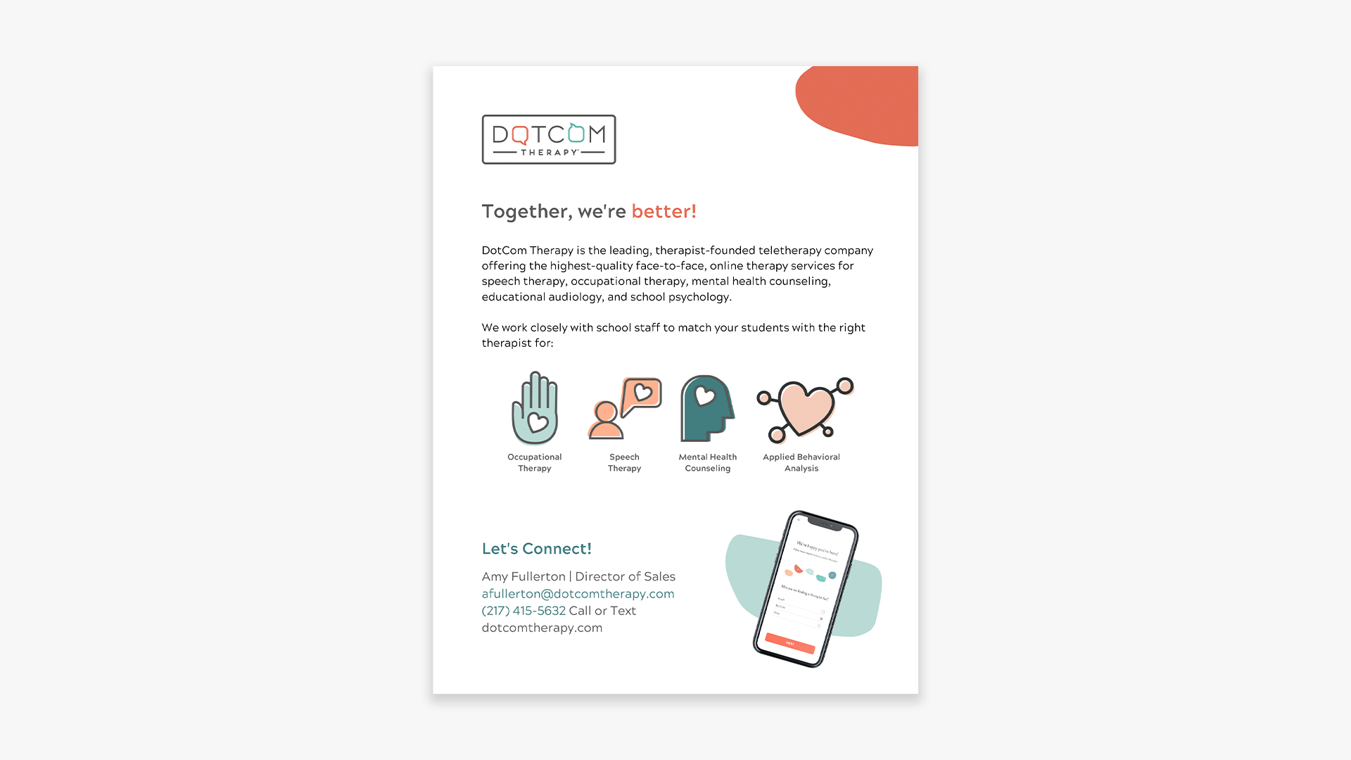
After establishing the brand elements I began creating a library of icons that would populate the website, social media, sales docs, and a dozen other types of collateral. The therapy space is full of abstract and often new concepts that the DCT team is tasked with translating to close deals, and help patients understand their journey better. Icons help to translate some of these higher concept ideas. We felt like line-less illustrations that focused on bright colors and soft edges served to make things visually appealing, in the DCT style, and came off as friendly and playful!


Collateral

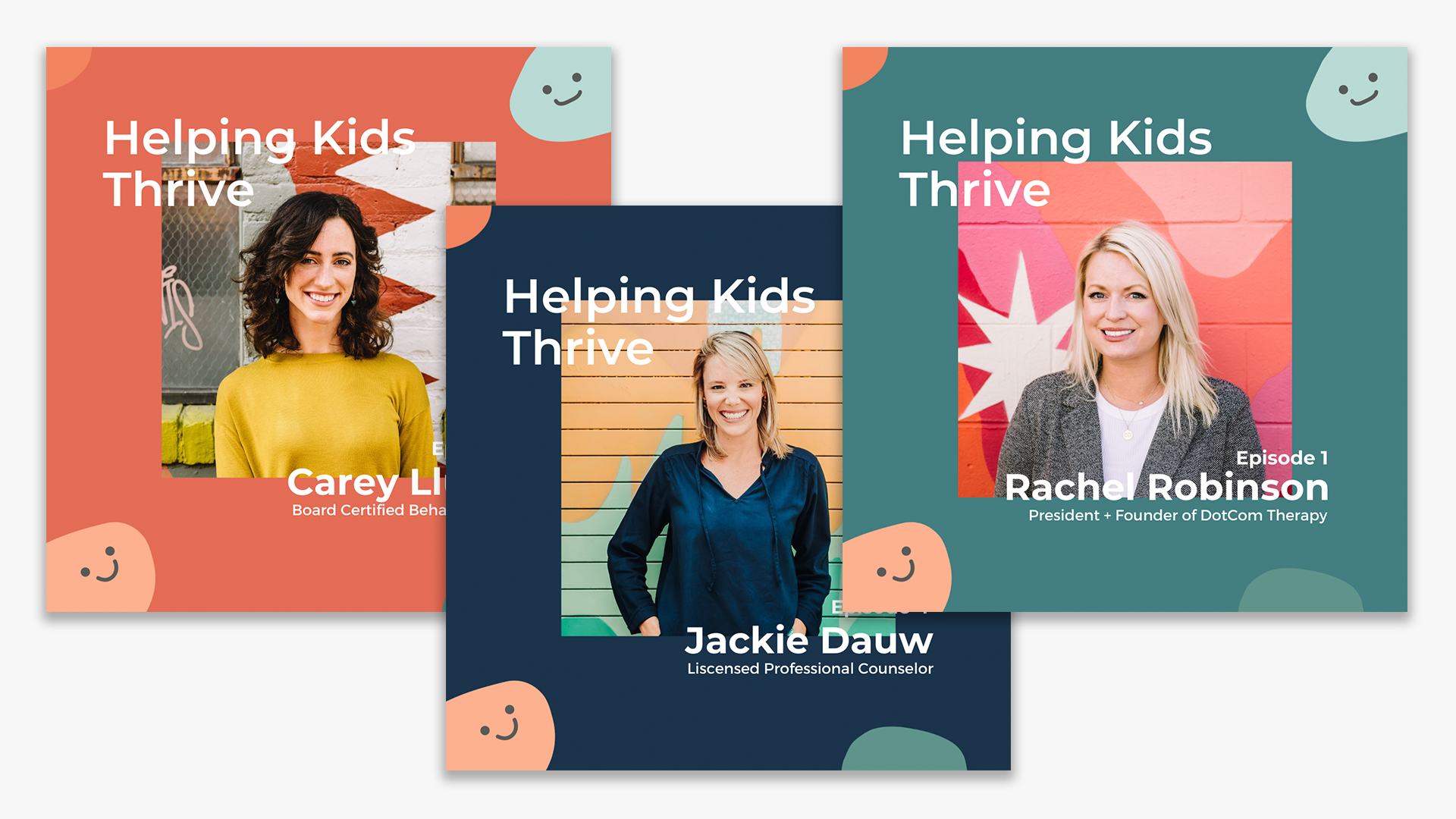
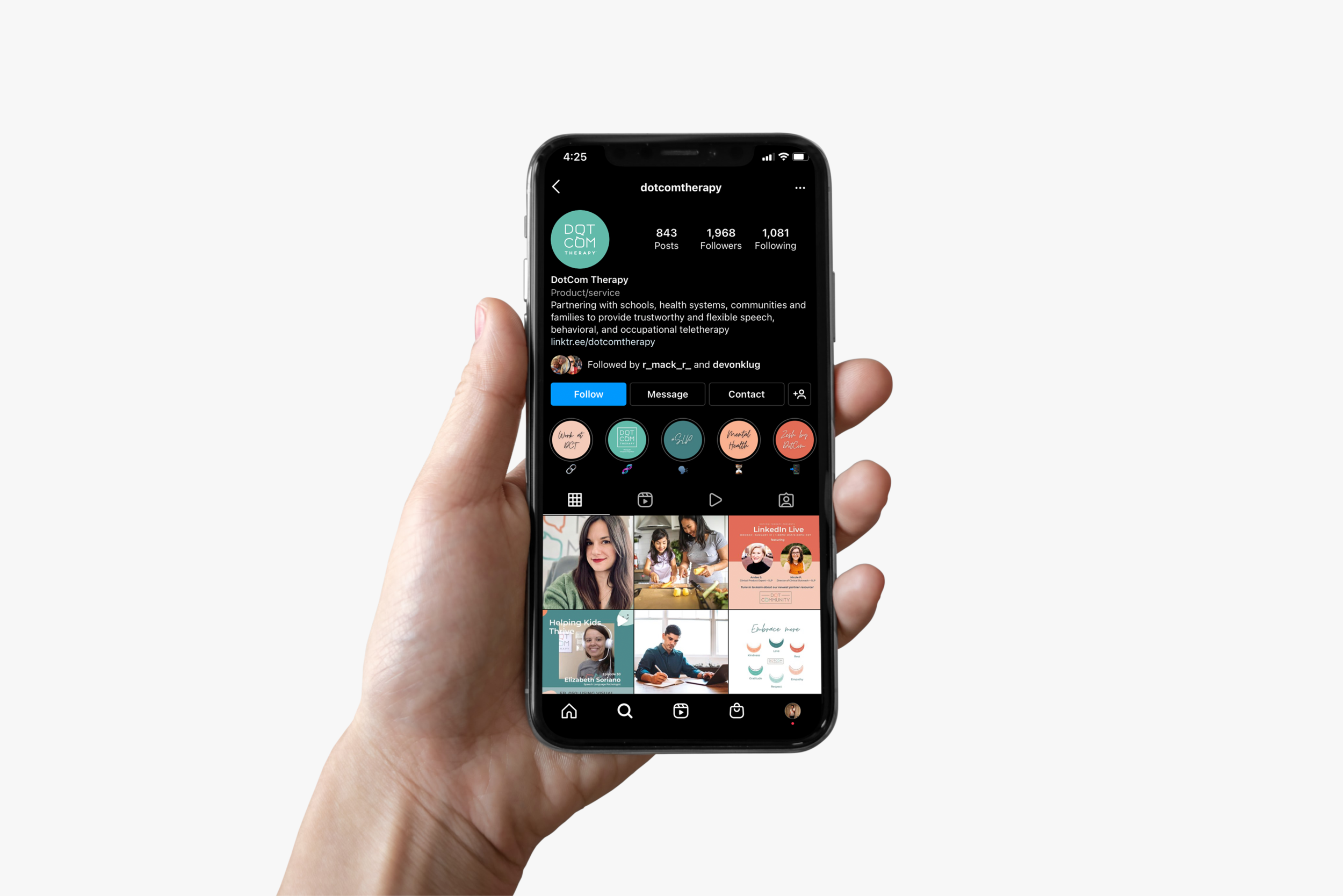
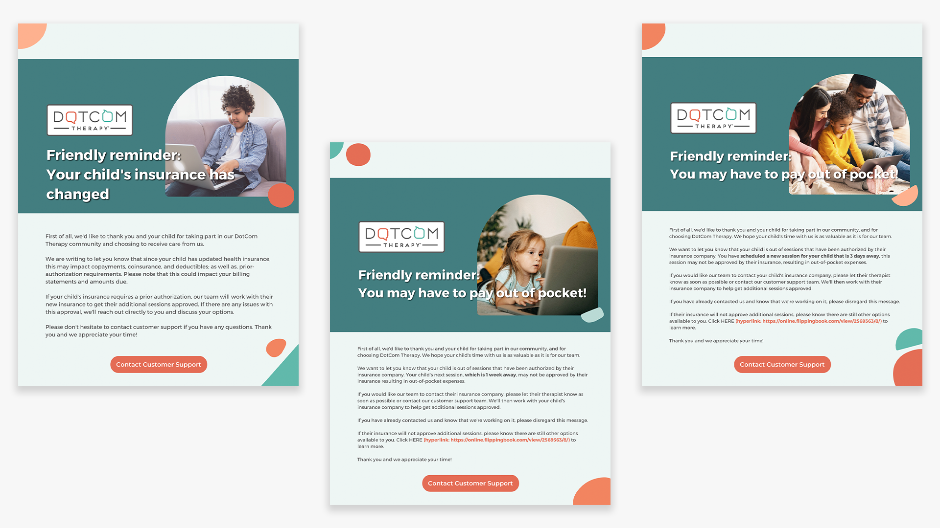
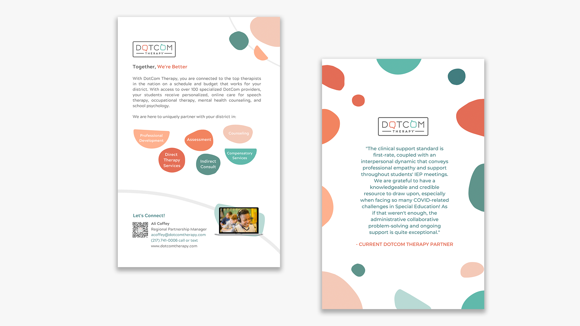
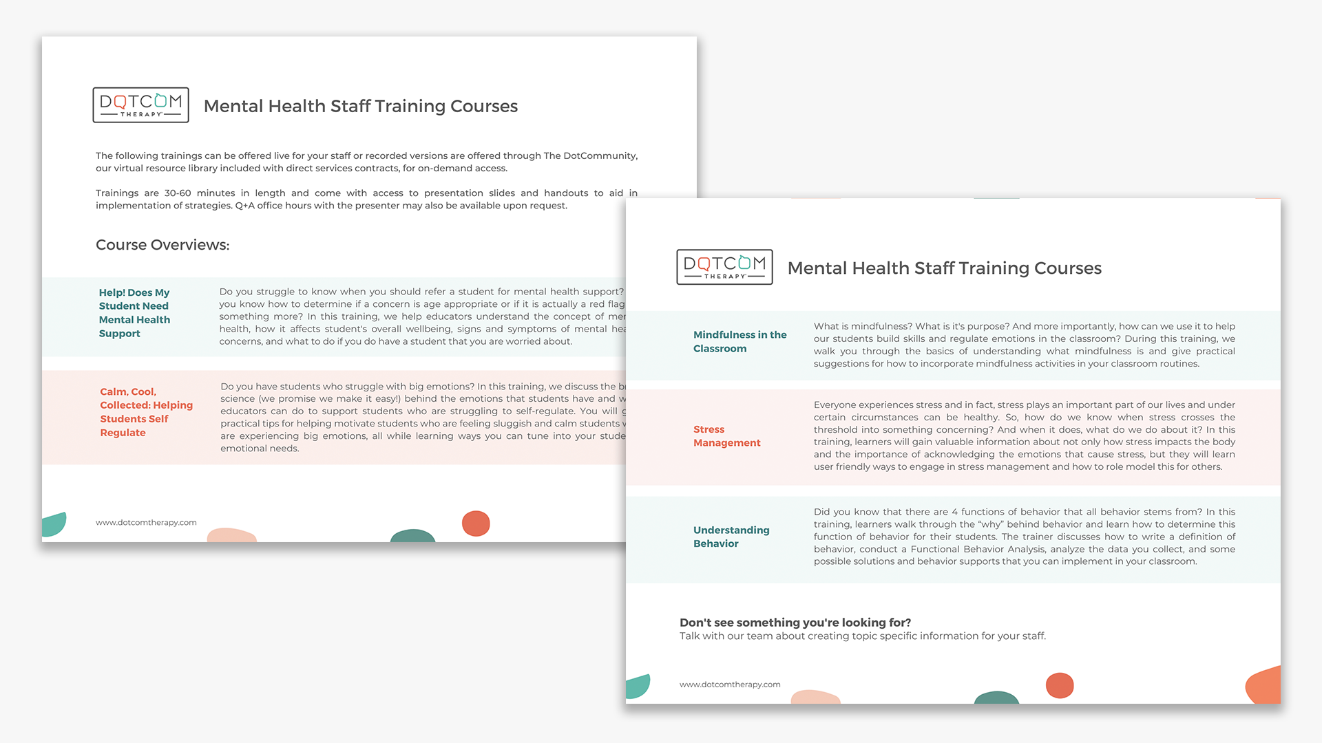
From podcast cover art, to print collateral, to social media graphics, sales sheets, and email design: I began applying the brand system to all corners of the DCT network. And things started to look more cohesive, uniform, and congruent.


DCT’s Website

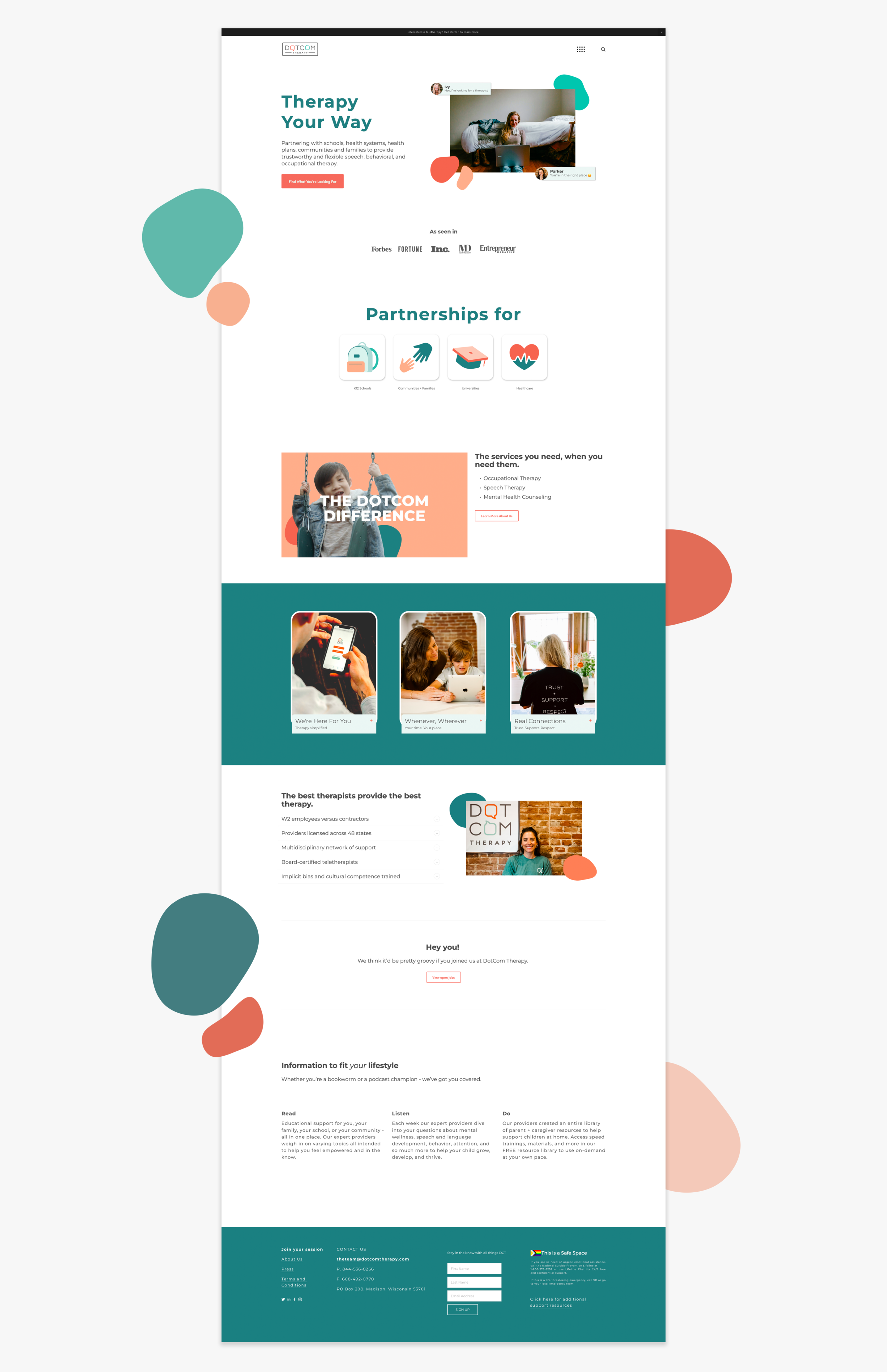
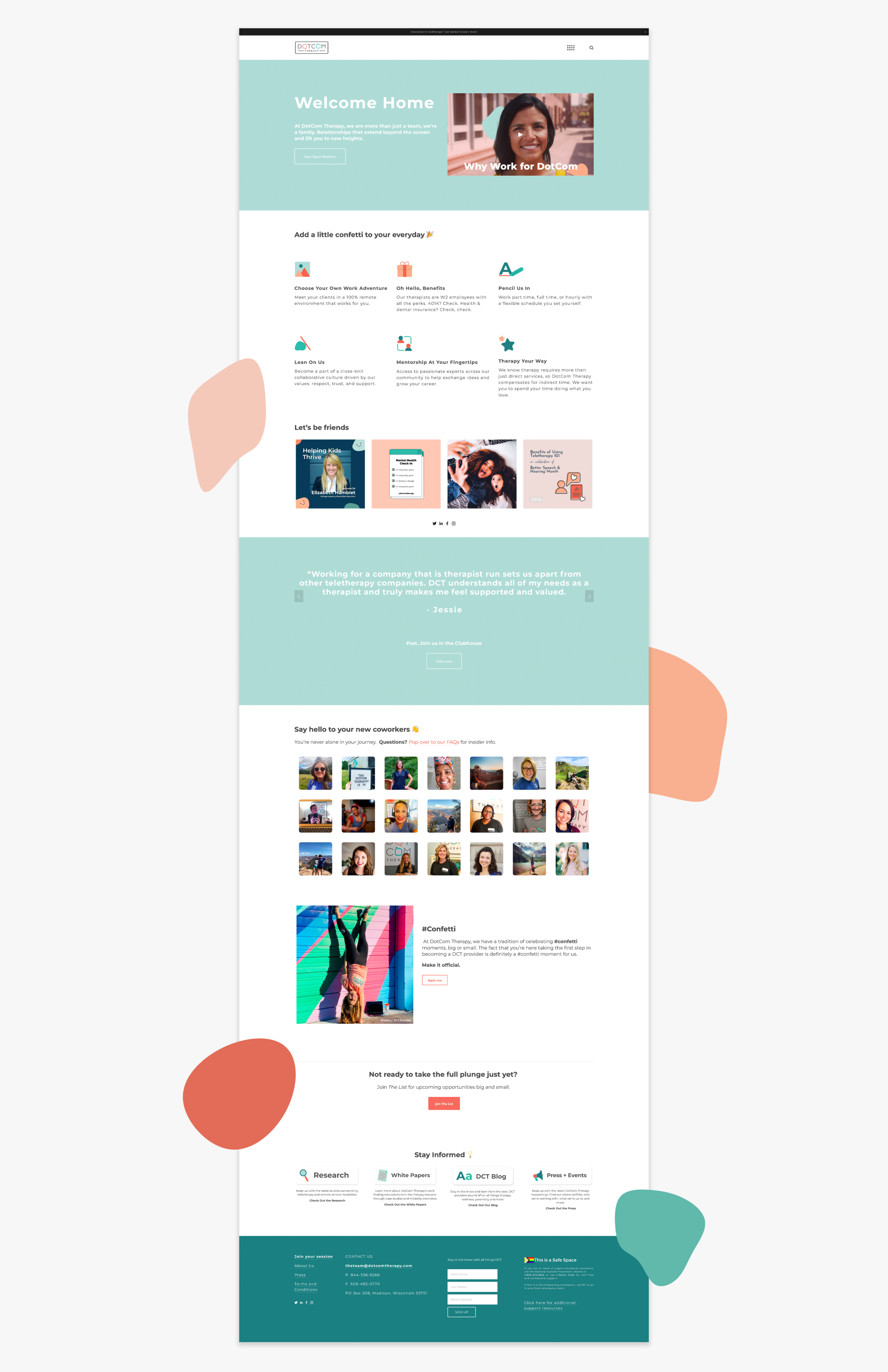
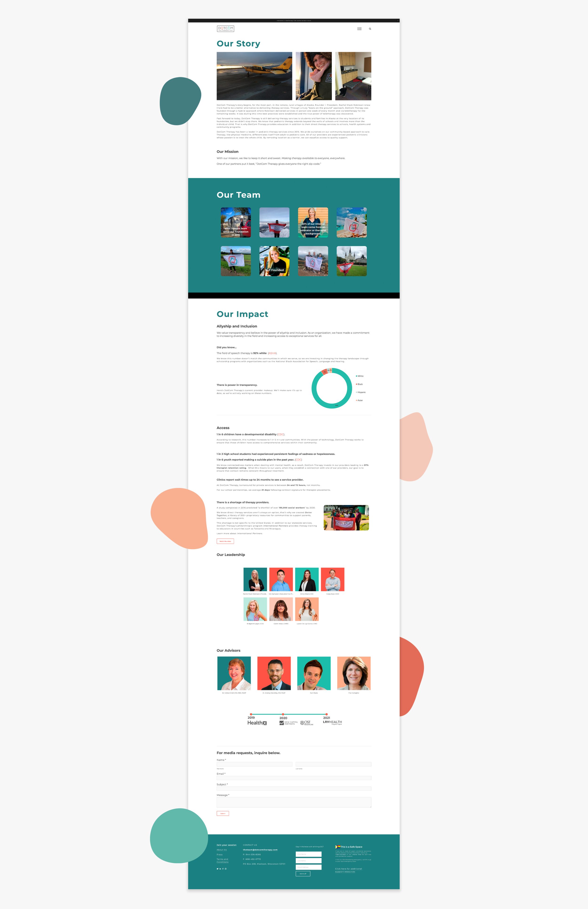
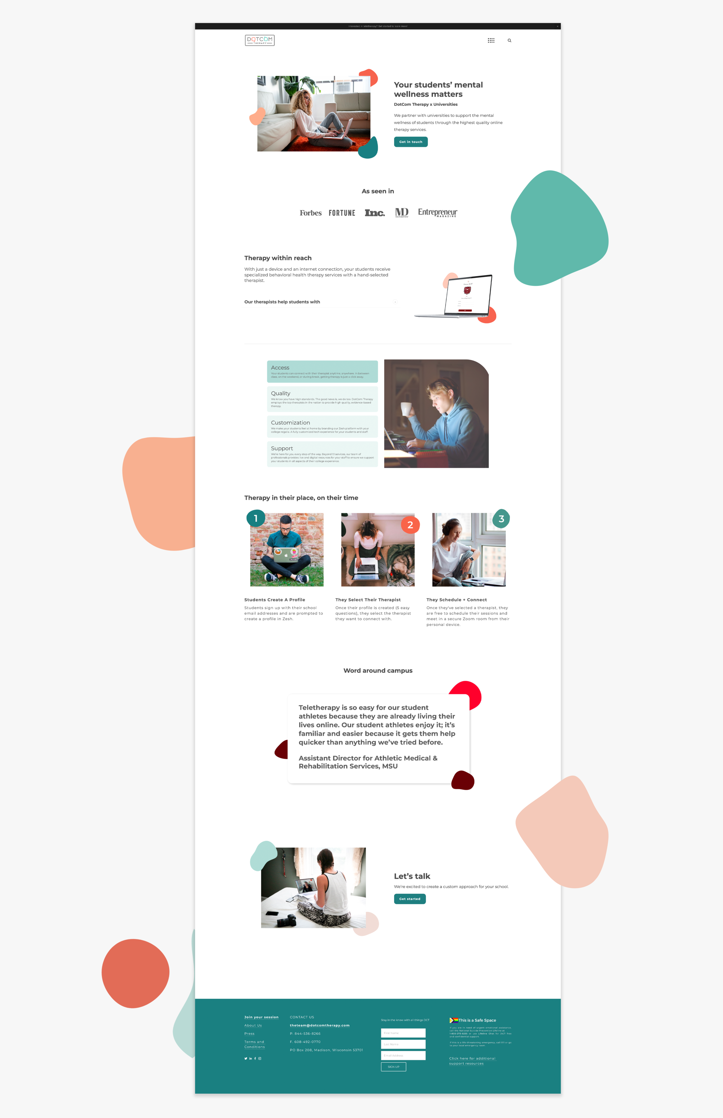
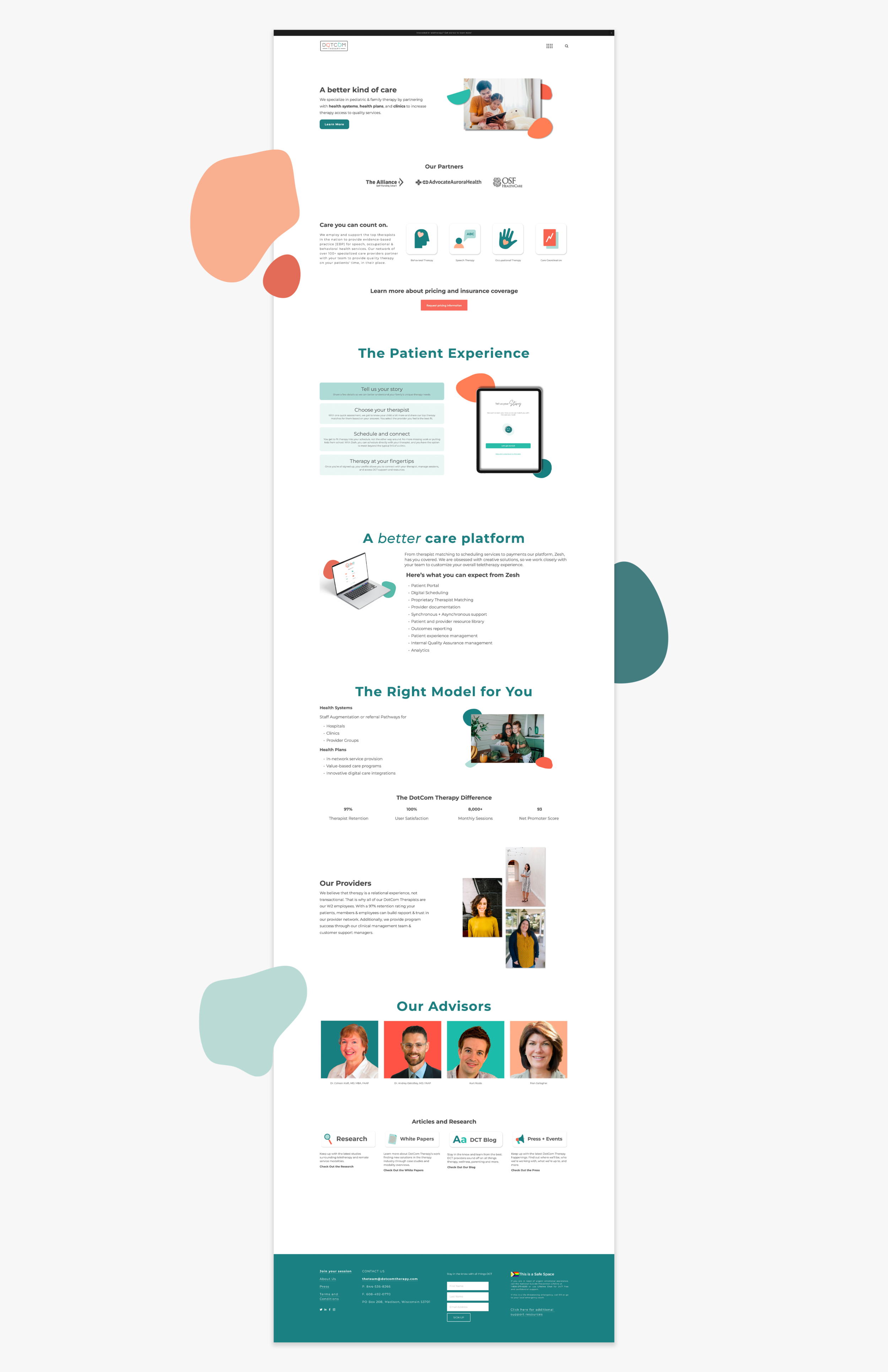
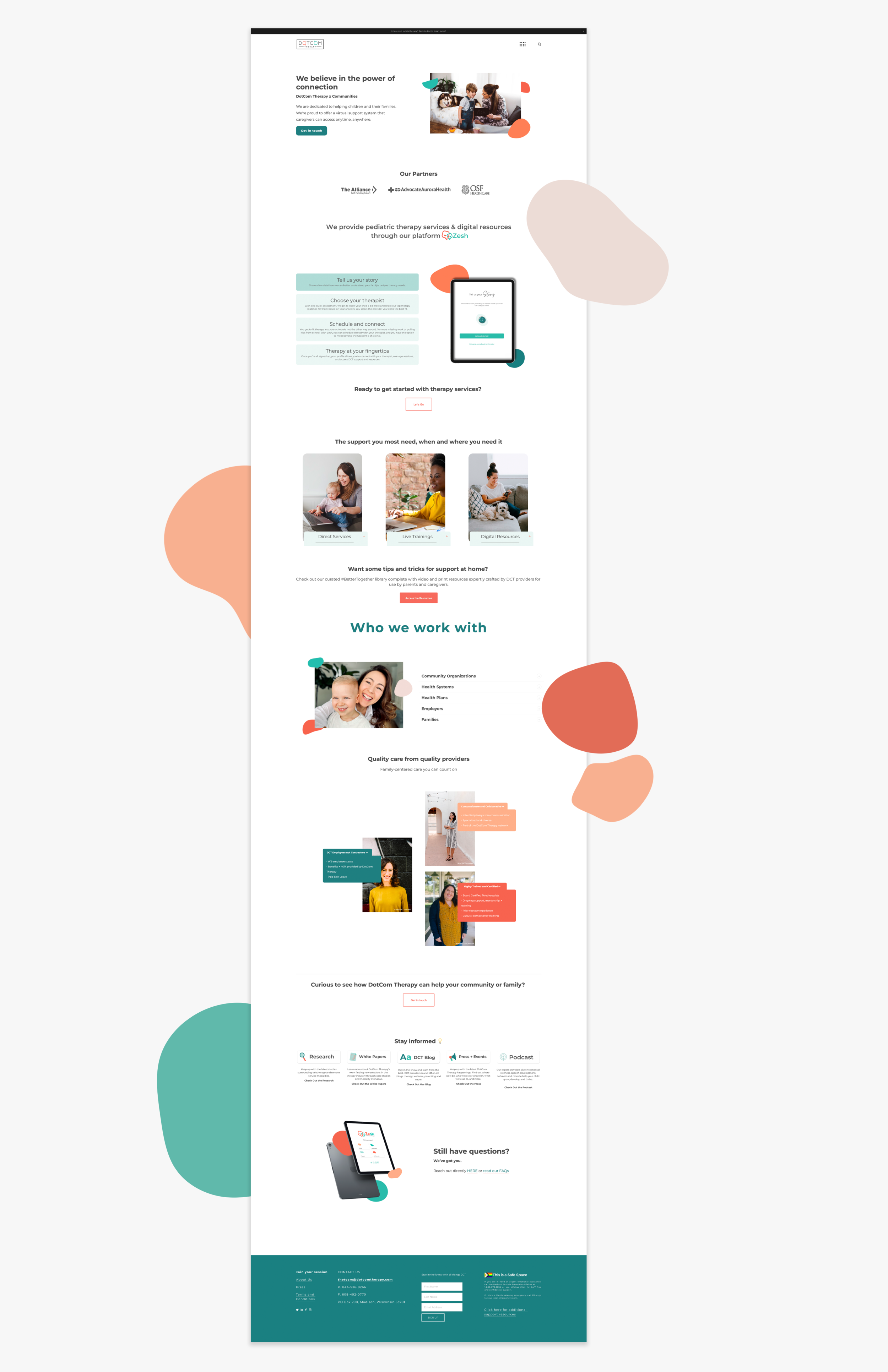
After the brand had settled and the rest of the oil tanker, that is DCT, got acclimated to the new brand, my team and I got to working on the DotCom Therapy website. The site’s primary function was to distill DCT’s complex processes and verticals into accessible, bite sized pieces to drive better sales and create better contacts. We prioritized white space, cleanliness, and pops of color to invite the user into DCT’s world and uplift them with every click and scroll.

This project is better seen if you simply visit the website.


SWAG

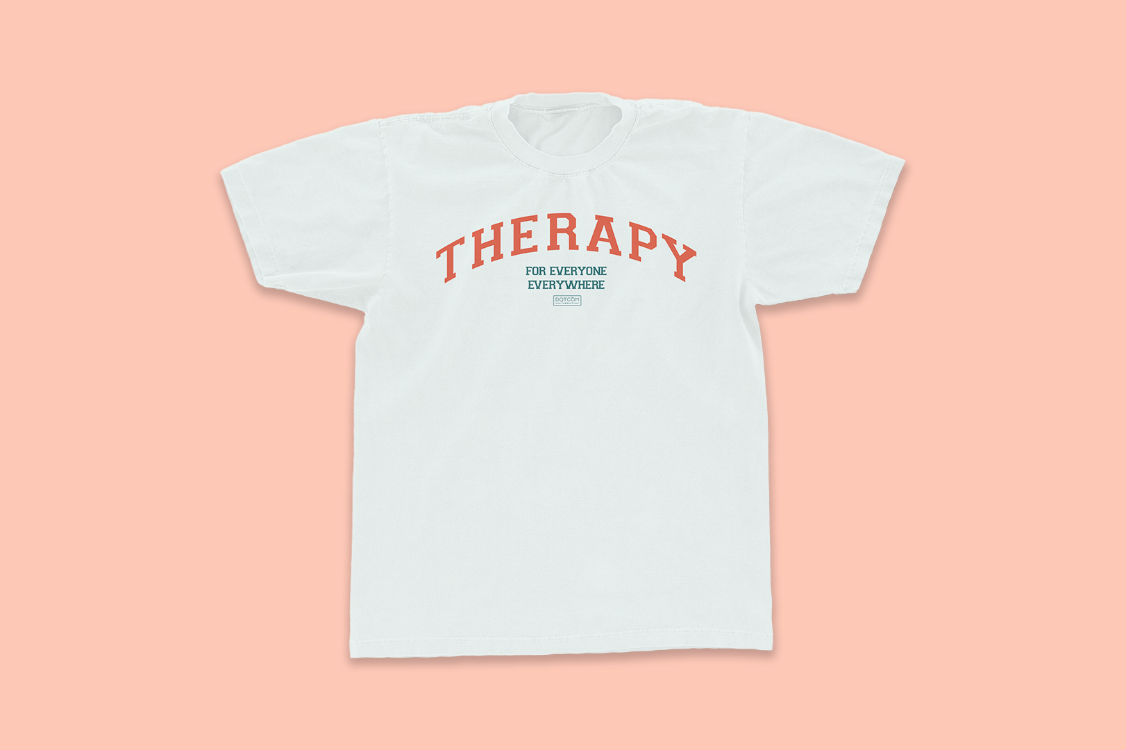
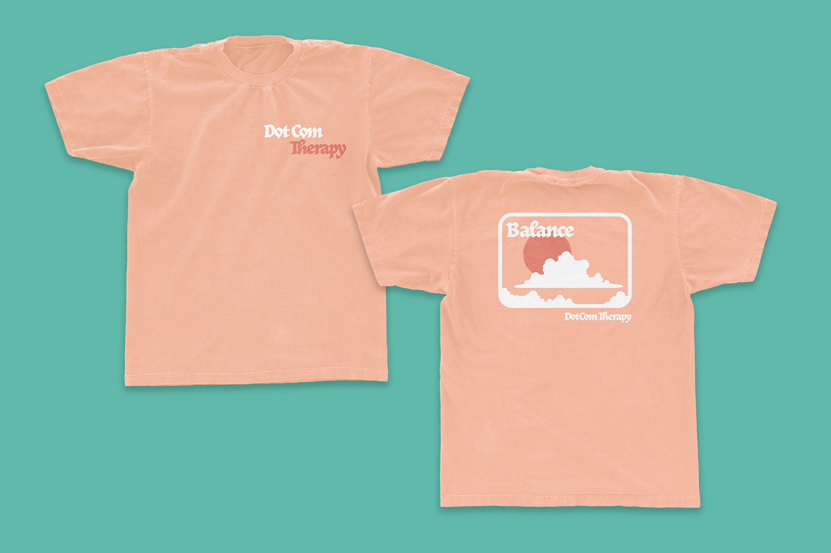
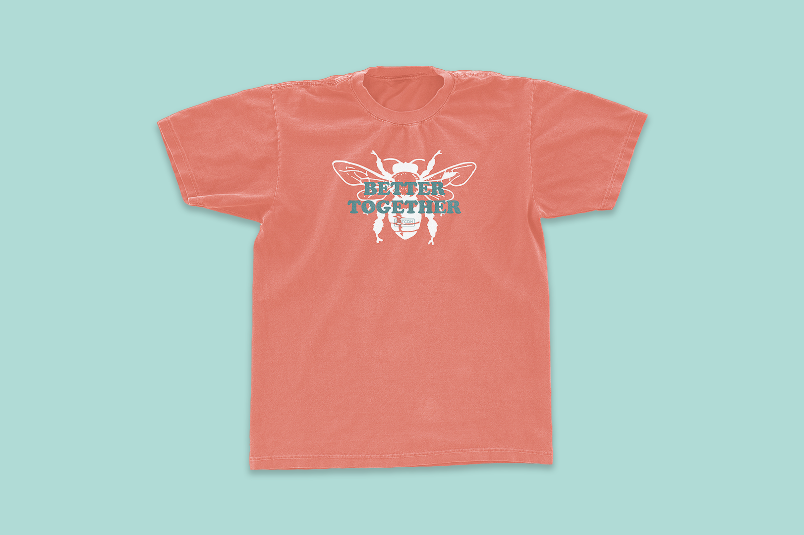
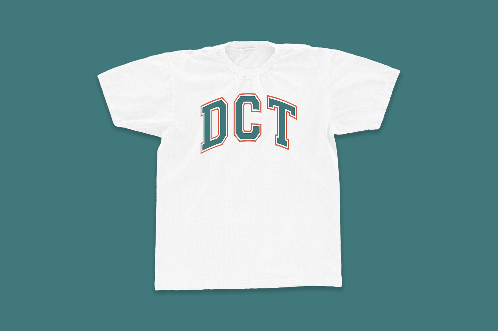
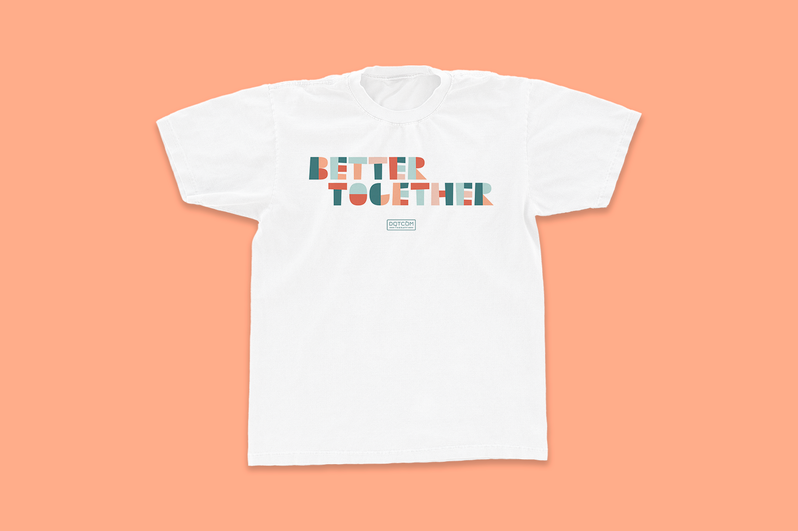
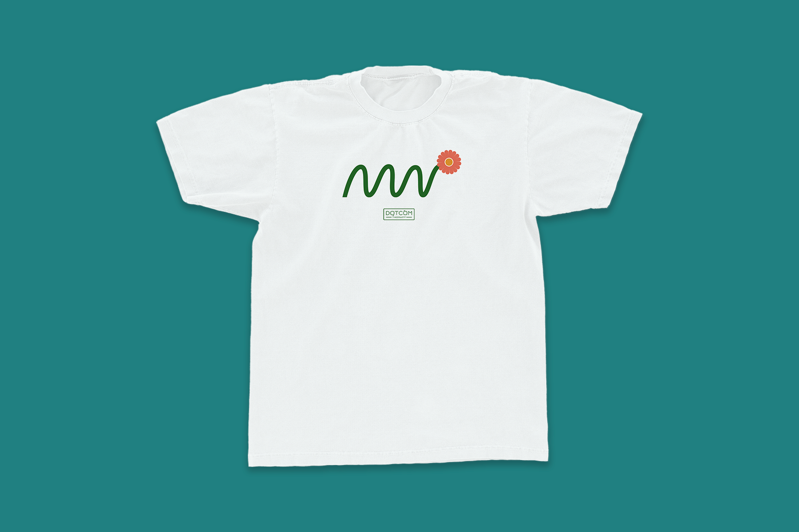
One of the perks of my job at DotCom is creating all the merch for our annual swag give-away. I take the year’s internally adopted phrases, new initiatives, and inside jokes and create fun gifts for our therapists, corporate team, and all the friends of the company. These items go neatly packaged to employees and we open them together on zoom and it’s gotta be my favorite day every year. This is also when I get to bend my own branding rules, have fun, and play the most.

 
DCT Media.png
 

 Cool Cool Cool Prod.

Is an Atlanta based video production agency founded by Mark Kendall and Bill Worley in late 2021. They’re comedy-focused and leverage humor to help clients meet their business/advertising goals, and too also change public perception and create community action. Before officially forming the LLC that CCC, Mark and Bill worked together over the past decade creating videos for Stacey Abrams’ campaign, the Fair Vote project, Georgia.gov, social equity initiatives like Black Lives Matter, and dozens of other businesses and non-profits.

However last year their opportunity and client base grew so large they felt it was time to officially join forces under and do things the right way. They wanted their brand to feel fresh, fun, lively, optimistic, and exciting. They needed it to look clean and professional enough to attract the attention of an exec in an agency or business, but also approachable enough to reflect the type of comedic work they do.

You can find CCC’s work here! (Website still under construction)


My Approach

Bill and Mark wanted their logo to evoke a sense of positivity and movement. Since so much of their work revolves around creating progressive change and swinging public opinion they wanted their logo to look youthful and energetic.

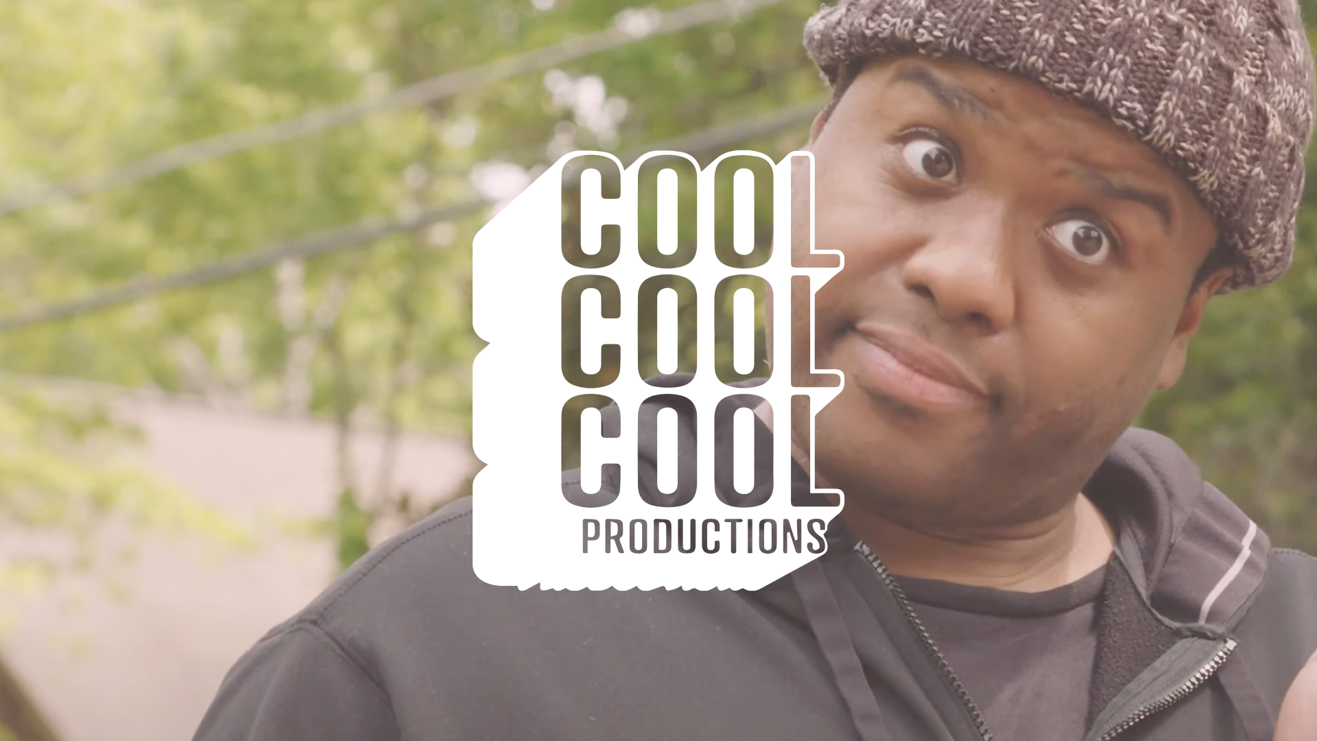
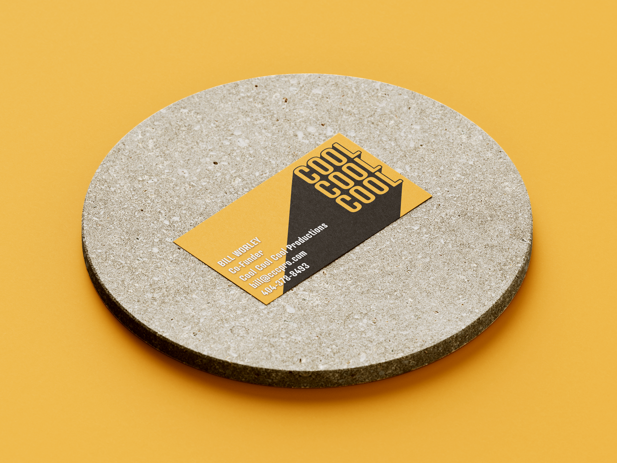
After throwing a lot of paint at the we landed here. Mark and Bill loved the shadow and the fact that the words were jumping out at you. It feels like the logo is up in lights somewhere. The rounded edges on the letters also soften the excited-ness of the overall form.

In addition of the logoform encapsulates a sense of cheerfulness, and confidence. The words are also coming from the left- a nod to the progressive political stance CCC is usually taking. In addition, the letters are illuminating the dark, just like the work CCC hopes to do.


From The Cutting Room Floor

A big part of my process is starting wide and narrowing things down. When starting there are no ‘wrong answers,’ and everything I do has potential energy.

Over time we establish rules and whittle things down, but in the beginning we say, ‘yes and,’ to everything that happens in the notebook and that first Illustrator file.

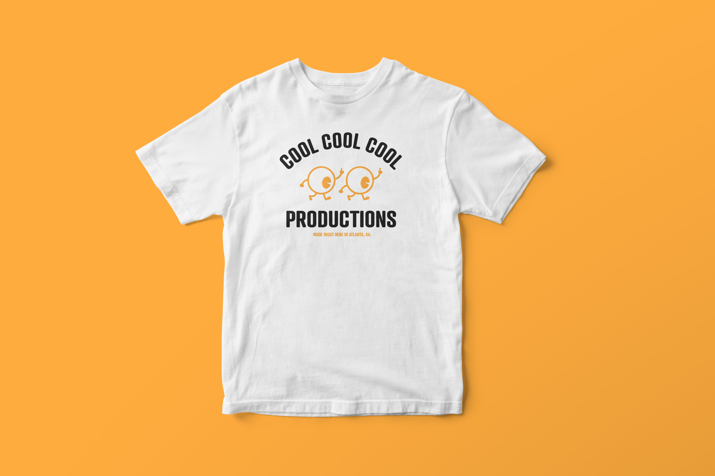
These are a few pieces that never made it to the finish line, but still made us smile :)

Final Brand Assets


Asset 13.png

About

Thrust Interactive has been making games in the Atlanta area for the past ten years. In their decade of operation they’ve worked with the NBA, PBS, Cartoon Network, and a large number of other big brands to bring fun and interactive content to the masses.

Services:

  • Branding

  • Illustration

  • Iconography

  • Strategy

  • Messaging

The Challenge

However until recently they did not have any brand guidelines or brand standards in place. This affected their collateral, their sales presentations, their image, and their overall identity as a company. This lack of direction was not representative of their work, and we sought to change that.

Our Approach

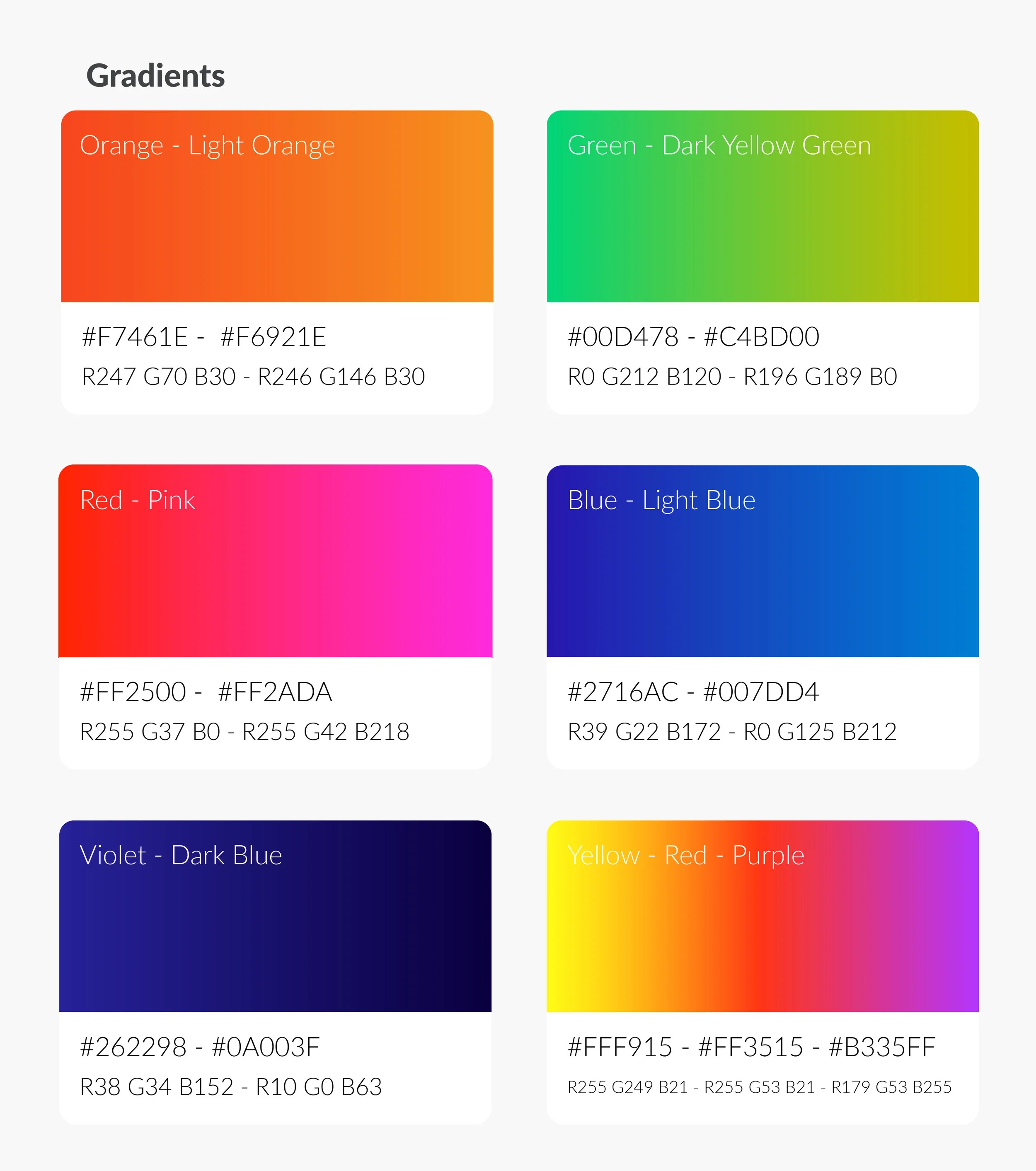
With its new identity Thrust wanted to strike a balance between professional and fun. Established, yet youthful. Experts in their field, while appearing casual enough to get a beer with. We achieved that by creating structure around the little they did have in their identity system. These elements helped to make Thrust look well-established and well-structures. By varying up the color palette and embracing gradients we brought a sense modernity and youth to the brand that livened things up.

We also took a magnifying glass to Thrust’s messaging, both visually and verbally. By adding more angular lines, energetic imagery, greater whitespace, and language that spoke optimistically we injected a sense of confidence and positivity to Thrust’s new image.


BEFORE

Thrust Brand Page Old.jpg


AFTER

Thrust brand messaging.jpg
Thrust Brand Fonts.jpg
Thrust Brand Colors.jpg
Thrust Brand Logo.jpg

Some of the Icons

Thrust Brand icons.jpg

Illustrations

Thrust Brand Illustrations.jpg
Thrust branding tile.jpg
pitchDeck_illustration_01.png
 

About

Hemonauts is a mobile game that teaches children about health and disease literacy! Players take the form of a microscopic nanobot in a person’s bloodstream and learn about the human body’s systems, defeat bacteria, viruses, and learn how to lead a healthier and more sustainable life.

What I Did:

  • Branding

  • Messaging / Strategy

  • Web Design

  • Illustrations

  • Writing

  • Storytelling

  • Character Design

The Challenge

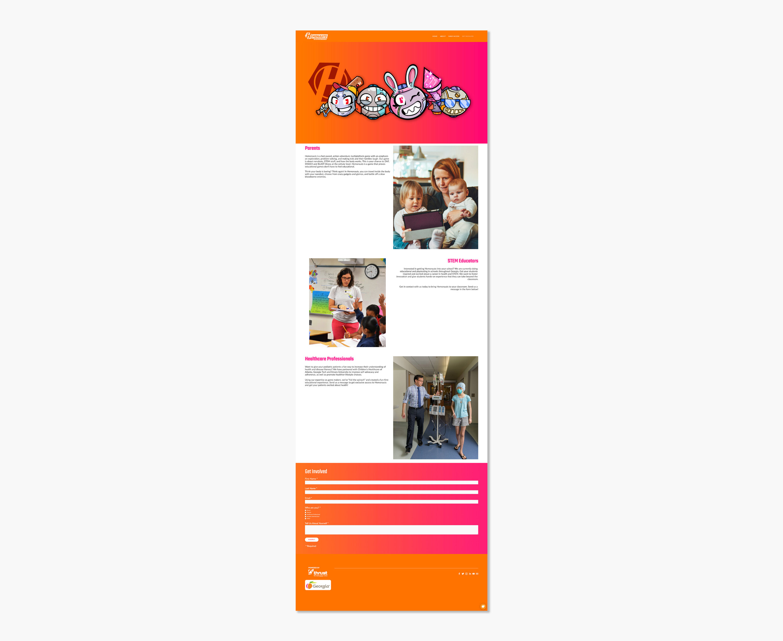
Hemonauts rides the line between education and fun and their brand and website needed to reflect those ideas. The game boasts high velocity zany action while still being very educational. The game needed to be for kids but needed to be something that parents, medical organizations, and scientific institutions would see the merit in. For that reason the Hemonauts brand and website needed to be something kids could connect with while also being something that looked professional and could stand up to the rigid scrutiny of a funding organization.
Our Approach

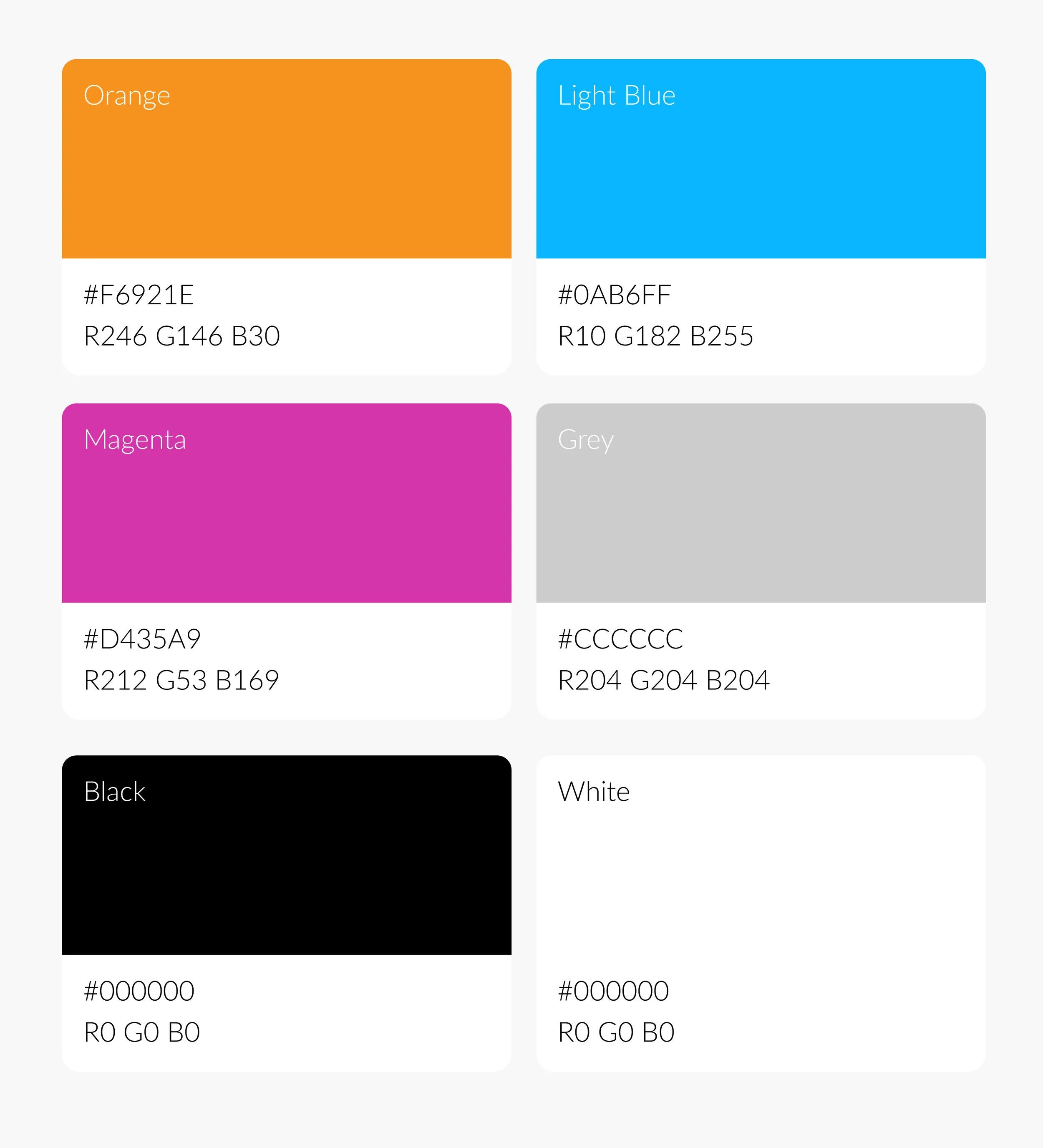
In positioning the Hemonauts brand we wanted to strike a balance between wacky and confident. We did this by solidifying a brand identity system that stayed consistent in the game, the website, the collateral, and the social media graphics. This brand helped bring structure to the game and the content centered around the game. We embraced bright and vibrant colors and gradients that had energy we felt was similar to the Hemonauts gameplay.

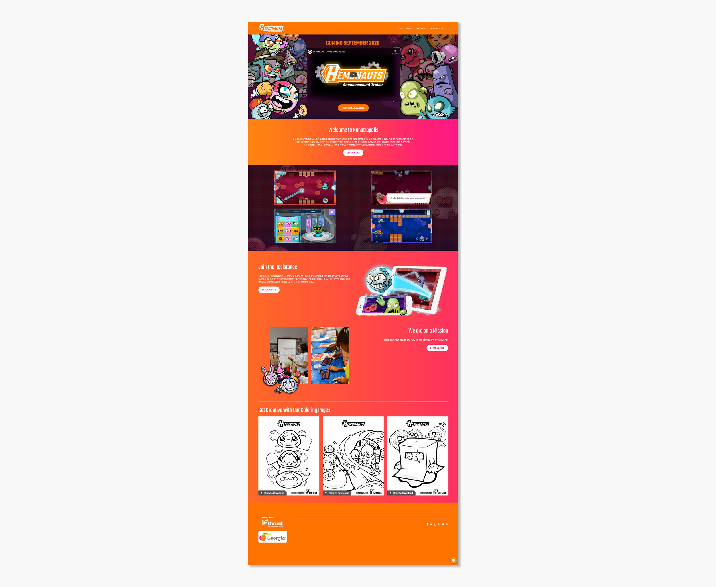
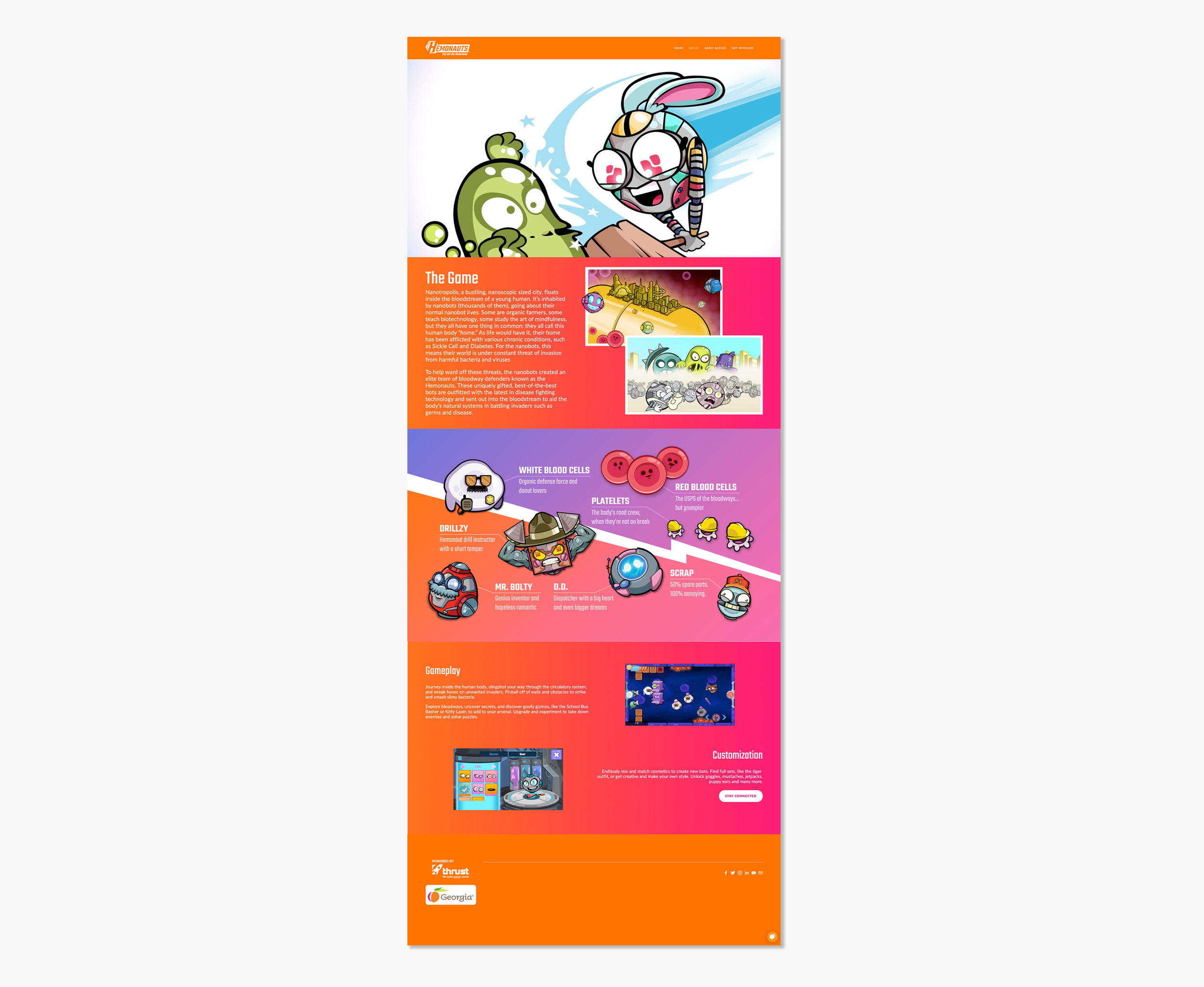
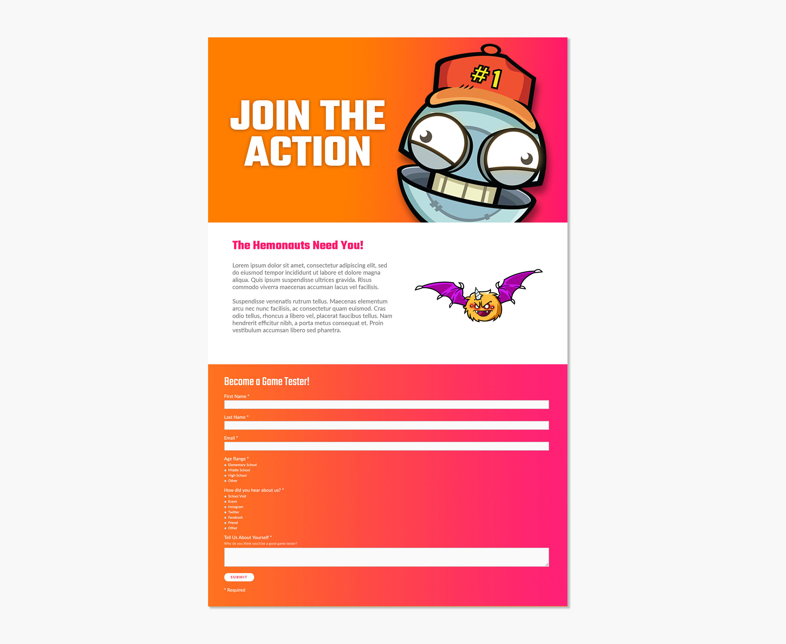
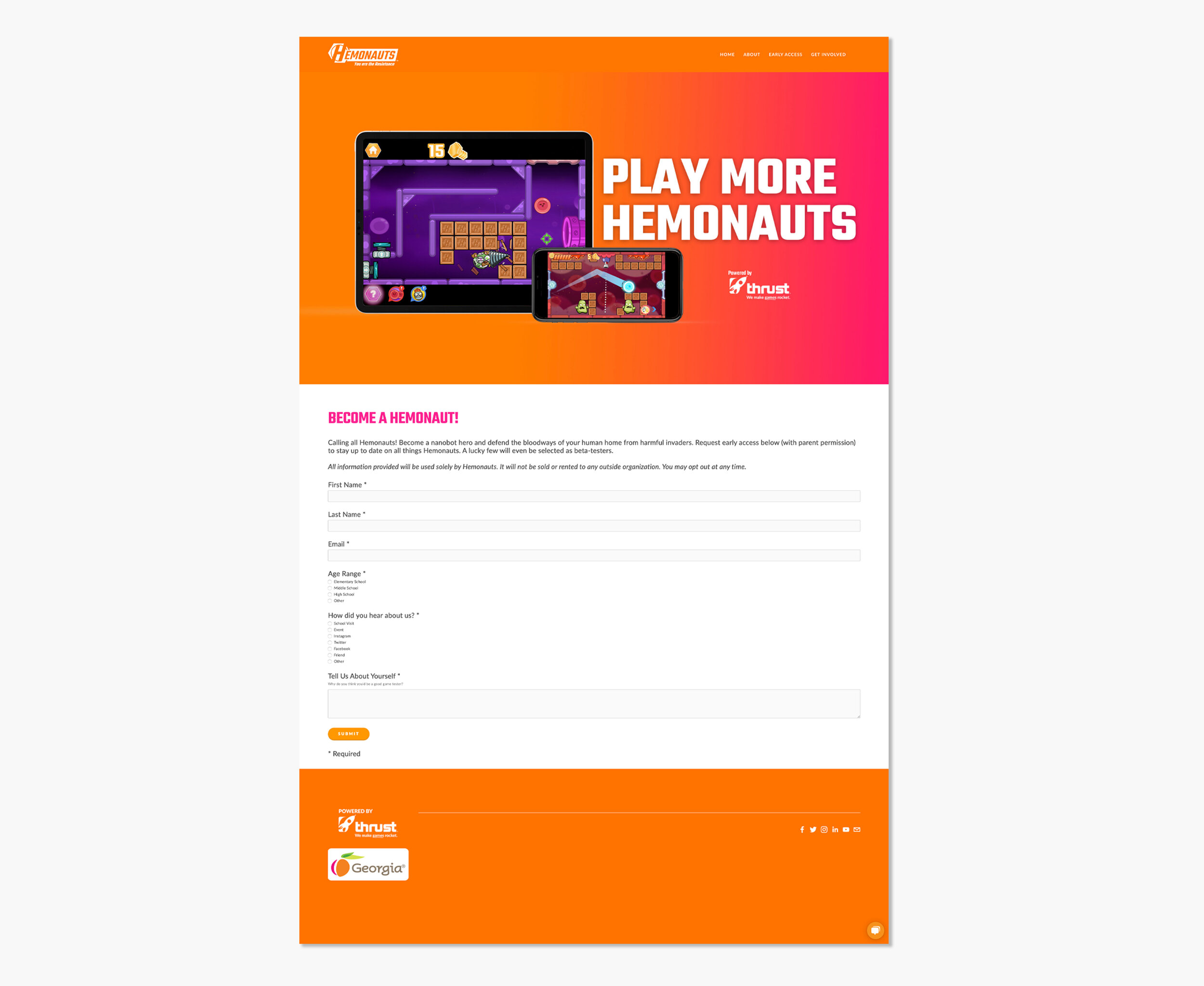
On the website we used fun and positive language that encouraged engagement and interaction. We employed full page, wall-to-wall colors and illustrations that made the newest of users feel at home with the characters and game. We also allotted a certain amount of real estate on the site for investors and parents to see the merits of the game’s practical and medical benefits.
I was also a head writer on a Hemonauts animated series pitch that positioned the brand as a fun and bite-sized animated series that is currently in the works!


BEFORE

Hemonauts Before Logo.jpg
 

AFTER

Hemonauts Font 1.jpg
Hemonauts font 2.jpg
Hemonauts Gradients.jpg
Hemonauts Logos.jpg
Hemonauts gear illustration.jpg
 

HEMONAUTS WEBSITE

The main objective of the site was to engage people quickly, make them feel like a part of our universe, and sign up to be a beta tester, a donor, or just interact with us in a meaningful way. We did this by making the site experience vibrant, fun, and illustrative while adding CTA’s and signup forms in order to prompt those interactions. Bright colors, lots of energy, and movement in the form of GIF’s helped make the site fun, and the utilization of funnels ensured results.


WIREFRAMES

hemonauts wireframes.jpg
 

HEMONAUTS.COM

hemonauts pages.jpg
 

OTHER PAGES


Hemonauts tile.jpg
Limewire header.png
 

About

In the early 2000’s Limewire was a free peer-to-peer file sharing software that allowed users everywhere to upload and download everything from movies, music, games, and software. If it could be pirated, it was on Limewire. And if you were on the computer from 2000 to 2010, chances are you remember what I’m talking about.

Limewire holds a special place in my heart. It’s where I fell in love with comedy by downloading early Chappelle and Chris Rock specials, where I saw influential movies like Akira and Ghost in a Shell, and learned about graphic design by downloading Gimp (a photoshop knockoff) in High School. Which is why I decided to take this piece of internet nostalgia, and tried to imagine it alive and thriving in 2020.

What I Did:

  • Branding

  • Product Design

  • UX/UI

  • Iconography

The Challenge

Limewire never had a consistent look. Because of it’s legally ambiguous nature, things got shut down and re-opened quite often. This led to it’s user experience to be very ambiguous and not very intuitive. Things changed drastically between versions with no explanation and you often had to relearn the software.
The interfaces you’d deal with as a patron were often drab, text-heavy, and monotonous. It should have felt fun! You were illegally downloading your favorite movies, the new Jay-Z album, and Halo on your parents’ work computer.

My Approach

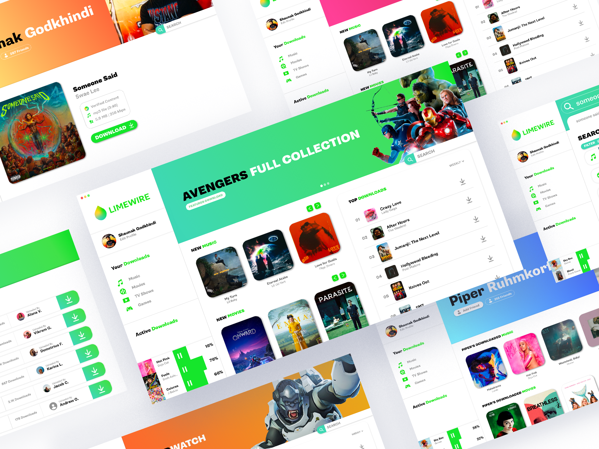
To clear up the previously opaque user experience I decided to bring in familiar pieces from software the average user already interacts with on a daily basis. Featured content, a weekly top downloads list, newly uploaded content, and a simple profile system mirror experiences we have using Spotify, iTunes, and social media. This along with useful employment of plenty of white space, sectioned out elements, and pops of color, allows any new user to take one look at a given screen and figure out what they’re being prompted to do, what they want to do, and how to go do it.

To create excitement and a sense of joy while using Limewire I injected way more color, imagery, and modernity than was found in previous versions. Artwork, bright pops of color, and bold text helps the user feel like they’re engaging with their favorite pieces of media. Social features like profiles keep the experience light, and allows users to express themselves.

This project was a lot of fun, and if you want the XD file I built it in, I’ll send you the Limewire link! Thanks!


BEFORE

Limewire old logo.jpg
Limewire before copy.jpg


AFTER

Limewire new logo.jpg
Limewire branding1.jpg
Limewire icons.jpg
Limewire verified copy.jpg
 

WIREFRAMES

Limewire wireframes.jpg
 

LIMEWIRE

Limewire Screens.jpg

HOMEPAGE

Limewire features copy.jpg

SEARCHING

Limewire features2 copy.jpg

USER PROFILES

Limewire features3.jpg

SCREENS

 
Limewire screenz copy.jpg
Limewire site tile.jpg